💰 Go Pay - Mobile E-Wallet


Introduction 👋
Hello folks, for this moment I will share my design work process as a UI Designer making a design exploration, this case is quite “special” than other my design exploration, in this case, I will make a design for the e-wallet platform and take Go-Pay as the main case, try to make a design based from the app flow.
Get full view at Medium:
Objective
This design exploration will focus on me as UI Designer to make an Interface, I’m not covering a lot for the research phase and I'm not doing user testing to validate the design result.
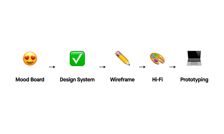
Exploration Design Process
The first thing for me when doing UI Design Exploration is choosing the theme of the application as I mentioned earlier for this case I will make an e-wallet app based on Go-Pay, after that, I gather information and design references to make a mood board.
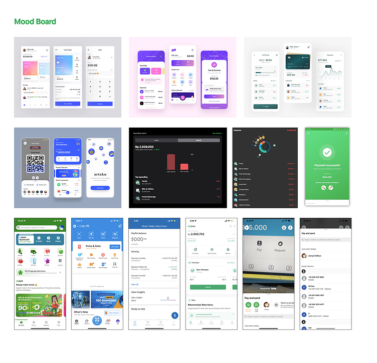
Mood Board 😍
In the mood-boarding phase, I usually open the inspiration app and collect some great designs that will be matched the exploration, for the content I usually took the real/live app at this point, I took some structure and menu for each app. This phase usually took a couple of hours for me, this phase really impacts the wireframing phase, the more data I get it will be easier for me to make the wireframe.
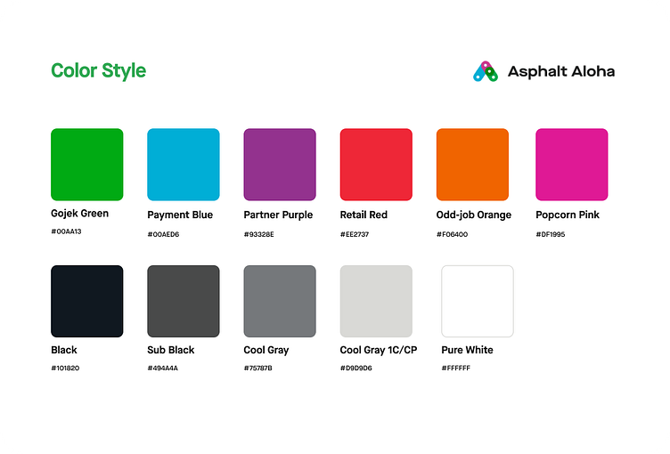
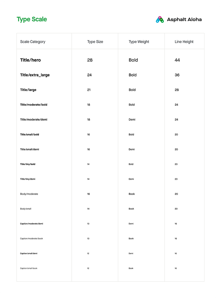
Design System ✅
I make the design system base on GoJek Design System, I define color, typography (type scale), shadow, and spacing from the Asphalt Aloha Design System, and also make some components with variants, which will be helping a lot in the design progress and keep the consistency for each object.
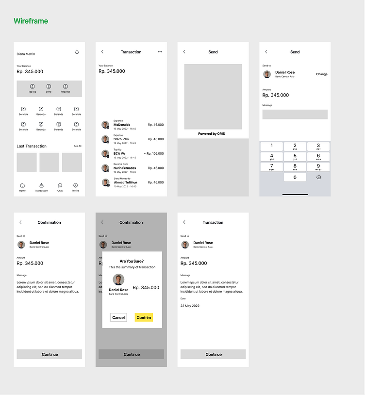
Wireframe ✏️
I gather the information from the mood board and take the feature and menu that will appear in the design.
When I make a wireframe, the main feature I do want to make is the home screen and transaction process, but when I make the hi-fi design I decide to add a new screen to the design is a log-in and success page.
Hi-Fi 👨🏻🎨
This is the best part of making an exploration, making the hi-fidelity make me as UI Designer in fire zone hahaha, I can explore and try many things to make a good looking UI, also still thinking for the UX.
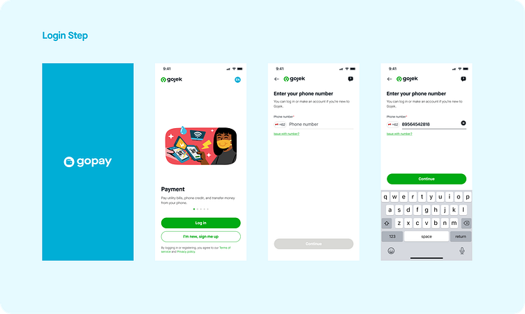
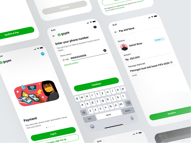
This same flow as the current Go-Jek Application. When the user open the app splash screen will appear (at this moment I changing the logo to GoPay) also I’m thinking to change all Go-Jek icon into GoPay to make this app stand alone like Ovo or Dana, but I decide to use the same design with GoJek because I don’t want the user thinking this app need you to make a GoPay Account, so this design concept keeps the user using their current GoJek Account.
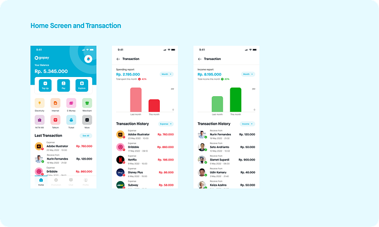
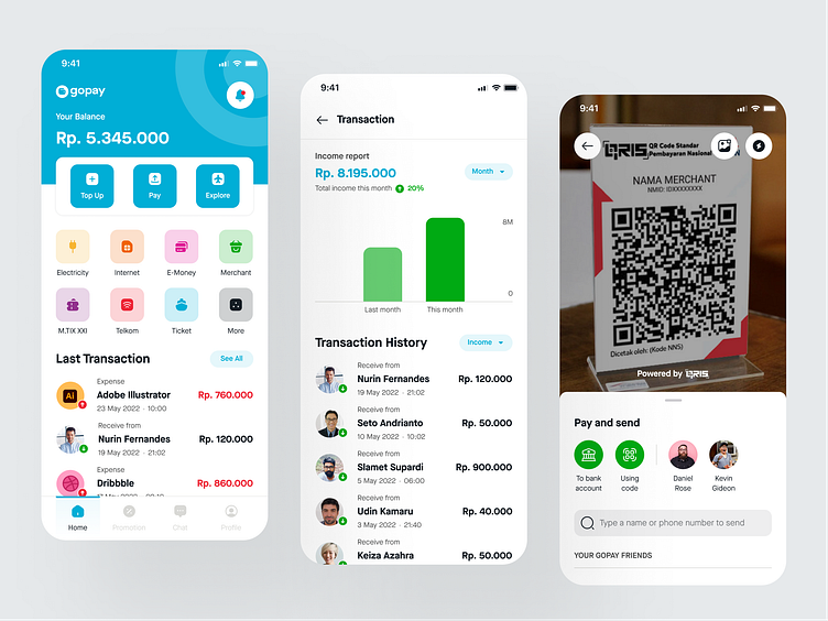
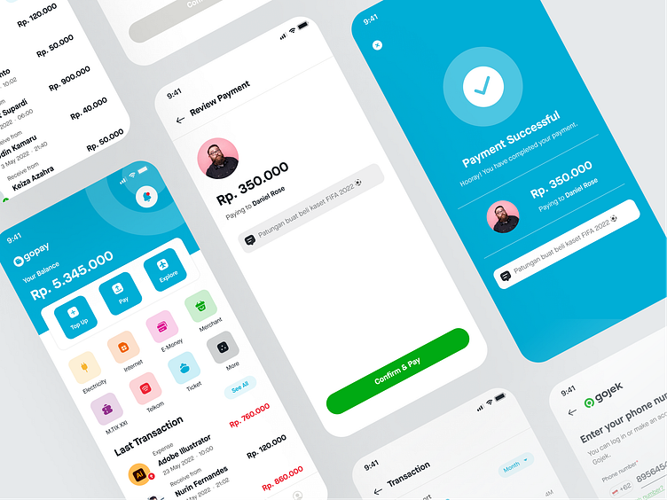
On the home screen, I keep GoJek Home Structure but change the top of the application, making the balance have a big portion, so the user will notice it more, also bellow the bunch of menus I add transaction history, this feature can track your expense and income for each month and week, also I make a graph to compare it so the user knows where their money is gone and the income. I get this flow from the Money Lover App, it’s a financial tracker app, you can write down all your transaction on that app, and the app will give you the report.
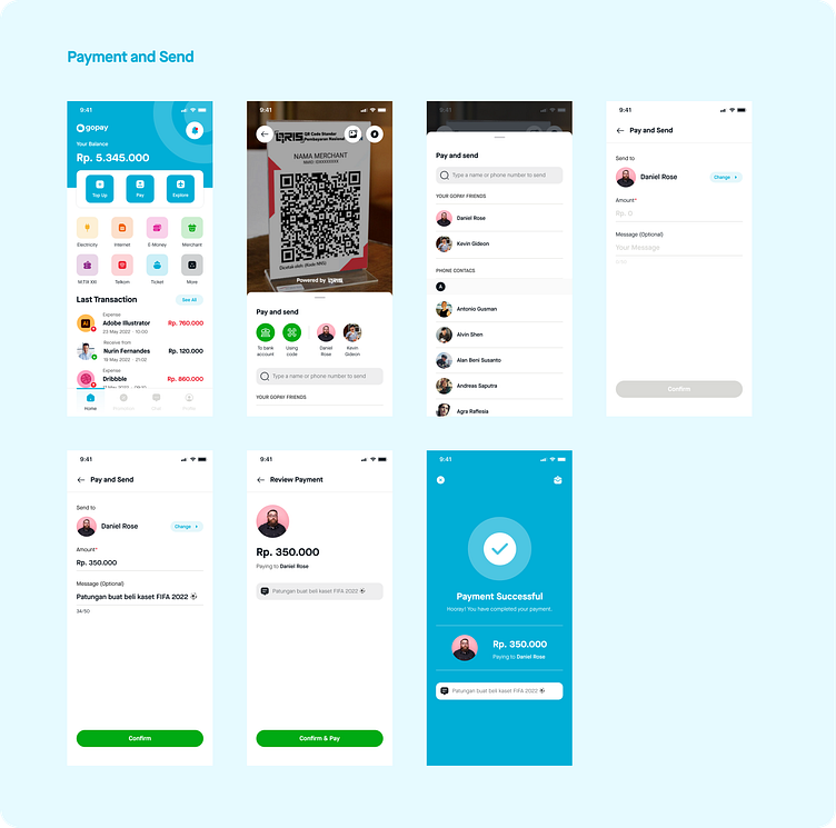
For the payment and send feature, I keep the same flow as the current GoJek App, the addition is, that I make a message note for the user. I also change a bit the review and success screen because I can’t find the illustration on the review page so keep the screen clean.
Prototyping 👨🏻💻
For the prototyping, I make 3 flows it’s a:
Login
Transaction History (Expense and Income)
Payment and Send
You can try the prototype with the Figma Embed, and each flow I make at Starting Point, so if you want to jump for a specific flow you can click on the left side.
Closing 🔥
I have learned a lot from this UI Exploration, it makes me practice how to make a design system and implement it into the design, also it’s made me meet prototyping tools again in Figma hahaha, I rarely do prototype actually at a design studio and as a freelance UI Designer, the client usually not asking me to make a prototype (also full design system).
Of course, this UI Exploration is far from perfect, needs testing to validate the design idea and result to know how the user interacts with the design, maybe in the future moment I can do that properly :).
So that’s all process when I do some UI Exploration it does not look like a fancy step or super movement hahaha, every stage is a conventional not really special, I really take a lot of energy at the Hi-Fi stage, and sometimes it makes me stuck in the form of my computer and thinking what the perfect color, icon and flow for this design, it’s happening in this UI Exploration and other UI Exploration I made before :) so I think it’s normal.
Thank you for reading until this part, also to get in touch with me we can get connected on my social media: 😍
For Project Inquiry - hello@kretyastudio.com


