#20 Victoria Leontyeva | UX/UI Designer | Interface for Day Zero


Test task completed — May 18, 2022
Contact — @Leontyeva_Victoria (telegram)
Portfolio— https://www.behance.net/victorialeontyeva
Our comment:
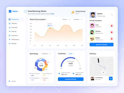
I liked the bright interface, unobtrusive color palette, and emoji- characters usage. The main design issue is “accents spraying”. There are too many colorful and large-by-mass objects, that distract from the main functionality. For example, a block with members It has unique colors and faces, that grab attention immediately. “Delete” icons are pretty big, but how often would a user delete members to give that function that much attention? Same with the buttons, they are not prioritized. There are many different numbers on the dashboard, but they’re all somewhere behind. We’d want more work with the typography and statistics.


