Instabook Reading and Review App: Product Design Case Study

Instabook is a mobile app that connects authors, publishers, and book lovers all in one place
Challenge
The challenge was to design a reading and review app with a social aspect. I worked to create a service called Instabook to connect readers, authors, and publishers together in a social way. Users can create reviews, share their reading progress, and check out new books or book clubs.
Step 1: Market Research
The first step I took was to compile market research to find existing companies that offer a similar service. I compared Kindle, iBooks, Audible, Goodreads, Bookly, Book of the Month, Book Club, and Libby.
Step 2: Interviews
I found users who are familiar with different reading and book apps to start identifying common reading app patterns that I could apply to Instabook. I also used Reddit to find threads and conversations people had about various reading apps.
"It would be cool if you could read a book and then find others or a club that has read the book to join."
"It's hard to find a nice app with modern UI. I like apps with clean, intuitive UI and a social community with friends and authors that you can friend and follow. I like reading lists and shelves, and keep track of your reading library."
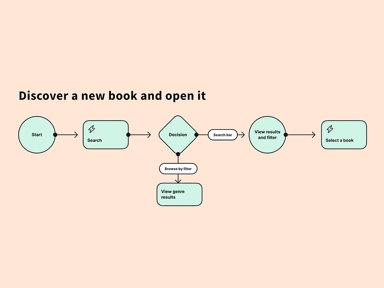
Step 3: User flow
Based on the app comparisons, I created a book-finding flow and what decisions users could make before sketching out some wireframes.
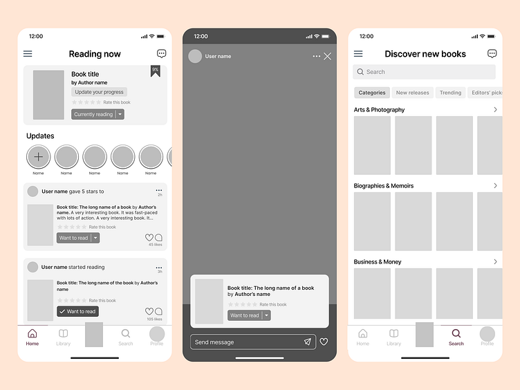
Step 4: Wireframes
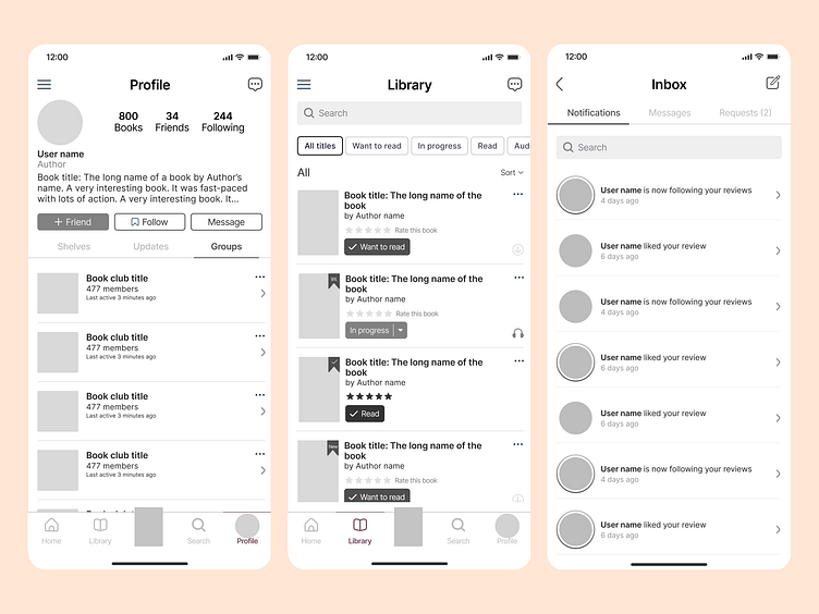
I began creating wireframes from my basic user flow and some low-fidelity page ideas highlighting the social aspect, reading shelves, and search criteria.
Step 5: Visual design
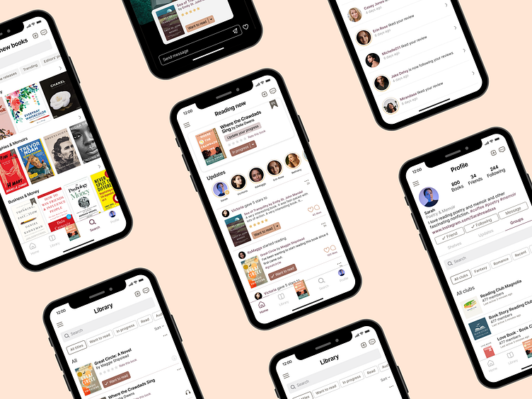
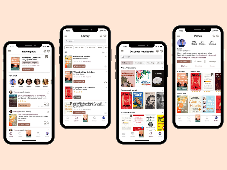
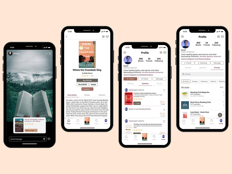
After some reviews, I created high-fidelity designs and worked on branding elements based on the final version of the wireframe.
I began with a mood board and then extended the visual branding to all the screens. I used consistent font, type size, and color. I also incorporated balance, proximity, alignment, hierarchy, repetition, and contrast.

Step 6: Testing
I tested the designs with users and took notes. I noted the pain points at completing the task and made minor changes to buttons, font sizes, and hierarchy.
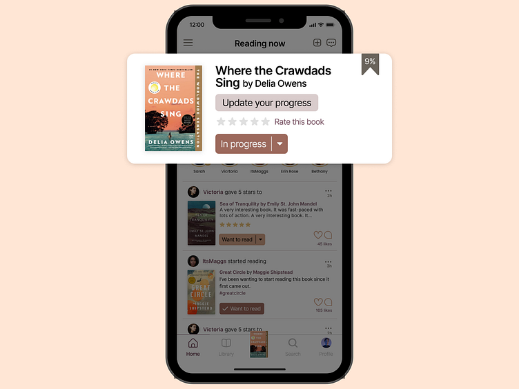
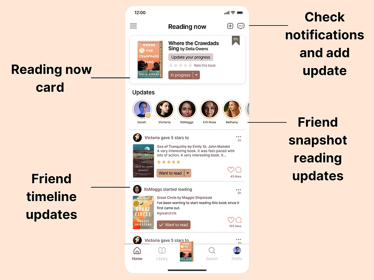
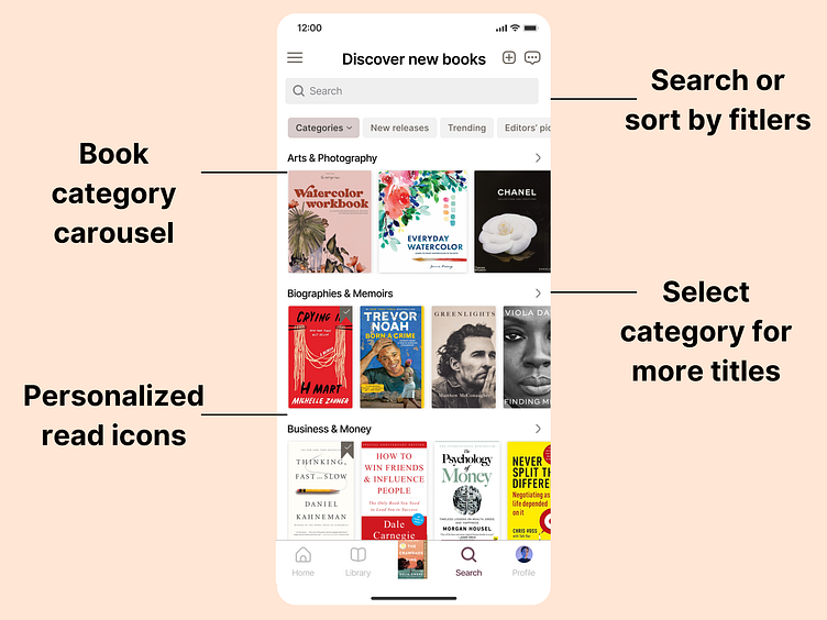
You can view a basic prototype below that highlights a few of the app's features. Please note that not everything works as intended in the prototype.
Step 7: Refine & Measure
I refined the designs and got more feedback from users in this step.
Users enjoyed the social aspect and felt interested in using this app more than other reading apps. Users liked to see a social element on the first screen and a quick way to update their reading progress.
Users felt the branding was professional and consistent. Users liked the easy-to-read buttons that are accessible and enjoyed the organizational features. They also liked the personalization aspect of the profile page.


