EO
👋🏽
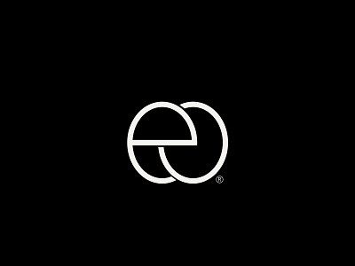
E&O monogram design exploration.
I did a reverse image search for the logo, there were loads of similar marks so I placed a crown on top of the letters for uniqueness but I decided otherwise because it affects the monogram functioning properly as an icon and also to make the logo minimal, which is important to me.
Do you want to develop your brand and design an identity?
Contact me kayifeolu@gmail.com
brand designer
brand identity
brand identity design
branding
creative design
design
e logo design
eo
graphic design
graphic designer
logo
logo design
logo designer
monogram
monogramdesign
o
vector
View all tags
Posted on
May 31, 2022
More by Ifeolu Kayode View profile
Like


