Capstone Project: Email Client Wireframe Prototypes

In spring of '22 I had the opportunity to be part of the first ever cohort of students in Dribbble's 12 Week Product Design course. My assignment in the final weeks of the course was to complete a capstone project showcasing what I had learned. I chose to create an email client and developed my design according to the brief:
In Capstone Project 1 you have the opportunity to be doing all the UX focused work for a desktop email application. That means you'll start from the research phase and work all the way through to the prototype phase. By the end of the project you should have a wireframe prototype that we can begin testing for feedback and validation.
You can watch a clip of my working wireframe prototype above, keep scrolling to check out a longer recording of the full prototype flow, or even click here to play with the prototype yourself!
Read on to learn about the work and my process, and please leave feedback!
From Zero to Prototype in Three Weeks
Ok, maybe not zero. I began the project with a problem statement provided to me, and an initial understanding of my theoretical user’s needs. From this starting point, I did further research to dig deeper and get a fuller picture of my user. I needed to empathize with my user to understand their needs, experiences, and pain points with email, and let all of this guide my design.
The Problem Statement
My jumping-off point for my work on this project was the problem statement that had been provided:
What is the problem we’re trying to solve? Who is the user? What are their needs and pain points?
The modern online entrepenuer needs an email client that is fast, efficient and a little less formal. Busy people would rather text than email and the user needs features that automate her emails to help her spend less time on email.
Problem goals:
Threaded chat style email view
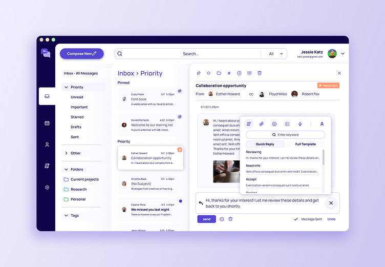
Canned response
AI driven suggestive text (like linkedIn)
Smart folders and filters
topical organization
Digging in to the Research
Step One: Competitive Analysis
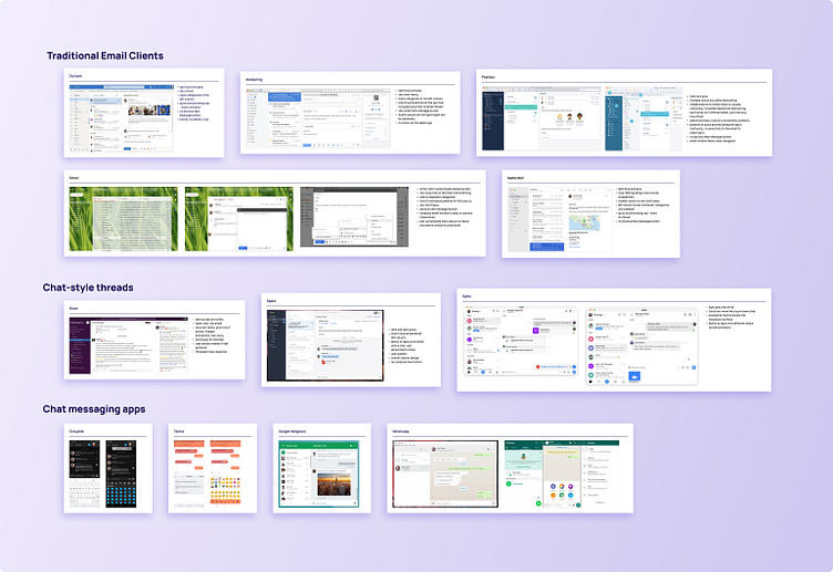
Before designing my own take on an email application, I needed to look at the landscape of existing applications. I looked at many traditional email clients (Outlook, Gmail, Apple Mail, and others), as well as SMS and messaging apps, and less traditional applications that used more of a chat style thread of messages. I took notes on the overall designs and the pros and cons of each. My main takeaways:
The traditional email clients tended to be very text heavy and felt formal
All felt very cluttered and busy
Almost none had an easy to find button to compose a new message
Some features felt messy and randomly positioned
Chat style applications tended to offer a more streamlined and clean design - but leaning too far in this direction could run the risk of losing some of email’s functionality.
Step Two: Read, Read, Read!
Before conducting any interviews, I wanted to take a look at existing research so I could begin to frame my thinking about this design problem. I dug around the internet and read several articles from the past ten-ish years that looked at people’s opinions on and experiences with email. You can see links to articles I read, and quotes I pulled from them, on a Notion page here. Some main takeaways:
People spend hours a day dealing with work emails
Responding to a barrage of emails distracts people from other work tasks
Many people find text more convenient and less formal than email
Email is based on the format of an office memo - it feels dreary and businesslike
Step Three: User Interviews
I'm a people person - I love this part! In a real-world scenario, I might have the time and resources to tap into a vast network of willing participants, send out hundreds of user surveys, conduct plenty of in person interviews, maybe a focus group or two... well, that all sounds nice, but one of the most important parts of a quick design challenge like this one is knowing how to manage my time and not let perfect be the enemy of done. I gave myself two days to conduct interviews, transcribe them, synthesize my notes, and organize my findings. Convenience was key, so I called on some trusty email users who I knew would make time for an interview... my boyfriend, my brother, and my mom. (Thanks guys!) With a basic understanding from my previous research (see Step Two), and a reminder to myself to not let these previous findings bias my interviews, I came up with research goals and a list of interview questions. I wanted to understand how people use email for work, what they find effective about it, and where they see a need for improvement.

I conducted each interview and took tons of notes, then transcribed my recordings so I could easily begin to sift through the quotes and information I’d gathered. I selected the most important parts of these conversations and laid them out in a FigJam board where I began to organize the information. I highlighted important quotes, took note of ideas that came up over and over again, and synthesized this information into some clear insights about my users needs and frustrations. My interviews revealed users who felt overwhelmed and frustrated with the amount of time they spent in their email instead of doing their actual work. They felt distracted and disorganized because their important work emails were cluttered out of view by junk, announcements, newsletters, etc - and they didn’t feel like it was easy or quick to filter all of that clutter. They thought that email was stiff and formal, and that it’s often much easier for them to just send off a quick text. On the other hand, no interviewee expressed a desire to do away with email entirely - they agreed that often it simply is the right type of communication for their needs at work. They particularly appreciated the searchable paper trail that email provides, and they loved having a calendar that synced with their email client.
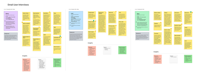
To even further empathize with my users, I created an empathy map. I organized the findings from my three interviews into one empathy map to begin to see a holistic picture of what my user Says, Thinks, Does, and Feels.

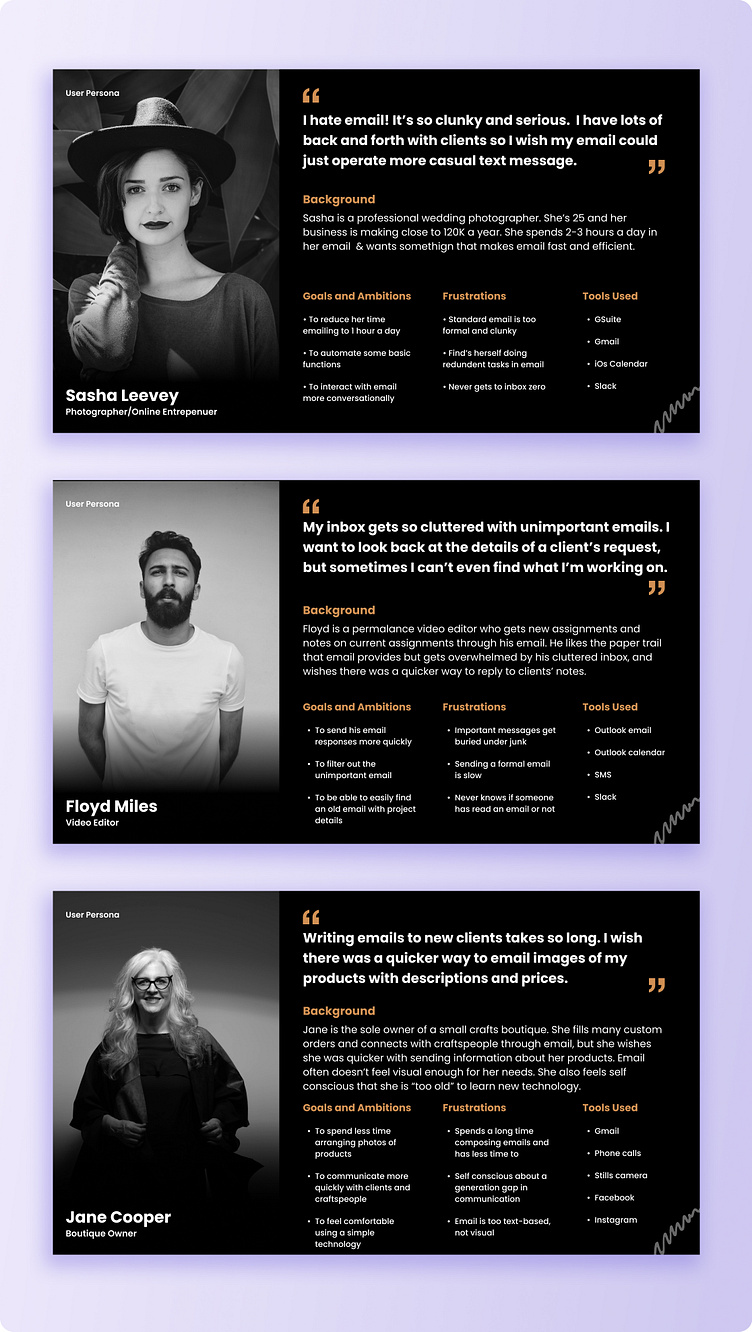
I finally took all of these insights and used them to create three distinct user personas to represent a range of my hypothetical users. Throughout the rest of this project, I made sure to frequently refer back to these personas to check in with whether my design decisions would serve these users well. Will this feature help Sasha send less formal feeling messages? Can Floyd use this to organize his cluttered inbox? Will Jane feel “too old” to be comfortable with this design? Stay tuned!
Ready, Set, Flow
Time to make something out of all this research! I was swimming in ideas and needed to narrow them down to pick a direction for my design. I boiled my research findings down into a list of eight main learnings (in yellow boxes below), and then turned these learnings into a breakdown of problems and a brainstorm of potential design solutions.
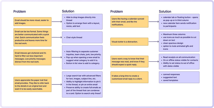
From this breakdown, I chose to focus on the canned responses/templates feature as the primary user flow I would explore. I also made a handful of other design decisions:
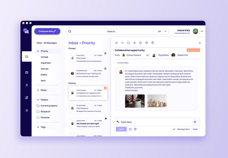
The open email window would be a chat-style thread, styled as similarly to SMS messaging apps as possible
The list of inbox categories would have a section for lower priority emails, and other customizable folders, with nudges to help the user organize emails into these categories
The search bar would need to be very prominent, and have a drop-down option to search either the current email, or the entire inbox, or other specific folders
The application needs a calendar tab in addition to an inbox.
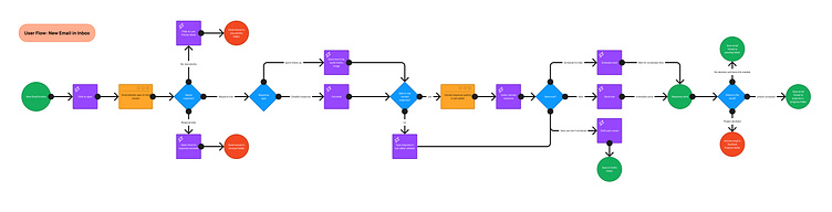
The User Flow
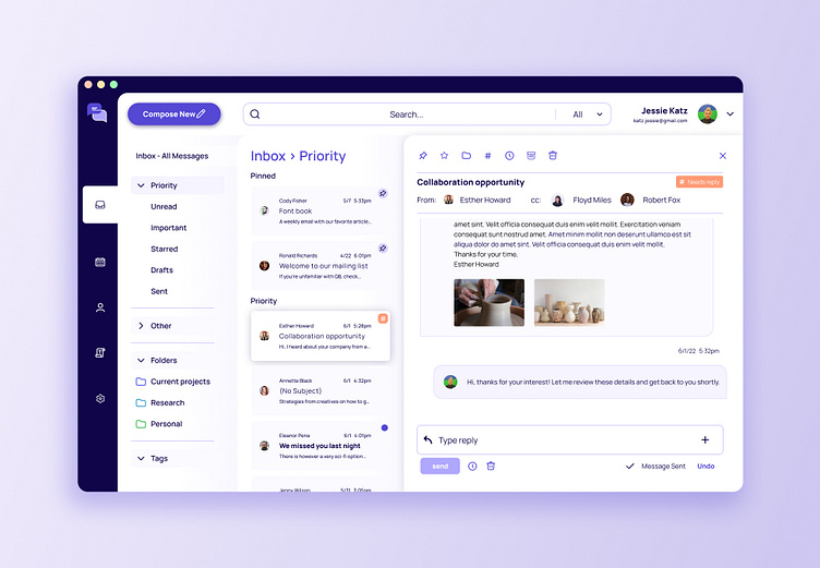
I created a user flow to work through the steps a user would take to read and quickly respond to a new email. If a response is warranted at all, the user can choose what type of response is needed - a full detailed email, just a quick note, or other media. The user can then decide whether they can use a canned response, and if so, select one from a canned response menu. They would select whether to send the email now or schedule a send for later, and finally, the user can keep the email organized by adding a tag, sorting it to a folder, archiving it, etc.
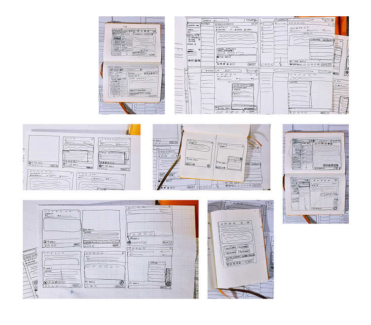
Low-Fi Wireframes
It was time to break out the graph paper and sketch some wireframes. I did several rounds of low-fi wireframing to quickly ideate on the structure of the email application. My focus was on the layout and proportions of the application as a whole, and on the look of the canned response menu within the current email frame.
Figma Wireframes
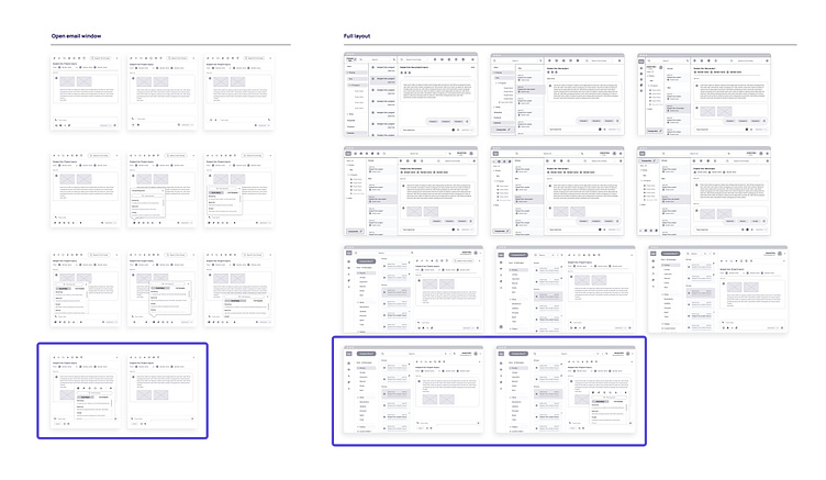
From these rough sketches, I created further wireframes in Figma, again looking at both the overall structure as well as the canned response menu. I was beginning to realize just how many features and elements need to be fit into the layout of an email application! To work through the many possibilities for all of these elements, I created duplicates of an initial wireframe and rapidly experimented with tweaks and variations on many parts of the design. Through making these adjustments, I eventually arrived at a wireframe that I was happy with, and was ready to move forward with prototyping.

Prototyping
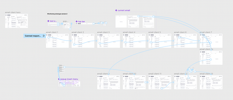
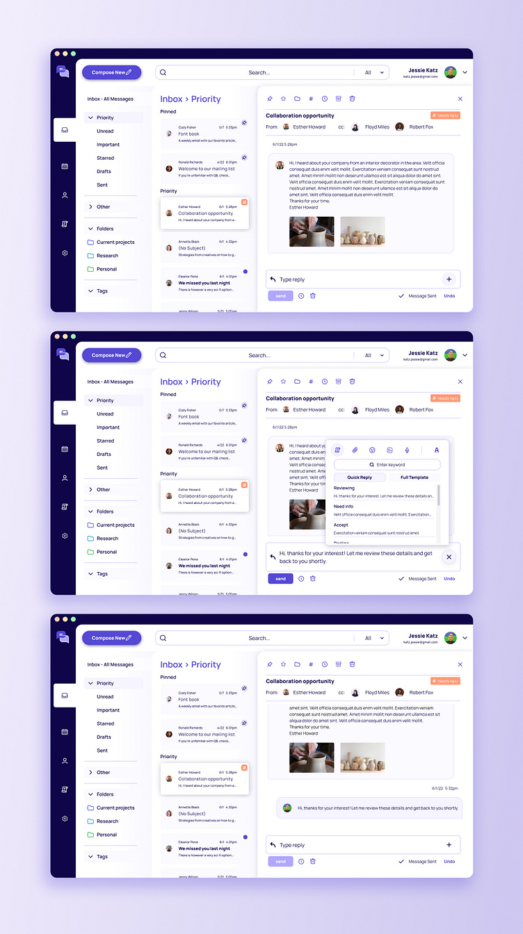
I used Figma’s prototyping tools to bring my wireframes to life and test the user experience of the email client. I limited my prototype specifically to the user flow that I had created, in which a user opens a new email from their “Priority” inbox, selects a canned response from a pop-up menu, sends the response, and then organizes the email by adding a tag. I leaned heavily on overlays and changing variants of components to bring it all together. Take a look at a recording of the prototype in action here, or click here to try it for yourself!
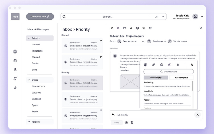
Visual Design
Although the focus of this project is on the user experience, and the most important outcome was a testable prototype, it just didn’t feel finished without a layer of visual design. I couldn't resist giving the project a little UI cherry on top...
Mood Board
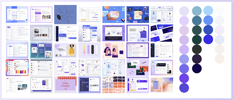
I began by looking at existing email client designs on Dribbble, as well as general color inspiration. I knew that I wanted to keep my design light and as uncluttered as possible, and avoid anything that felt formal. I landed on a range of purples that felt modern and fun - without getting too loud and distracting.
I began by looking at existing email client designs on Dribbble, as well as general color inspiration. I knew that I wanted to keep my design light and as uncluttered as possible, and avoid anything that felt formal. I landed on a range of purples that felt modern and fun - without getting too loud and distracting.
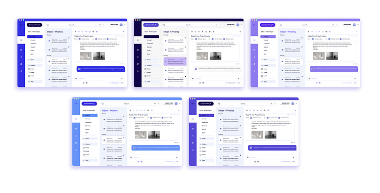
I went through a quick burst of color experimentation to see how the blues and purples I liked would work when applied to my full design. Some of the blues felt too similar to traditional mail clients like Outlook, and some of the brighter purples felt a little too bouncy and bright for serious work. I selected my favorite happy medium and continued to ideate on variations of this pallet.

In this final round, I went through a process of experimentation with how my color pallet could be applied to the elements of my design. I made subtle tweaks to shadows, gradients, and color lightness to see how different styling would affect the usability of the design. I checked the contrast levels of my text to make sure that everything remained readable and up to accessibility standards.
I eventually selected a styling of my design that felt sleek and modern, not too cluttered, and (hopefully!) legible and usable for all users. Take a look below, and feel free to leave feedback on the final look!
Looking Back
Designing an email application in a matter of weeks was a big task, and I had to prioritize my time thoughtfully in order to get it done. There are so many directions that this project could go in, and it was very tempting to keep working through every little feature that an email client might have. With more time, I’d be interested to expand on the canned response menu that I designed and take a look at the full templates that could be included in this feature. Because my research interviewees all relied heavily on a calendar being synced with their email clients, I’d be excited to build out the calendar feature of the design. And naturally, I’d love to spend time turning my wireframe prototypes into fully designed beautiful prototypes, and do a few rounds of user testing!
Thanks for taking a look at this case study! I welcome all feedback, questions, suggestions for future edits, etc!


