Design VS Design Landing Pages

Hey Designers,
I’ve been working on Design VS Design for a few months now and I reached that stage when I need to focus on small design details that add up to a good UX.
I figured the first touchpoint with the user is the obvious place to improve. I had a landing page in place to support the Figma plugin so I started designing around that.
Design VS Design Brand
Although wordy, I believe the brand name plays really well with the subdomain trick (https:// design .vs.design) to create a memorable identifier for the service.
My primary audience at this stage is visual designers so I need to:
Take inspiration from precision and measuring tools.
Keep it use case agnostic: I really like a tool simple yet powerful enough to be used for a variety of purposes.
Make it customizable: Go beyond basics and allow designers to craft truly custom experiences.
Design VS Design
Hey Designers, I’ve been working on a personal project for a couple of months now and, as I approach an MVP, I am pleased to show you a Loading I was considering.
Design VS Design enables you to compare design ideas with peers, teammates, and clients.
Use the Figma plugin for actual superpowers.
Let me know what you think.
Visual Language
Typography
I would have really liked to use DIN or something a bit more techno like Blender Pro but I am an indie hacker with a budget so I went with the free Barlow typeface family. I couldn’t help but animate around different “loading states” for the brand icon.
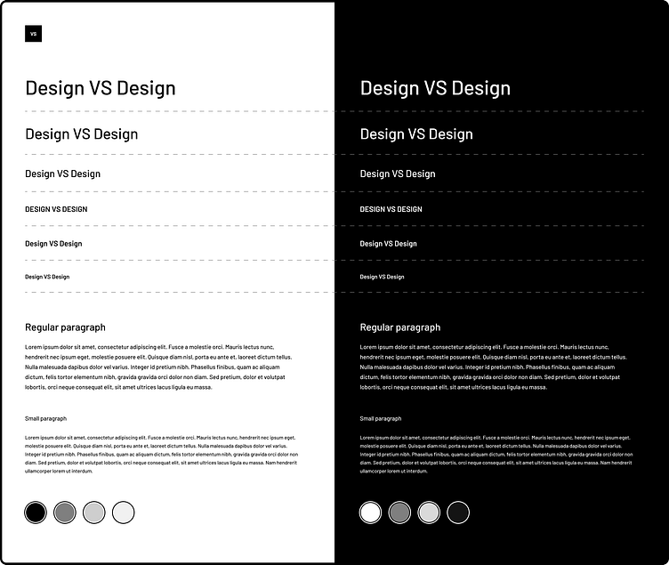
Color
With the customizable aspect of the brand, I plan to reserve the use of color for user-picked backgrounds.
Design VS Design’s UI will be monochrome to play nicely with any design or color combo. Furthermore, I will need to support both light and dark themes of the UI and alternate between for higher contrast.
Content & Navigation
The main goal of the marketing website is to elaborate on the capabilities of the tool and enable further exploration. SEO and copywriting are also high on my to-do list.
Besides the homepage, I planned distinct pages for each type of test. Easy navigation between those pages was also a priority.
For the homepage I wanted to emphasize:
The general purpose of the service (Frictionless UI Research)
The quantitative method of gathering and inspecting data
Examples and plenty of calls to action
For the individual product pages my main goals were:
To explain how that specific test works
Reemphasize customization
Showcase demos and reports
Iterations
The initial landing page was aimed at a single type of test and was struggling to highlight its use cases.
Although I kept some visual motifs across the process, the pages themselves have gone through multiple iterations. Here's the final result:
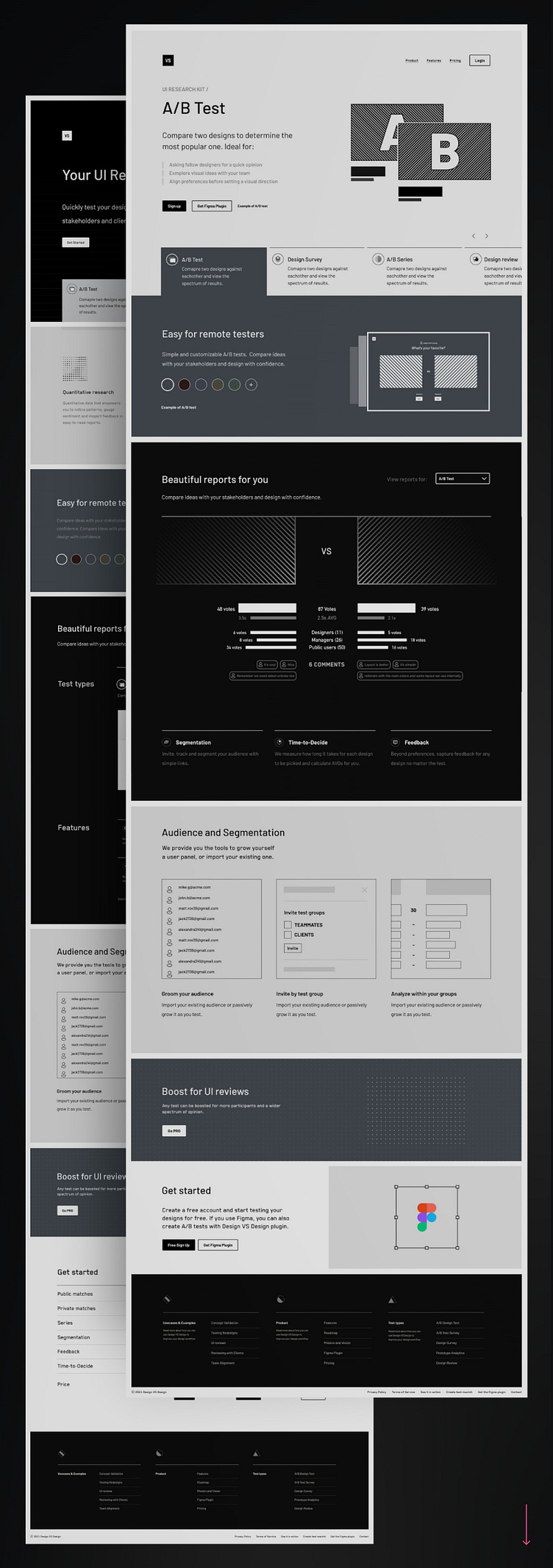
Implementation: Homepage
A/B Test | Prototype Analytics | 5sec Test | A/B Survey | Design Series
Final Touches
After the design, comes implementation, and with that, all the minor details that make up an authentic experience. Animation is my preferred medium of explaining stuff, so I heavily rely on short GIFs to showcase test functionality and improve the page's overall look and feel.
Findings
Analytics show more interest in Design Review and Prototype Analytics than A/B tests and surveys which is a bit off-brand but I shall take the product where the interest is.
Next Steps
I plan to group A/B tests, Design Series, and A/B Surveys under a single Preference Test and develop better examples with real results.
Thank you
Thank you for checking my work. I am always open to feedback about my process, visual design, the Design VS Design service, or my Figma plugin.
Don't forget to press "L" to like this Case Study and follow me for more updates.


