💡 Accessibility Pro-Tip: Don’t rely on color alone


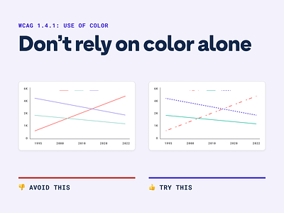
Having alternate visual cues like shapes or even patterns is the best way to ensure people understand what they’re looking without relying solely on the color—which many folks don’t see in the same way.
📚 Read more about accessible contrast ratios and A-levels fresh from our blog post
Want to join a community of other designers, developers, and product managers to share, learn, and talk shop around accessibility? Join our Slack Community and follow us on Twitter and Instagram.
To stay up to date with the latest features and news, sign up for our newsletter.


