Brand identity design for The Makers Planet 🌎


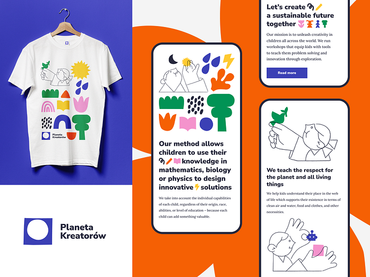
A piece from Branding for The Makers Planet. An organisation and fund that teaches children the aspects of sustainability through playful workshops. Their mission is to unleash the limitless power of creativity in children across the globe.
The whole visual language is inspired by paper-cutting techniques. Brand’s main symbol is represented by the remainder of a sheet of paper with a circle – the shape of Earth – cut out of it.
Icon font is a simple and expressive way to highlight the message of the brand. Starting with basic cut-out forms through to symbols themed on sustainability, nature, education, DIY and technology, we get a whole alphabet of shapes.
The line-based set of characters interact with the cut-out shapes and form hand gestures communicating the important values of the brand, helping to express its friendliness.
You can look up the whole case study on Behance
Thank you for stopping by 🖖
We're available for new projects! Drop us a line at branding@netguru.com.
—
Show us love! Press “L”.
Want to see more projects? Visit our profile or Netguru.com and remember to follow us!


