Ro – Stationery

Stationery designed for Ro.
—
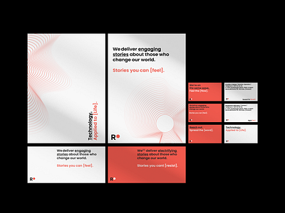
RO is an example of an organization whose visual identity did not reflect their modernity, agility, and fresh approach. However, they put their trust in our process, and that’s how Remarkables became RO - with a new name, new visual identity, juicy colors, and a strong tone of voice. If you associate PR agencies with old-school press releases - take a fresh look at this industry and see what is happening in it in the third decade of the 21st century. The concept was inspired by a physical property - Resistivity (electrical resistance) - a characteristic property of each material, useful in comparing various materials based on their ability to conduct electric currents. From here, it takes only one step to electrifying communication. RO are like a transmitter, a radio for broadcasting worldwide, an electrifying wave of engaging stories.
Full case study here:
https://www.behance.net/gallery/146418247/RO-rebranding-webdesign


