Branding & Packaging Design for La Palma Coffee 🌴


Professional work is recognisable by other professionals as their eyes are just like eagles' eyes.🦅👁️
How can we recognise if this work is professional or made by a beginner?🤔
Here are some tips for differentiation between professional and non-professional branding work: 💁🏻♂️
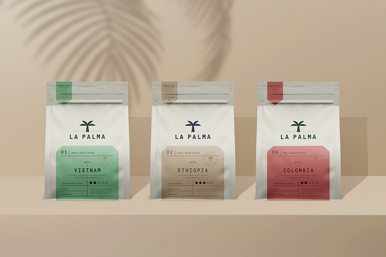
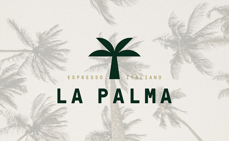
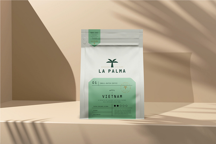
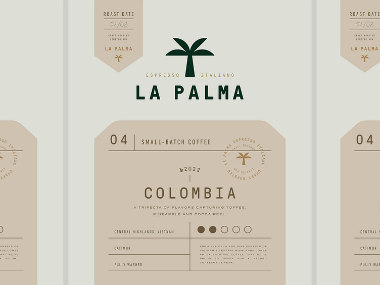
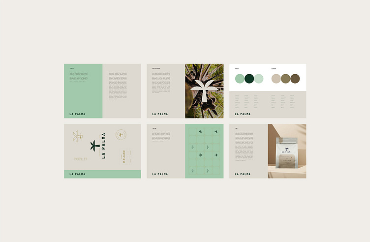
- Brand’s identity has been identified correctly. La Palma’s identity is luxurious, minimal, and natural. The Vector palm emblem perfectly fits the logo as well.🌴
- Viewers can feel the brand's intentions, priorities, and understand its message. The brand's intention can be felt through its extravagant packaging, showing that they care for the high quality of their product. ☕
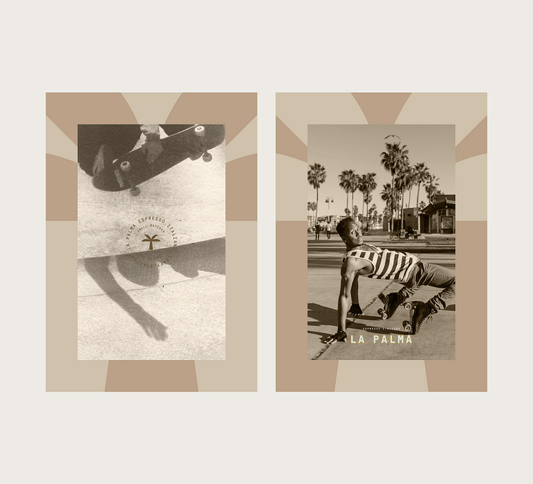
- Viewers can feel the brand's intentions, priorities, and understand its message. The brand's intention can be felt through its extravagant packaging, showing that they care for the high quality of their product. ☕
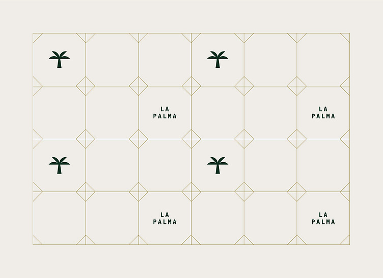
- Even a simple and minimal design looks unique and mesmerising. There can be millions of palm-connected brands, but the vectored palm of the La Palma is recognized from the first glance.👀
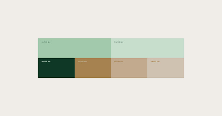
- The color compilation looks natural and native to its brand. The color palette includes earthy shades of colors, which fit and match with the logo and nature of the coffee🏞️

There are more points for recognition and differentiation between pros and non-pros, and the list can be too long, beginning with small details to huge mistakes. 📃