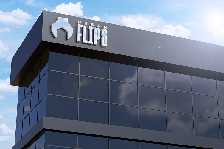
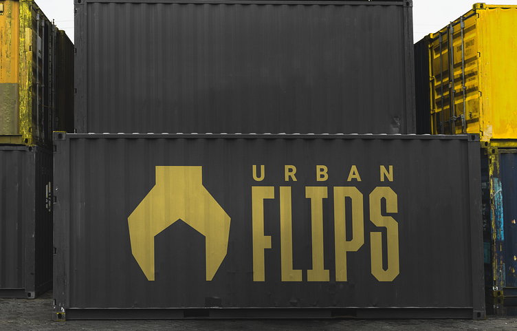
Urban Flips Construction Company Branding

Urban Flips is a company in the US that does everything related to construction and house repairs!
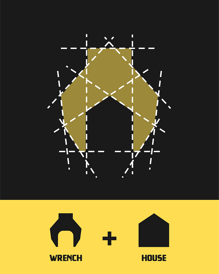
That's why I decided to use this really bold and blocky typeface that expresses their brand perfectly.
Lastly, their logomark is a combination of a wrench and a house! I went for bold and modern colors used in construction since they didn't want to differentiate in this part of their brand.