Case study: eCommerce mobile app

a full case study of the UX design process of an eCommerce mobile application
You can read the full story on Medium or Behance.
Don't forget to press the "L" key or the like button and make me happy :)
This project has been done in collaboration with Zinat
————————————————
Follow me:
Get in touch:
✉️ hey@farshid.pro
About Qsouq eCommerce
Qsouq is a B2C eCommerce platform launched in Qatar, and there weren’t any good and trustier eCommerce except Amazon.
We can sum it up in three words: easy, convenient, and wise shopping experience.
Qsouq focuses on offering a variety of affordable, high-quality products accessible to everyone in Qatar.
Retailers will add in the future to help Qsouq grow.
[Updated] The company has now been rebranded as 1Sell.com
Business Goals
Build brand & becoming number one in Qatar
Acquire trust
Removing mediators in Qatar
Growing retail markets
What was our role?
They asked us to build their brand identity and design product to become number one in Qatar.
Conducted a UX survey of 27 participants and interviewed three people
Created a user persona and its empathy map
Made the user journey map
Designed information architecture and created a flow chart
Executed brainstorming to generate ideation
Drow sketches
Took usability tests from five people
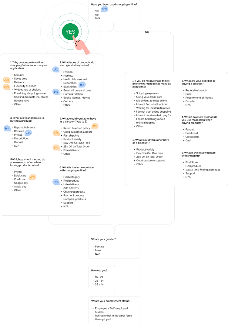
Survey
The client had time and budget limitations, so we decided to survey cause this is a quick way and less budget to gain data, so we learned these from users:
They tent to buying fashion and electronic products
Delivery and a wide range of choices were more common causes of shopping online
Reviews and photos of a product were the most priority to buy that
Fast shipping and return and refund policy were most important rather than discounts
The credit card was more common in payment methods
Late delivery was a common issue in during shopping online
%55 of the shoppers were men
41% of the shoppers were 21 to 44 years old
37% of the shoppers were employees and self-employed then the students were 27%
Based on these data, we consider:
Order of our categories started with fashion and electronics and what kind of banners should we show mostly
Design a guideline for taking high-quality photos and taking the shot from all perspectives
Showing ratings and reviews in detail
Added value propositions in the walk-thorough
Interview
By synthesizing the result of the survey and interview, we made a user persona with their motivations, frustrations, and goals.
We need to keep this user in mind during solving problems and designing the product. It can help us make better decisions by selecting a representative of product users.

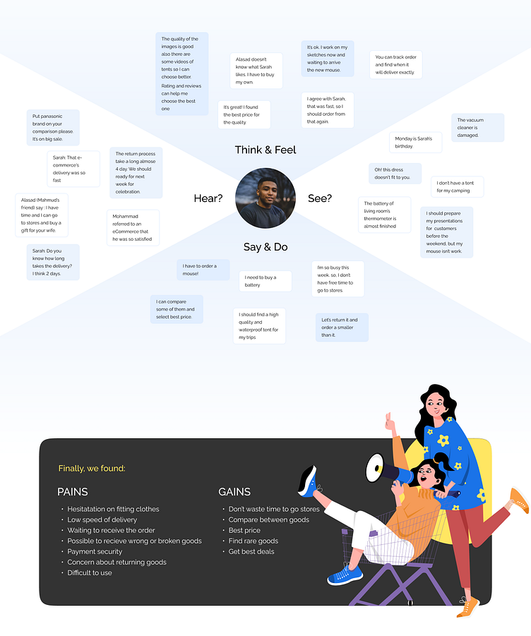
Empathy Map
To create a more accurate user persona, we need an empathy map. The empathy map helps us understand what they need, think, feel, see, hear, and do. Finally, We found their pains and gains to care about those areas and make them easier and simpler.
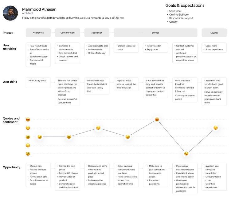
The User Journey Map
We need to comprehend the feel and touchpoints throughout the experience from the user’s perspective, so mapping the user journey helps ensure no user drops out cause we can find what obstacles they might face along the way.
At the end of the user journey map, we have some opportunities and solutions brought into the product.
Also, it reveals unconsidered flaws or new opportunities.
Information Architecture
An optimized and organized structure of business requirements and user needs helps the users navigate easily between pages and find what they want. So preparing a simple IA by the data that we obtained in the previous research method will reach a more accurate flow chart in the next step.
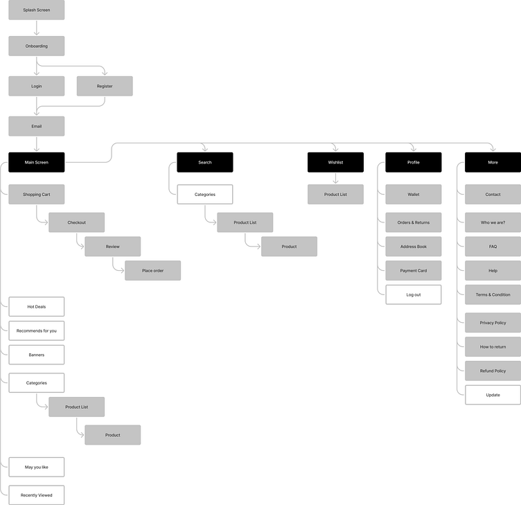
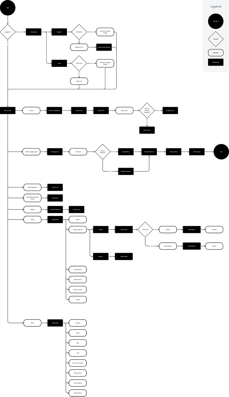
Flow Chart
After we reach a simple IA and fit it with stakeholders, we can go ahead with a detailed flow chart to ensure nothing missed. Furthermore, we reach the task flows of users by having a flow chart, which helps us write our scenarios and test them.
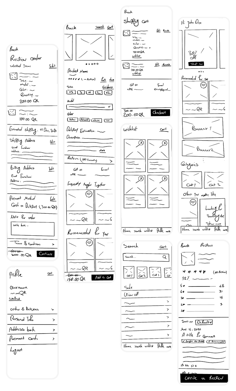
Sketches
Finally, after we get the basics down, we jump into drawing sketches and check those screen by screen with our data from research to ensure we are in the right way!
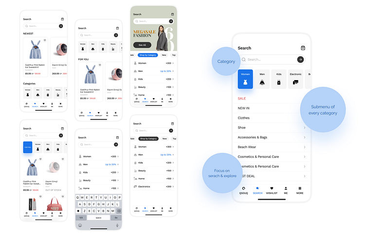
Brainstorming for search page
In the middle of the UI design, we noticed our search page should be better, so we conducted a brainstorming session and reached more screens by quick testing with friends and colleagues to reach the best one.
User Testing
After designing the UI, we created the prototype of that and conducted a usability test with five people to validate our design solutions. We found some minor issues that had to fix before going to develop.
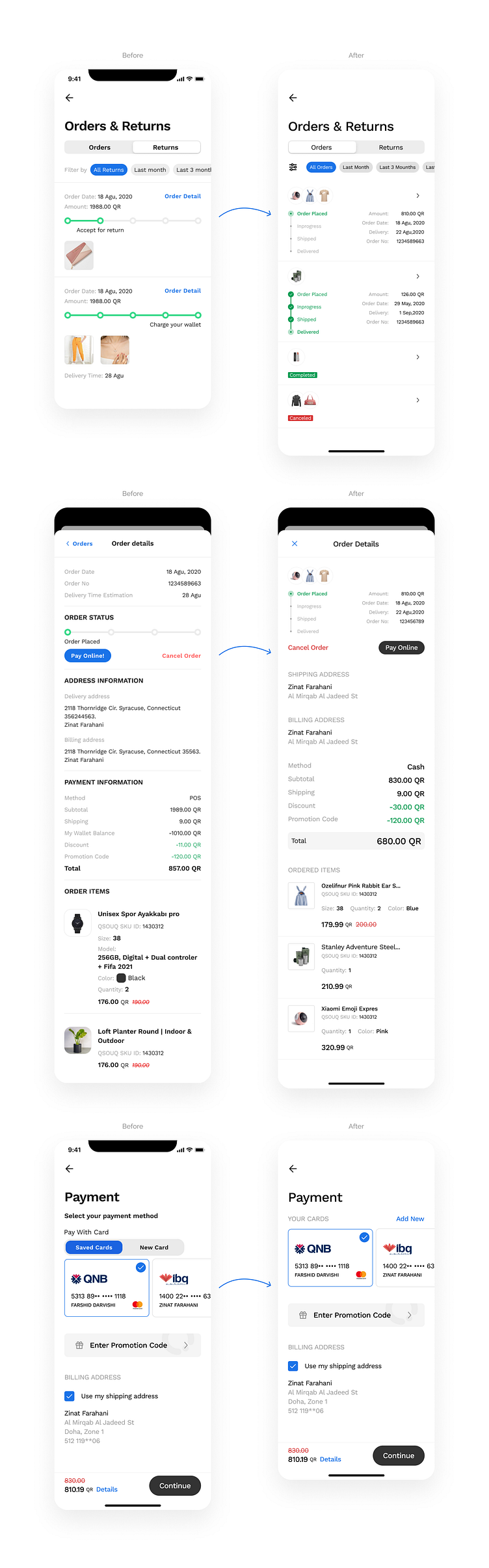
The tracking order was not clear enough, and 3 out of 5 users were confused.
The payment section was a little confusing for 3 out of 5 users, especially when they had an amount in their wallets.
By brainstorming and best practices, we turned those like below:
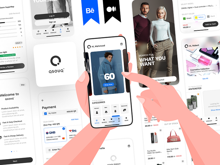
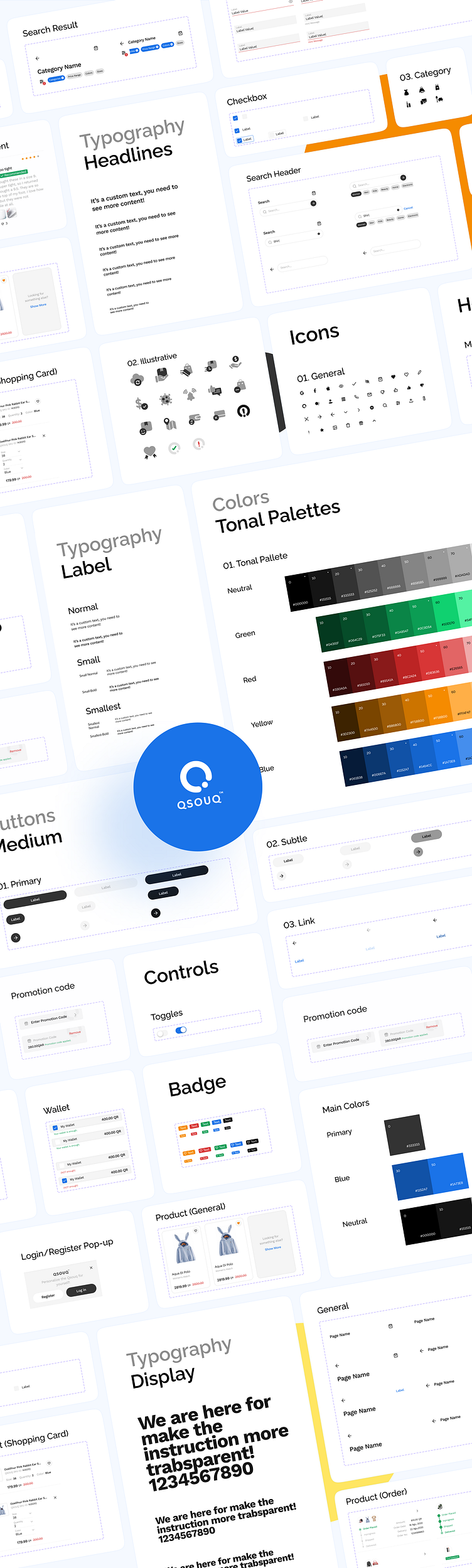
Design System
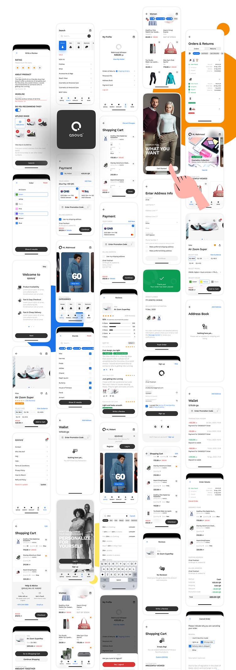
User Interface
What did we learn?
Figma releases variants feature to make more clear libraries in late October 2020. We were in the middle of the UI design of this project when it was released. We decided to upgrade our current library with the new features, so we updated the library with minimum effort successfully in the middle of the project. It taught us that we could upgrade our old libraries to new ones with less effort.


