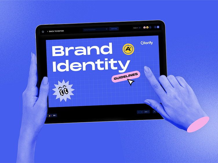
The strategy behind an effective rebrand

Fresh ideas are constantly in demand among the design community. That’s why Glorify aims to inspire anyone and everyone to bring their big ideas to life with the latest trends.
Our retro-futuristic style supports Glorify’s vision to make design accessible to all regardless of age, location, career or design skills.
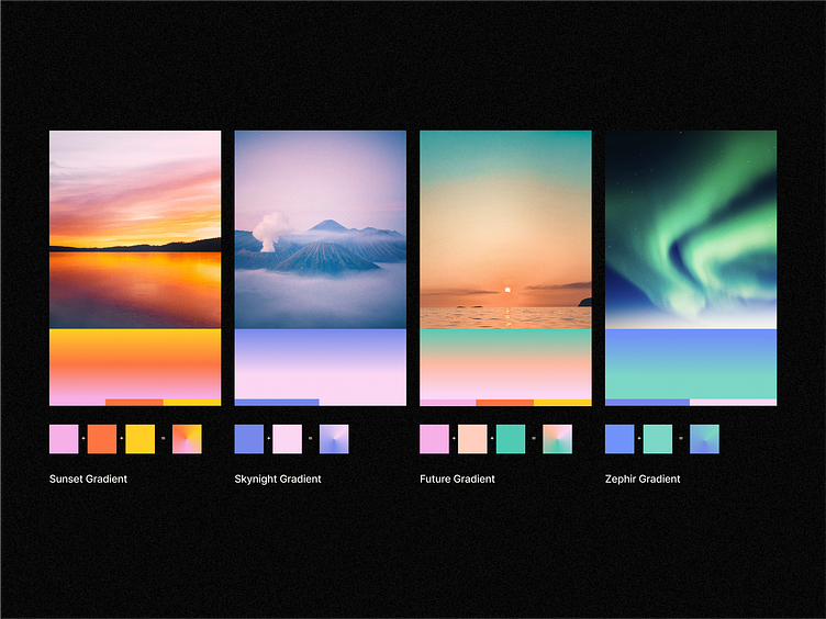
Glorify uses a flat retro color palette with four opacity variations and futuristic gradients, each gradient being made from a mix of 2 or more flat
retro colors.
Paper, black, blue, pink, yellow, acqua, orange and red are the refreshing splash of colors that give character to our content.
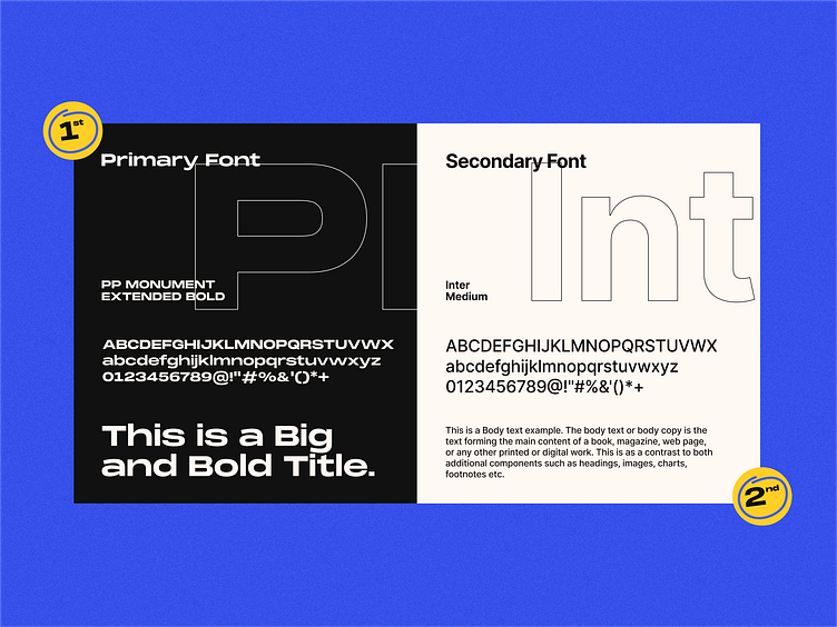
To sync with our retro-futuristic style, Glorify uses a bold, unique font to make headlines and titles stand out.
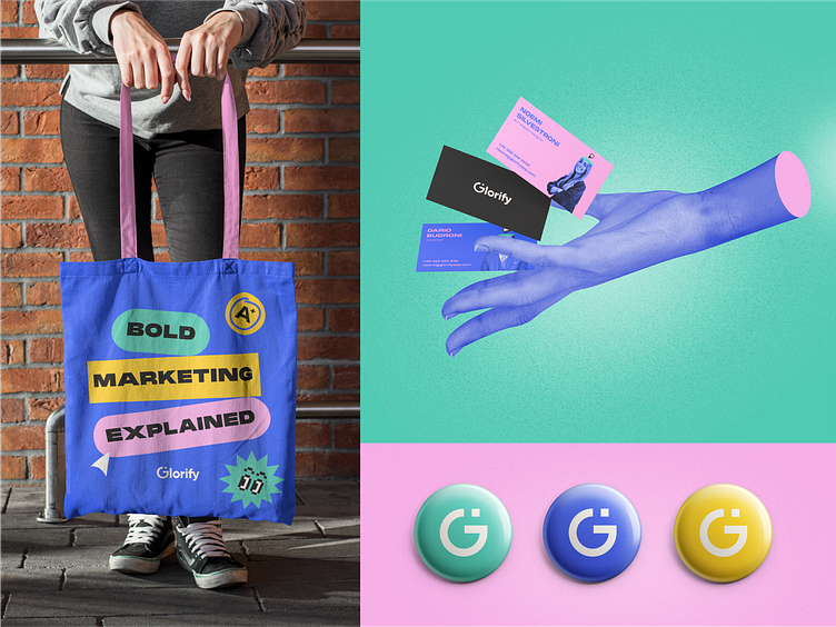
Cut out elements and customized icons are also a big part of our brand identity and are crucial factors that promote brand recognition.
Created with strategic design techniques, we prioritize the use of retro objects to make Glorify relatable to all.


