Logo & Branding for Food Truck

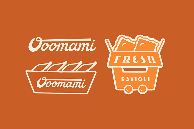
New brand identity for Ooomami and food truck specialising in Fried Ravioli.
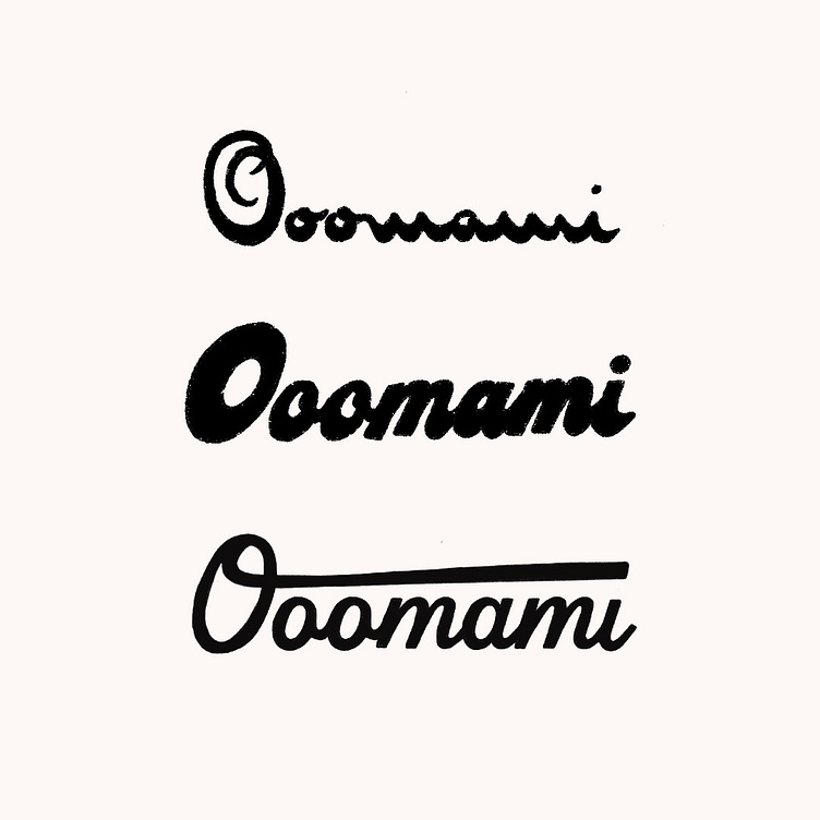
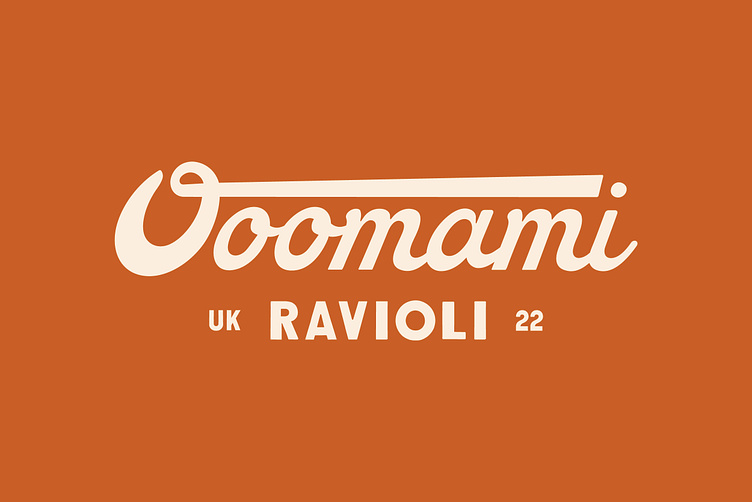
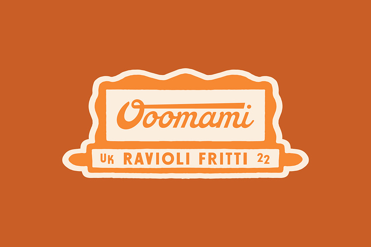
They were looking for script font for the main logo, I wanted to provide something with character which didn't feel to traditional so sketched up some ideas which are included below. In the end we kind of went for a mix of the bottom two. Combining a more traditional script with something more playful.
The icon was created to summarise the 3 core facts of the business: 1. Food Truck 2. Take Away 3. Amazing ravioli.
More work at: https://florencestudios.net/
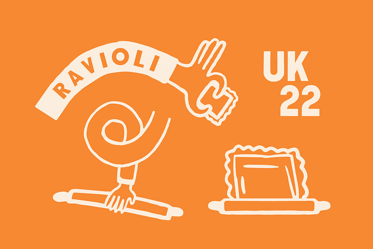
I wanted to include some illustrative elements in the identity which played on the idea of creating the product. The team who own the truck are fun and want people to have fun eating food so it was important this came across in the brand.
We ended up with a full set of brand assets which can be used on websites, social media, merch, loyalty cards, on the truck and anywhere else they might need.


