


Clind - Case study


Hey Dribbble 👋
I worked for 1 year as a single designer at Clind, a young startup that promoted continuous learning.
Clind is a note-taking app that allows you to keep "takeaways" on content that matters to you.
During this year, I completely redesigned the app, created a brand new design system, and took care of the product evolution.
Here are some shots and animations I wanted to share with you 😊
Thanks 🙏
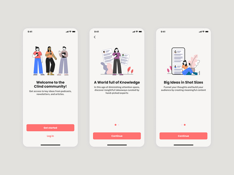
Clind UI
These are the first screens users is seeing when arriving in the app. Onboarding is quite simple and straightforward.
After that, users are arriving on the discover screen and can either navigate through the 3 categories available or scroll to find some recommended content.

Clind animations
The idea behind all animations you could find in Clind was always to teach something to the user.
For example, we integrated a native sharing option to easily import content into the app. But we figured that most of the users don't know how to use this feature.
So we thought it would be a good idea to give them a visual clue of how it works
Native Share iOS animation - Clind App

Native Share Android animation - Clind App

Here is a sweet loading animation after a user complete the onboarding with categories selected. Just to confirm that we'll offer him/her the best experience according to his/her choices.


