Feature redesign for an e-learning SaaS web application

About Avatao
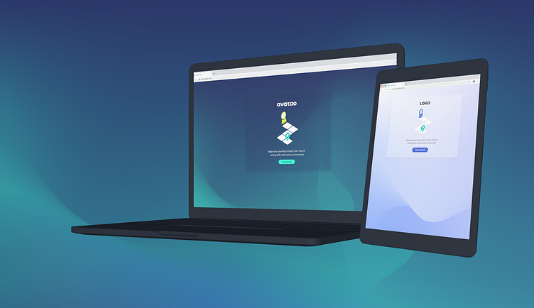
Avatao is a secure coding training platform that made its mission to help developers write vulnerability-free code. The idea is to deliver the right knowledge to the right people at the right time. The platform and its content are adapting quickly to meet the needs of a new era of cybersecurity.
The problem
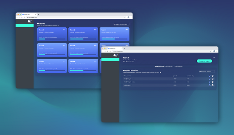
Within the web application, users are grouped into teams to make their learning experience organized. Every team has exercises assigned to them, that each member has to complete before it’s due. Initially, a user could reach their assignments through the Teams menu, where they could perform their tasks within each team separately but they didn’t have a screen where they would be able to see all their assignments in one view.
Persona
Avatao has two main target persona. This project affects the first one, a developer, whose main goal is to complete tasks on the web application as fast as possible.
Brandon Herwitz - Software engineer, 34
Goal: Complete all the exercises that are assigned to him.
Barrier: Checking all the teams Bob is a member of is time-consuming. He feels like it slows down his work and it frustrates him.
Process
My team and I conducted user and customer interviews in order to identify the most important factors the interface should focus on in order to fulfill user needs. Through the mix of these interviews, iterative prototyping, and concept testing, the goal was to take this conceptual idea and deliver value to Avatao’s power users.

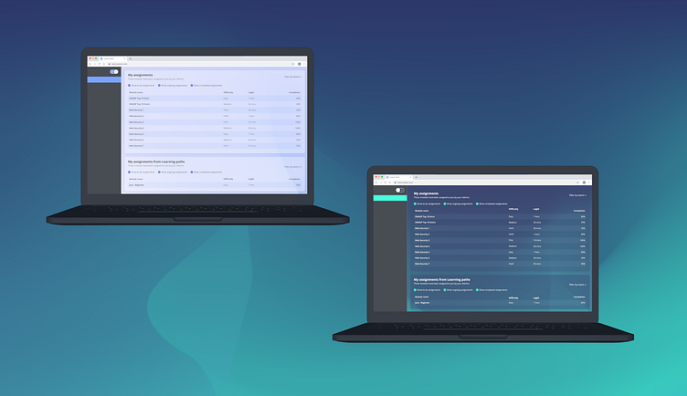
Filters and Sorting
With this project, we wanted to take the experience a step further and lay out all the content assigned to the users highlighting a unique experience per user in an engaging way.
We conducted an online survey and from which it was indicated that there’s a strong desire in developers who want to finish with their most important assignments as quickly as possible to be able to tell which module belongs to which team.
At this point I involved the engineering team too, to discuss if there was any technical constraint that we should know about.
Concept testing
Before finalizing the visual details of the design, I wanted to see how our customers respond to our chosen direction. After presenting mid-fidelity mock-ups and a low-fidelity prototype, the solution was highly welcomed. We conducted usability testing as well, to test the whole user flow from the login through completing an assignment. Our goal was to see if users could complete a set of tasks as quickly as possible and if the general interest and time spent on the web application would increase too.
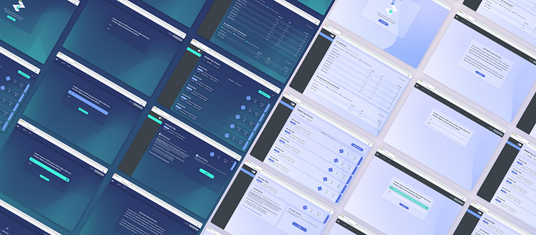
Final deliverables
The usability test showed that 80% of the users felt more confident in finding the right content and 60% claimed they would return more often to learn. After the evaluation, I created the final UI design and the hand-off materials for the engineering team. After implementation, I took part in the QA testing as well.
Role: Lead Product Designer
Skills: User research, Data Analytics, UX Design, Branding, Wireframing, Prototyping, User testing, UI Design
Project type: Client project
Timeline: October - December 2021 (3 months)
Tools used: Google Forms, Excel, Adobe Illustrator, Figma


