


Càphê Roasters Case Study


Honoring heritage and passion with color and concept.
We've got rainbow holographic gold foil, coffee bean roasting dragons, squeeze and sniff valves, and all kinds of hidden treats in this rebrand for our friends at Càphê Roasters. It's a long one so hold on to your butts.
A little brand update — a stool for you, a stool for me
The original Càphê logo was awesome. I absolutely loved it. It’s got some personality and tells a bit of a story. So when we updated it, we wanted to carry on that story, while making the new identity feel a little more bold and maybe just adding a bit of confidence to the mix. We wanted this brand to feel a little less hometown hero and a little more like something that could stand up on a national level.
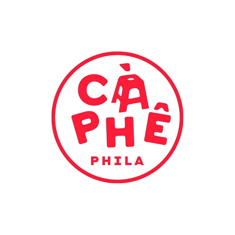

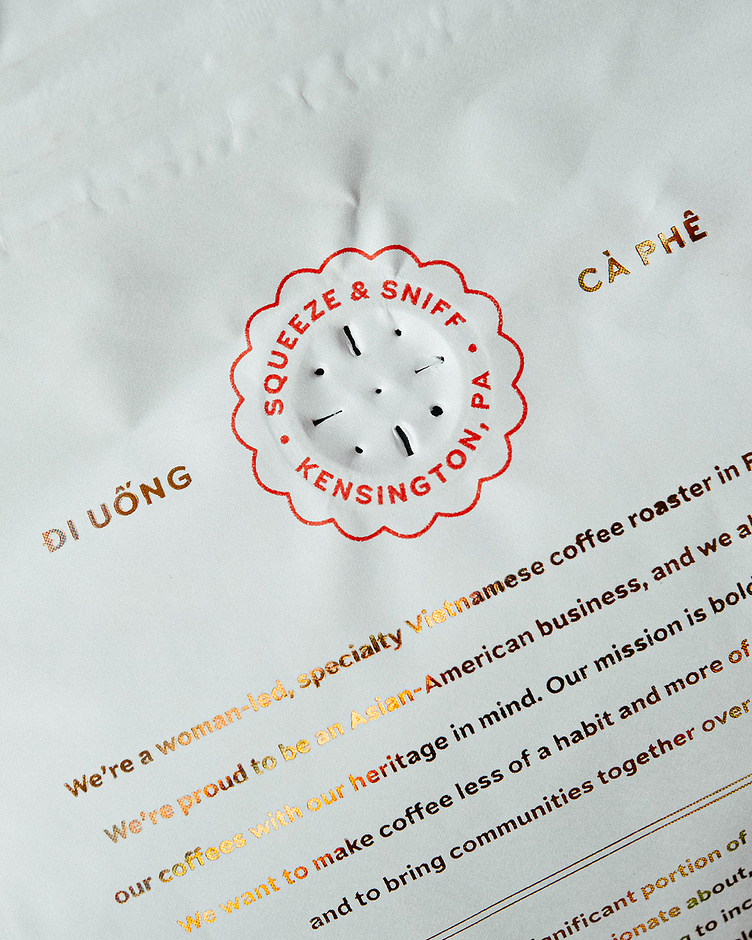
The name Càphê comes from the full Vietnamese phrase of “Đi uống cà phê” which roughly translates to “Let’s get coffee.” Thu told us about how folks all over Vietnam will just pull up these little stools and have a chat over some coffee on the side of the road.
I started googling Vietnamese stools and was like holy shit these look like little ‘A’s, we deff need to figure out a way to get that into the logo. This was also a subtle way to connect the little red stools from the original mark into the updated one. We pulled the stool out to be a much larger element of the brand and tucked it into the alphabet soup wordmark. It was a definitely a bit of a challenge to get the double read on the A + stool situation, perspective is a major pain. The first round looked wayyyy too much like the barstool sports logo, which no one ever wants to be associated with, but eventually we sorted it out.
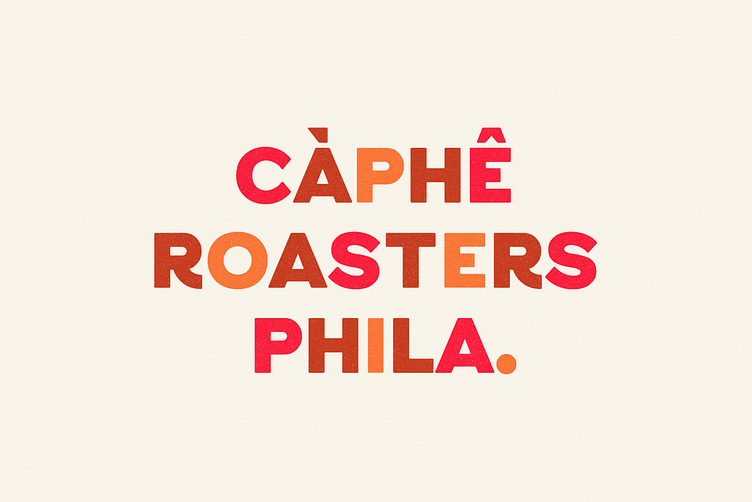
Typography — Capo: Cute Gotham
The typography for the identity is Capo, which is just a cute Gotham lol. That uppercase “R” and lowercase geometric “e” really spoke to me on this one. I love the boldness but also the slight quirkiness that Capo exudes. It’s not perfect but it’s trying it’s best. Very relatable.
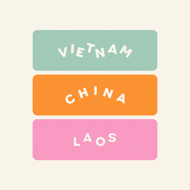
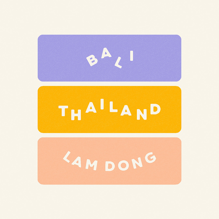
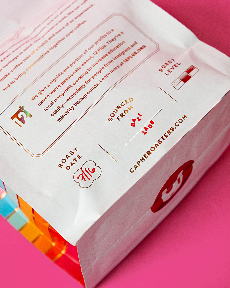
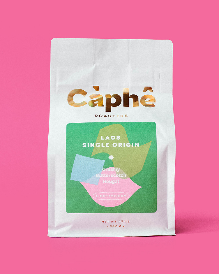
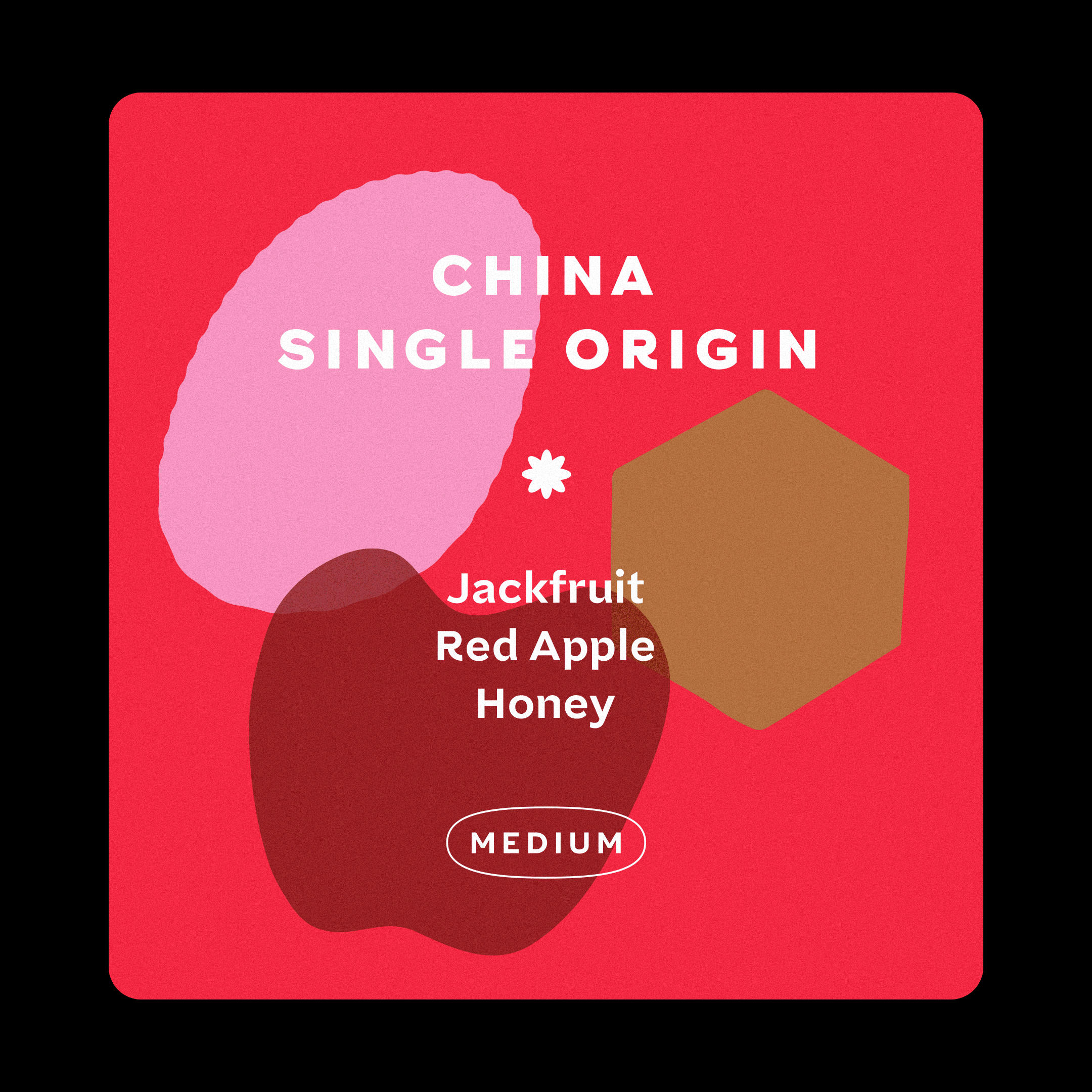
Since the type is pretty straightforward, especially in uppercase, we decided early on that we were going to have it be colorful and a little bouncy. On the back of each bag there’s a line to indicate where the coffee was sourced from, so we used that space to give the locations a bit of personality and playfulness to match the overall vibe of the bag and brand.
Coffee Dragon - Càphê Roasters
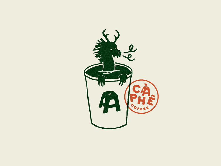
Working on a Vietnamese coffee shop and wanted to take a looser than normal approach to it. Stumbled upon this dragon emerging from the coffee idea and loved it.
SPEAKING OF PERSONALITY…more dragons
I feel like nowadays I’m constantly like…how can I squeeze some sort of hand-drawn mythical creature into my projects?? (Group X anyone?) This one was no exception. Vietnam has an amazing history with dragons that have gone through all kinds of different variations through all of the dynasties. The one I based this drawing off of was from the Nguyễn Dynasty, and there’s a statue of it in the Imperial City of Huế. My version is a much less dope version, but it’s got most of the same elements. Much more friendly though.
My thought when making the dragon was like, “Okay, what if this little bud is out here roasting all the coffee beans, one at a time??? And then what if it just lives inside a cup of coffee???” Why does it live in the coffee cup you ask? I just didn’t know how to finish drawing the rest of the body. #designdecisions
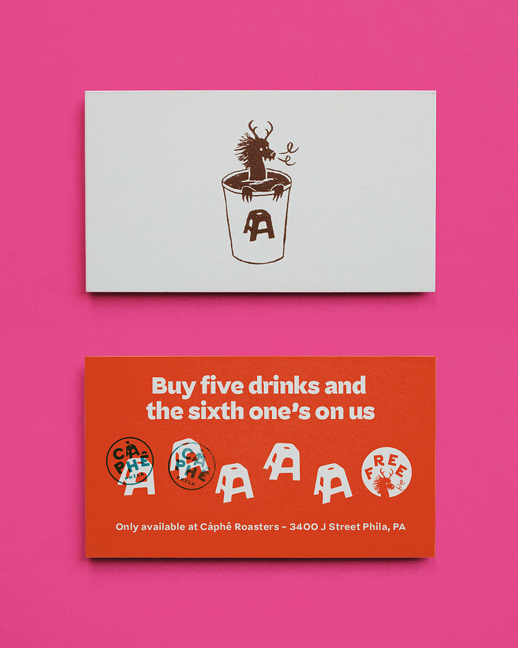
This little guy has found its way into a ton of pieces throughout the brand, saying wassup and giving you little hints on the packaging, hiding in your wallet on the loyalty card, and even some telling you how to recycle on some trash cans in the cafe. Nine times out of 10, I’m trying to include it somewhere.
Packaging — color, concept, and production issues
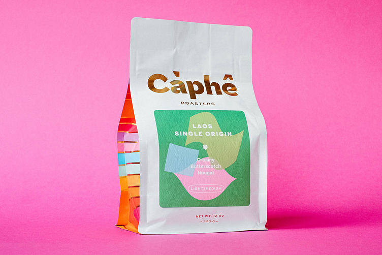
After creating a brand full of cute, playful elements, we knew we’d want to bring that vibe into the packaging as well. Rong Xiang was working with me at the time and we both took stabs at two different options. Mine was a little too off the wall for what the Càphê folks were looking for, but Rong’s version was just so elegant, bright, and truly beautiful. We all knew it would jump off the shelf, and feel so special to hold in your hand.
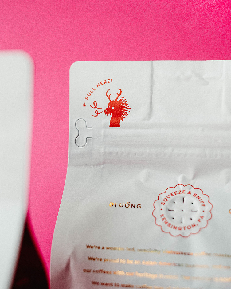
We brought some of the tiny elements from my weird direction—like the pull here dragon at the top and the squeeze and sniff flower over the valve—and incorporated them into Rong’s rainbow holographic gold gilded version. We also included the Đi uống cà phê phrase flanking the squeeze and sniff flower, to nod towards the Vietnamese roots of the company. Sort of like an ‘if you know you know’ kinda thing.
Rong put her whole heart into designing these bags and wrote a beautiful description of her thoughts and process:
"
Càphê Roasters is a coffee shop that wants everyone to know just how delicious Vietnamese coffee is. As Philly’s first and only Vietnamese coffee roaster, Càphê was looking for a packaging update that more closely reflects who they are — a proudly Asian-American business working to bring people together, one cup of cà phê at a time.
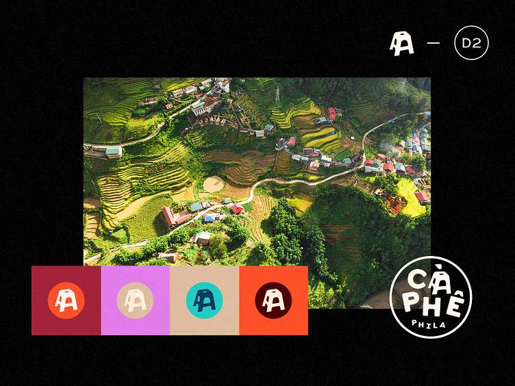
I created a packaging program that reflects this vision of a more inclusive, more open coffee community. Inspired by the colorful streets of Hanoi, the new system embraces a broad spectrum of hues. Each variety has its own colorway and playful forms, so customers can spot their favorite right off the shelf. The sides are the best part — abstracted from the terraced rice fields of Sapa, the pattern references the beautiful landscapes of Vietnam while adding a surprising pop of color to the entire system.
The result is a vibrant and delightful packaging solution that’s less about closing doors and more about opening them — to more diverse, wider coffee experiences and to those we share them with.
"
I’ve been to a ton of shops that carry these bags and the rainbow foil really does its job on the shelf. These bags are nearly impossible to miss, and then when you pick them up, they shimmer like a beautiful mermaid singing its coffee-scented siren song of exotic caffeinated mornings.
Sidenote: Producing this bag was so much more challenging than I would have ever thought. The printer made us sign a contract that said that they could not be held responsible if these things came out looking like garbage. They reallllllllly didn’t want to do a lot of the things we wanted:
1. The foil on the sides of the bag were a huge issue. They were worried about it flaking off and getting into the coffee. We had to resize the foil lines a bunch of times to basically act as an ink trapping situation so we could account for the potential misalignment of the printed colors. That line was originally supposed to be like 1px, very thin and elegant.
2. The squeeze and sniff flower almost didn’t make the cut because the printers didn’t want to print foil over the valve. So in the end we changed it to regular red ink and everything was fine.
3. They said they couldn’t print the dragon over the top zipper when they sent us samples of printing over the zipper??? It was a lot of very weird communication because they sent sample packs that included all of the design elements that we included, then told us they couldn’t do any of it?
I was like, I refuse to edit this thing down and lose all of the beautiful little moments that we’ve created for this brand. It’s just not going to happen. Without those tiny elements, this bag would have been no different than everything else. It would have lost its soul. We had some pretty heated calls and zooms about production, but now that they’re finished, I think we made the right gamble. I deff was hung up on a few times for getting too heated. Printers love to say no, but you just gotta give them a little nudge, or 25 phone calls. Either one.
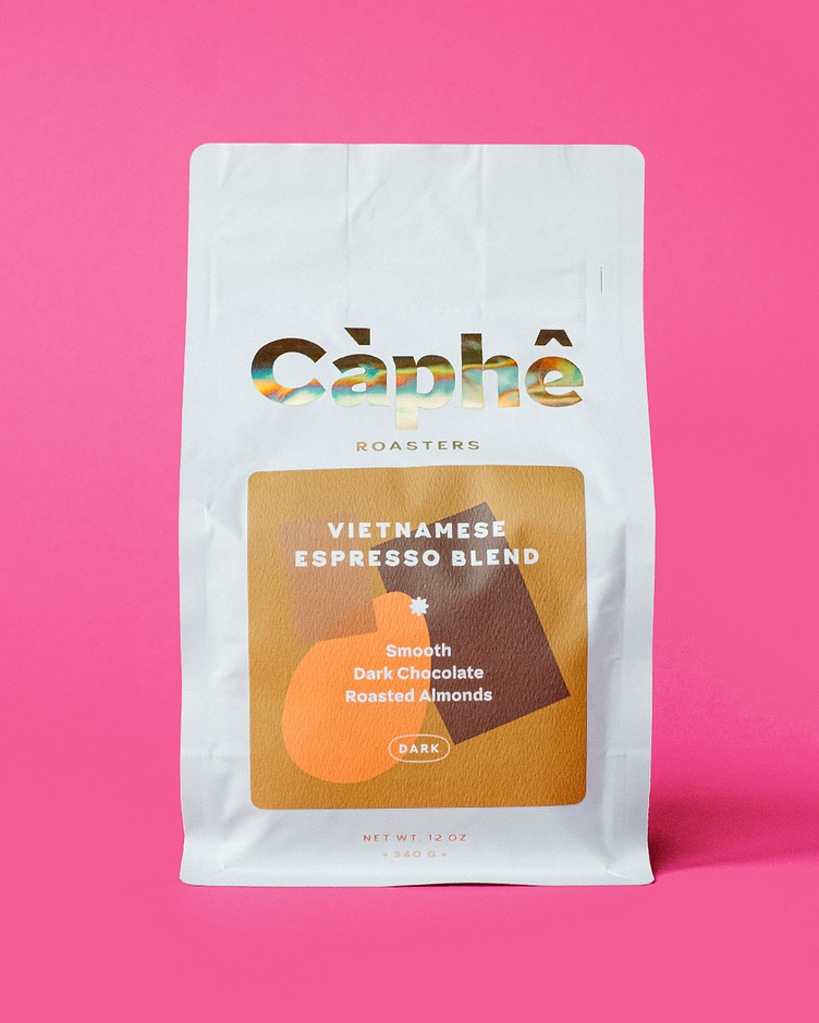
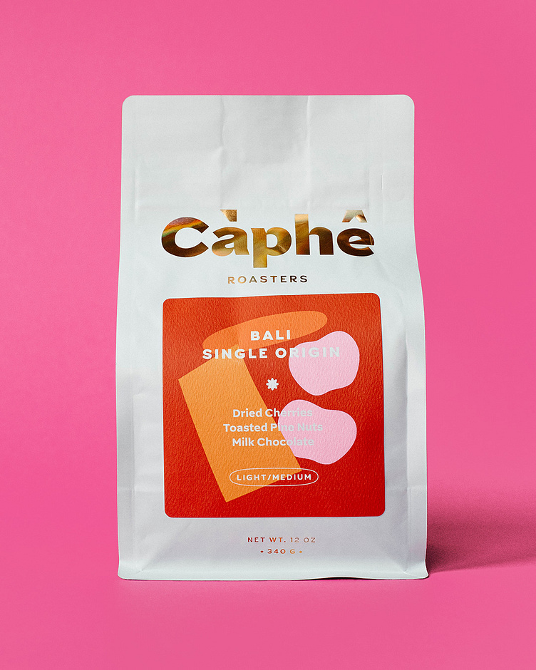
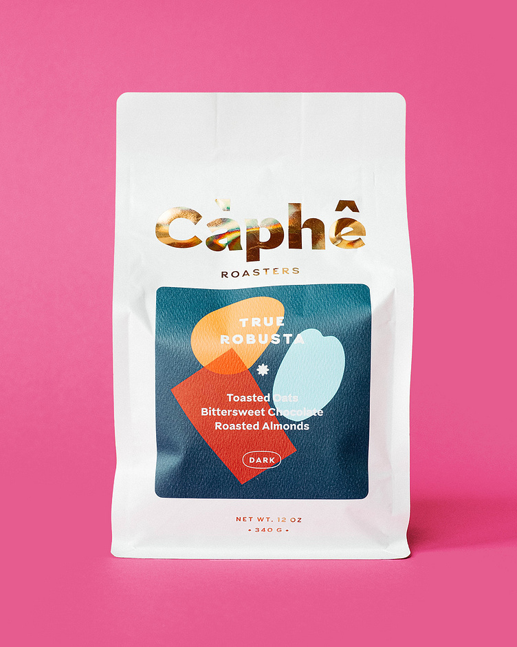
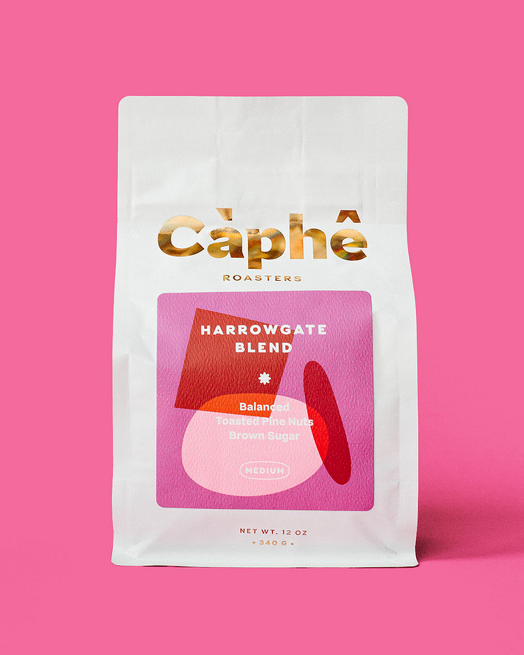
Labels—an artfully abstracted and colorful system
Each coffee variety has its own colorful label with a hyper-abstracted version of the flavor notes. It’s an incredible system to add on to, because you’ll get something like peanut butter and you’re like, how the hell am I going to show peanut butter? But Rong pulled it off and made a truly amazing color story with these stickers. I’m pretty sure that’s the reason a majority of people pick up these bags in the first place. The colors are so incredibly vibrant and the designs are deceptively simple. It’s got the whole, “I could do that, but yeah you didn’t” vibe going on. So you pick it up to look a little closer, and then when you flip it over you’re hooked.
Simplicity over everything
Vietnamese coffee is a little different than regular coffee. To make it properly requires some condensed milk and a phin. So we made a nice brew guide that the team could drop into orders, explaining the process so you can make it taste jussssst right at home. We tried to keep some of the bounciness of the labels and type alive here as well. We let the illustrations sort of float around a bit, which deeply disturbs me, but it’s good to push your internal boundaries every now and then. Gotta keep up with the kids out here.


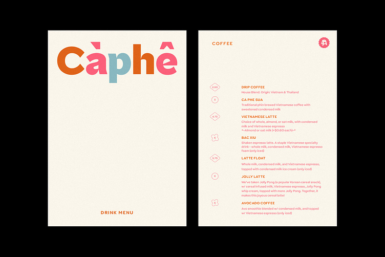
The drink menu is straightforward and easy to read. You can see the fun multicolored logo in action here. The idea is that they can change the colors whenever they change the menu, or as the season changes and whatnot. We ended up having to make a Google Slides version of this that’s a little less elegant, but much easier to manage. I feel like, “we ended up having to make a Google Slides version of this,” should be our new studio tagline.
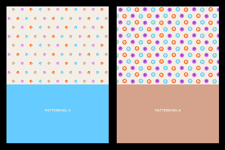
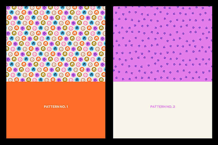
We also made a bunch of patterns using the multicolored stools. We haven’t actually used these anywhere yet, but they’re too pretty not to share. We’ll have to make some tissue paper or something like that eventually. Maybe it will show up on a bucket hat or something??
The food and the space
Because Thu is a genius, she knew that she couldn’t just open a regular cafe slinging coffee and “light fare” so she built an unbelievable food menu with Jacob Trinh from Vernick Fish. The dude’s food is incredible. I mean like best in the city incredible (even Philly Mag thinks so). The fried chicken banh mi sandwich is not from this planet. The bread is perfect, the sauce is perfect, it’s simply a perfect sandwich. I could get paid in a lifetime supply of this sandwich and I’d be more than satisfied.
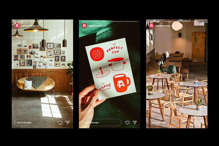
The space itself is like a bright, beautiful living room full of cozy seating and family photos of the folks that work there. Full of history and respect. Not a drip of pretension.
Thu is living proof that if you you put your whole heart into something, good people will join you. Passion is contagious, people want to be near it. This coffee, this space, and this company are built fully and completely out of passion and you can feel it when you walk in the door. It’s colorful and inviting and the food is so good it makes you close your eyes and forget that you’re in Kensington for a hot minute.
At the end of the day, we just tried to build a brand that does the same thing. We wanted this brand and packaging to feel super special, somewhere between cute, vibrant, and elegant. We wanted these designs to invite people to try something new—maybe something a little bit outside of their comfort zones. And maybe, by seeing something beautiful that they just want to hold and look at, it’ll lead them in the door to everything else that’s magical about Càphê, too.


