Wanna Go Outside?!

Overview
As a part of Dribbble’s Product Design Course, I prepared a dog walking mobile application from an initial concept to a dev-ready prototype. During the course, I dove into each stage of the product design process in the hopes of transitioning my career from graphic design to a more user-centric role.
Research
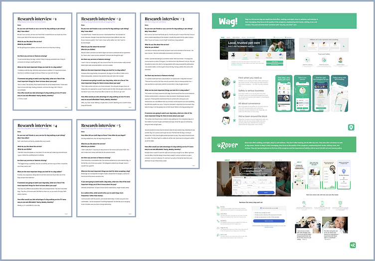
The foundation of a good product is an understanding of the end users. That's why the course began with market research. I conducted interviews with five potential users within my network to gauge their interest level in the product and gain insight into what types of features the app should have. Overwhelmingly, those surveyed were most interested in the safety of their pets, and the tailoring of the services to fit their fur babies' needs.
In addition to surveys, I also performed a competitive analysis to understand what solutions were already available and seek out potential points of parity.
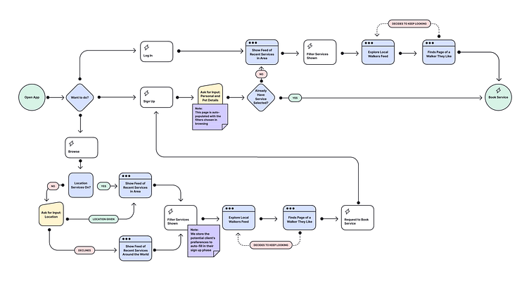
User Flows
After research, it was time to build a user experience flow. I created a basic onboarding flow to understand how a user might go about signing up for my dog walking application.
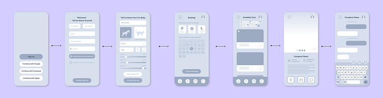
Wireframing
Next, I laid out what my user flow could look like in action with a simple wireframe. I made sure to emphasize the pet details page since tailoring the experience to the unique pet was a common theme in my initial surveys.
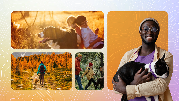
Mood Board and Visual Design
Once I was happy with my wireframes, I got to work on the visual identity for my application. Overall, I went for a clean and bright vibe encouraging playfulness and “sunshiney” warmth. I chose orange to represent that bright happiness that furry friends bring. I chose lavender to evoke tranquility, and hint at the luxury that the service provides. I also used a tinted gradient to bring the compound harmony together.
At this stage, I also came up with the app name. “Outside” came from how people talk to their dogs, saying things like “Wanna go outside? Let’s go outside!” etc.
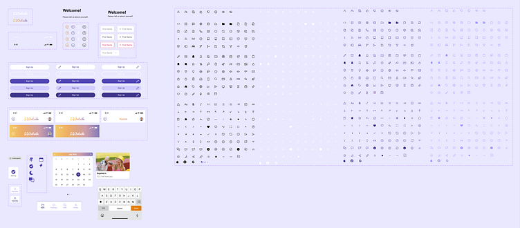
Scaling, Autolayout + Components
After the visual identity started to come together, I worked with some of the tools that make Figma efficient and scalable. I created a component library to house the design system components, like buttons, and all of their possible variants. I also used auto layouts and position constraints to make my designs responsive to different screen sizes.
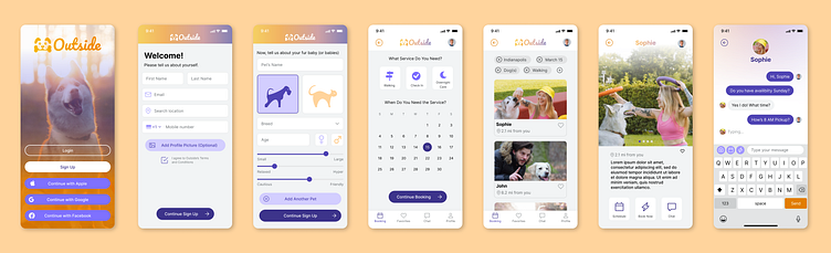
Final Prototyping
Finally, I combined the screens using Figma's prototyping tools to create a cohesive, high-fidelity flow through an onboarding process. Then, I did a little bit of user testing and implemented a few changes to my final prototype, which you can see below.
Key Takeaways
Overall, I learned an immense amount in a short amount of time with this project. Beyond the 'hard' skills I learned in the course, I've also gained an even deeper appreciation and passion for the 'soft' skills surrounding UX/UI/CX design. I've started looking at everything, and I mean everything, I do as a user experience.
(How awesome is it that Starbucks knows my go-to order and what location I'm most likely to go to? And they stored my payment so all I have to do is drive up!?)
I'm more excited than ever to keep learning about the ever-growing product design world.
Please Note:
I used Nucleus UI Component Library, Animal Line Icons (dini.matu) and Octicons (Primer) in this project, and customized resources from each of the community files to fit the Outside brand. Special thanks to the creators!


