Hoefler&Co. Detail Page Concept

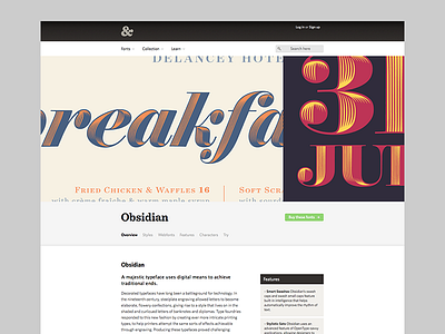

So I did this today as a practice, because I had some time and came across the page for Obsidian, a new font from Hoefler&Co. and while the font is absolutey lovely, the rest of the page was quite boring and hard to read. I really enjoy the whole feel of the site, so I tried to keep that and focus on improving the UX, fonts and spacing a bit. Just messing around mostly.
Any feedback would be awesome!
Original page: http://www.typography.com/fonts/obsidian/overview/


