PAWKIT WATCH

Mobile App Design for Dog Owners and Dog Walkers
Role: UI/UX Designer | Tools: Figma | Platform: Mobile

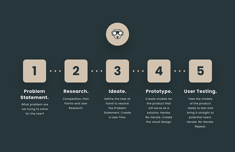

🐕 PROBLEM STATEMENT:
Dog owners sometimes need help caring for and walking their dogs. The problem for dog owners, is to be able to find dog walkers within their community whom they can trust, knowing that their dogs are in safe hands.

📝 COMPETITION, PAIN POINTS AND USER RESEARCH
ANOTHER dog walking app?
"Why should I sign up for a new app, when there are established ones out there already?"
What products are already in existence that have tried to solve this problem? What does the competition look like? A comparative analysis was done between Rover, the most popular competitor, and the next best competitor, Wag.
This comparison was supplemented by User Interviews conducted with two different potential users who have interest in finding dog walkers in their community, who also have experience with the existing apps.
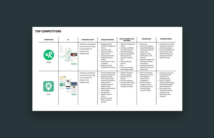
👩🏻💻 KEY TAKEAWAYS FROM THE COMPARATIVE ANALYSIS
1. Rover’s pricing transparency makes its services seem trustworthy for the user.
2. Rover’s assurance of an extensive background check gives some dog owners reassurance that the profiles found on the app are legitimate and that they will know how to behave with their dogs, making sure they are safe.
Even if there is a way to verify these background checks, there is no way to verify any certifications that dog walkers on Rover claim that they have.
3. Wag has a lot of unique features, such as the 24/7 vet assistance, the ability to “favorite” dog walkers and award them badges, yet Rover is still the more popular competitor by far.
This is potentially due to the fact that Wag charges a subscription fee for the premium version of the app that seems to offer more services, while Rover’s fee is simply tied to the fee that the dog owner pays the walker.
4. Rover allows the user to explore the app directly before even signing up/logging in, while Wag requires the user to sign up/log in before getting a chance to walk through the app.
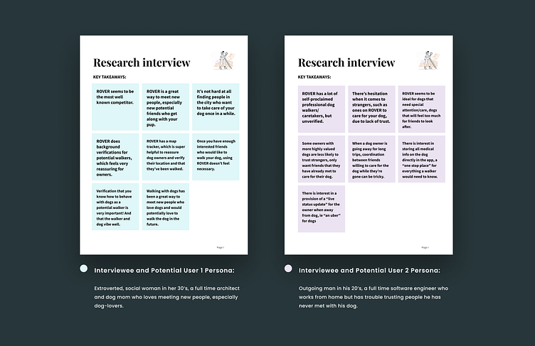
👩🏻💻 KEY TAKEAWAYS FROM THE INTERVIEWS:
1. Dog walking can be a very social activity, often involving friends and making new friends.
Dog walking apps are a great way to meet new people, especially new potential friends who along with your pup
It is very easy to meet people in the city interested in caring for dogs, especially since it is a great way to make new friends
Having friends look after dogs seems the norm for some dog owners, except schedule coordination can be very tricky, especially for longer trips
“Walking Deekin is a great way to meet people, often people who would be interested in walking or hanging out with him in the future. I think Vancouver has a a lot of expats who miss their dogs back home so they don’t mind taking care of Deekin once in a while!”
2. There is still hesitation from some users to trust people on the existing apps.
There is currently no way to verify the self-acclaimed professional status of a dog walker on Rover
Background verifications from Rover are reassuring for some dog owners, but not for all
Assurance that the dog walker knows how to behave with dogs is very important to dog owners
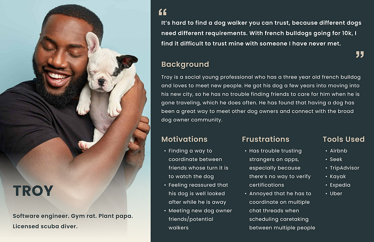
"It’s hard to find a dog walker you can trust, because different dogs need different requirements. Some dogs need special needs such as medication, some dogs aren’t well trained and might not do well with other dogs, which concerns potential walkers who plan on walking more than one dog at a time."
3. There are some elements of the existing apps that are helpful to users, especially specific user groups.
Dog walking apps seem ideal for dogs who need special attention and care, dogs who are too much for friends to look after
The live status update on current products is very helpful for dog owners to assure that their dog is being properly looked after
“I did use Rover for a bit and that was a great experience! It connected me to good people. I think they do background checks so that’s really promising, I’d love to know that whoever is taking care of Deekin isn’t a criminal (yet). I did really like that Rover had a map tracker so I knew exactly where Deekin was walked and for how long.”
👩🏻💻 USER PERSONA:

🔨 THE TASK AT HAND:
Based on research findings, 2 key user needs were prioritized for the unique features of our product to support those user experiences:
1. Trust in the legitimacy of the profiles.
2. Alignment of the needs of the dog owner and what the dog walker can provide (ie. schedule alignment, assurance that any special requirements for dogs can be met).
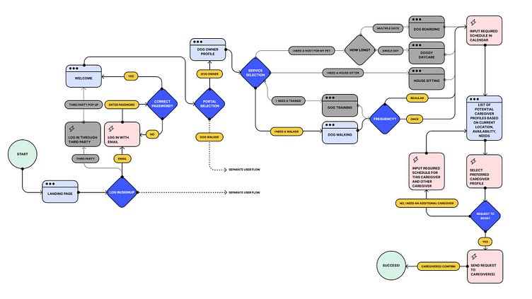
Two User Flows were created to illustrate the 2 different persona flows. One from the perspective of a dog owner logging in and finding a dog walker that meets their schedule as well as any specific needs they have for their dog, and another from the perspective of a dog walker getting matched with a dog owner, whose schedule needs align with their availability.
One happy path was established to create building the wireframes: logging in as a dog owner and being connected to a dog walker in the area. The paths that were not built for the prototype have been grayed out for visual clarity.
🌟 HOW CAN I MAKE THIS SPECIAL?
Why SHOULD the user sign up for another dog walking app?
I needed to design a way to show how this app would be different, that the pain points surrounding trust and schedule alignment that are prevalent with existing dog walking apps can be resolved through this product.
Before the user even signs up for the app, can there be a way they can get a sense of the legitimacy of the profiles of people they can connect to in the community? Can they get a sense of what kind of community they are being welcomed into before they are asked to give out any personal info?
💡
Upon choosing a service, the idea is that dog owners can set their required schedule, along with specific qualifications they require to be met, in order to assure that the list of walkers they will be choosing from will already be right choices for them.
💡
Perhaps an extra indicator in the form of trophy-like symbol to show that certain caregivers have completed over a certain amount of services already, establishing themselves as a trusted dog walker in the community? Along with a visual way of verifying that all of the dog owner's necessary qualifications set beforehand are met with this walker?
💡
For booking confirmation, the idea is that upon clicking “request to book” on the caregiver profile, the dog owner will be led to an instant messaging page, where they can send a request to the dog walker to confirm their booking, then they will only need to wait for that confirmation in order to confirm the service.
👩🏻🔬 IT’S PROTOTYPING TIME!
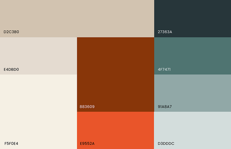
Vibe: friendly, trustworthy, warm, modern.
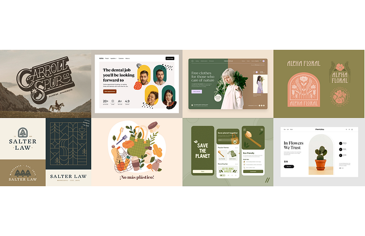
Moodboard that matches the vibe for the visual design:

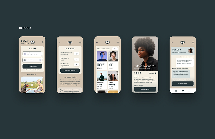
🧪 ITERATION 1:
PAWkit Watch, a name intended to bring about a sense of responsibility, elegance and a bit of playfulness.
The logo icon depicts a dog with binoculars that visually represents the core values of the brand: a sense of responsibility, excellence, elegance and a bit of playfulness. After all, this is a product man for these dog owners’ best friends. The logo has been designed for a user to look at and immediately have a guess as to what kind of product it represents.
The goal was to create an interface that looks as simple and elegant as possible, complemented by fun icons to break up the seriousness a bit when appropriate.
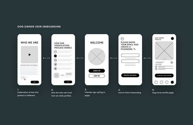
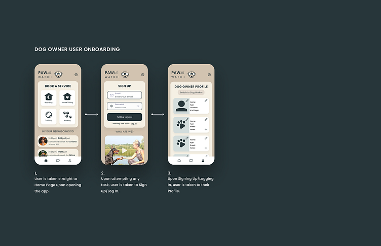
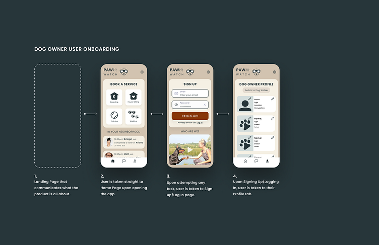
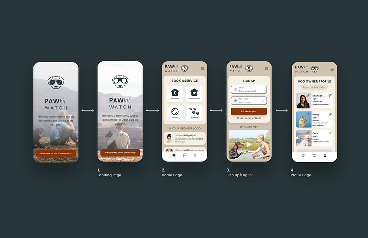
DOG OWNER USER ONBOARDING EXPERIENCE
💡
The home page experience has been designed to emphasize a sense of community, allowing the user to build trust with the platform before even signing up. The user is offered an opportunity to explore activities going on in the neighbourhood Signing up/logging in would only be prompted if the user decides to actually click on a service they’d like to book on the home page.
💡
Upon being prompted to sign up, an intro video that greets the user into joining the community and explains what makes them stand out compared to the competitors keeps the user engaged and encouraged to move to the next step.
💡
The distinction between being a dog owner on the app versus being a dog walker is shown on the profile page, where the user can opt to switch their use from one to the other.
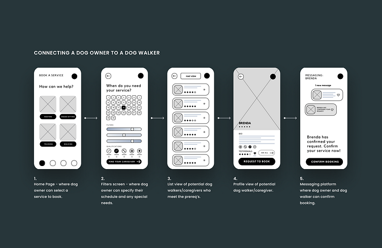
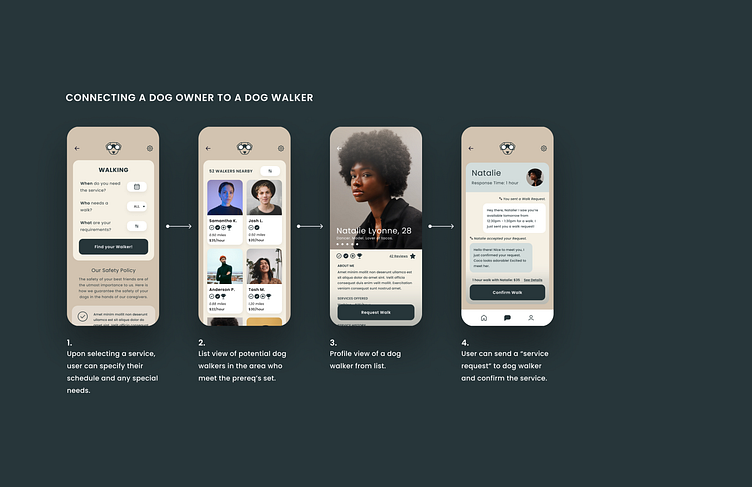
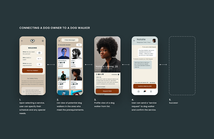
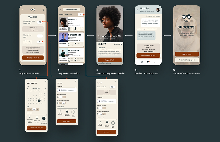
CONNECTING A DOG OWNER TO A DOG WALKER EXPERIENCE
💡
In order to reassure the users that their dogs will be in safe hands when working with a dog walker found through this product, a “safety policy” panel has been placed directly under where the user would input details for the service they need. This gives the more cautious users the option to read through why they can trust the verification system used by the app.
💡
The profiles were carefully designed to appear friendly yet informative for the user, showing the profile picture, qualifications, background verifications and rates for full transparency.

🔬 FIRST FEW USER TESTS LATER...
Comments:
📣
"The logo is taking up too much real estate at the top."
📣
"The call to action color needs to pop more, it's blending in too much with the text."
📣
"The note on safety doesn't have a lot of distinction on the filters and date setting screen for the service, my eyes don't know where to look."
📣
"I feel like the list view of potential walkers is too small, how will I be able to look at the list and immediately get a gauge of the person's vibe?"
📣
"The messaging screen feels SO small. How am I supposed to scroll through that without squinting?"
👇
Upon realizing that the reason the “call to action” color of the button was not standing out because it was the same color as the text, a complementary color to the dark green of the text, revealing a warm red, was presented to the user, who immediately commented on the improvement.
👍
“I can actually see the button now!”
🧪 ITERATION 2:
🔬 SECOND ROUND OF USER TESTS LATER...
Comments:
📣
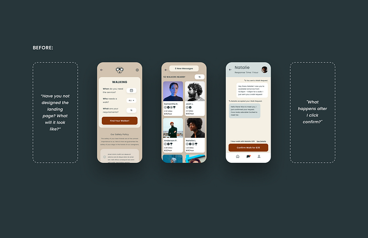
"Have you not designed the landing page? What will it look like? I want to have a sense of what I'm about to experience before I even get there."
📣
"I need some visual feedback for the filters and scheduling page. I like that when I select which pet, I get an immediate visual assurance that my selection is accounted for. What about for dates and filters? I'm nervous my selection's lost when I click next."
📣
"I still feel like the list view isn't doing much for me. Why is there so much focus on the images of people? I want to get more of a sense of their qualifications and what they can offer me rather than what they look like. What do the icons mean again? They don't really mean anything right now. What's the information hierarchy?"
📣
"Do I have to click 'See Details' to get the details about my service on the messaging screen before I confirm? Can't the details just show up before I confirm automatically? I'm not going to bother clicking that."
📣
"What happens after I click confirm?"
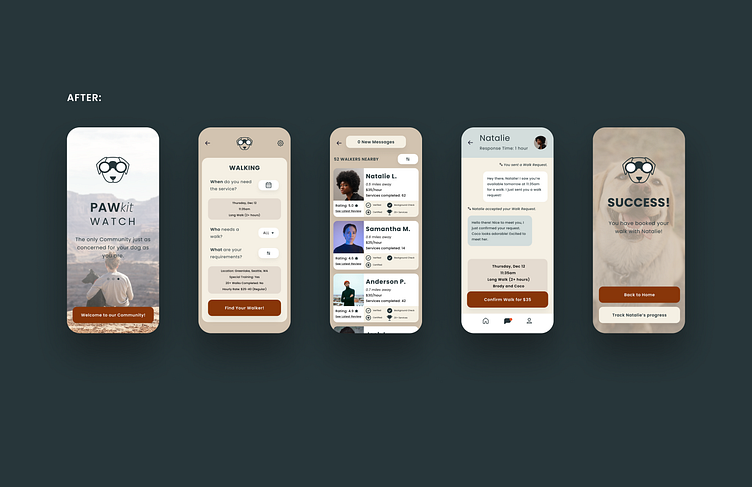
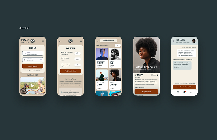
🧪 FINAL DESIGN:
DOG OWNER USER ONBOARDING
🧪 FINAL DESIGN:
CONNECTING A DOG OWNER TO A DOG WALKER
🎨 Vibe: friendly, trustworthy, warm, modern.
Muted, pastel color tones are complemented by bursts of warm, bright tones of red to achieve this desired vibe for the product.
📚 NEXT STEPS…
Does this product actually differentiate itself from the competition? The next step would definitely be to do some quantitative testing. Do users actually feel a sense of the legitimacy of the profiles upon using the app, compared to the competition? Do more dog owners feel like the dog walkers on this app can be trusted based on the flow and how the profiles are presented?
Planning for the KPIs would be a very important next step as well, so more detailed user testing would be involved. How many people complete the flow and how quickly? Are there any moments in the flow that make users confused or abandon the process entirely?
Now that a prototype is ready to test with more users to keep iterating and making it better, prototyping the second User Flow would come next as well: logging in as a dog walker, establishing their qualifications, schedules and being matched with a dog owner to make some new friends, while also getting to know the community.
🧠 LEARNINGS
So much has been taken away from this experience! I have learned to check my biases and assumptions when asking users interview questions, many of the answers I received were surprising and not at all what I had expected.
I have also learned that even if a flow makes sense in your head as the designer, the user might interpret it completely differently and have trouble in unexpected areas of the product experience. I see first hand why user testing is such a key part of the UX design process, it helps keep our biases in check when it comes to designing an experience, always making sure we are bringing it back to the user!
I would love to learn more about how users evaluate how trustworthy and legitimate someone is purely based on their profile page. Does this sense of trust actually translate to corresponding quantitative results? Would this improved experience of feeling like they can trust the profiles on the app actually make users willing to sign up for another dog walking app after all?


