Muesli Packaging Redesign

Hey dribble! 👋
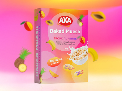
Oatmeal is a very specific product in terms of preferences. The target audience is, as a rule, conscious people who care about their health. There is quite a lot of competition on the market, so packaging is of great importance, which should be bright and attractive to interest the buyer in choosing this particular product.
I approached the task creatively and decided to make the packaging quite bright, but at the same time not a Christmas tree. I kept the overall style and placement of the logo as the customer wanted.
Choosing a style, I decided to apply trendy design techniques of recent years to make the design modern and attractive. Since the product contains tropical fruits in its composition, they have bright colors, which directly suggested to emphasize it, and for this purpose I used a mesh gradient that made the background bright and unusual.
For the circle with the main information, I used elements of glassmorphism - also a feature of modern design, which made it possible to place fruits both in front of the circle and behind, and the effect of frosted glass made it possible not to overload the composition and at the same time see the full picture as a whole. I put all the main information in this circle.
For a 3D depth effect, I added 2 more circles but with different sizes and transparency. To highlight the UTP, I used the shape of the logo, which is similar to an oat grain, so it also added similarity in the rhythm and steps of the design.
The latest trends of the so-called anti-design were also used here, everyone is already tired of symmetry and alignment, so I decided to deliberately place the text that goes beyond the boundaries of the objects with dies this technique allows.
Since there was a desire to highlight one element of the UTP from among the others, a decision was made to make it a different color and size, which harmoniously highlighted it among the others. So that people understand that this is oatmeal, of course, I posted an appetizing picture where this useful product is prepared in an attractive way.
Thus, we have a bright, attractive modern packaging that has preserved the corporate style and incorporated the latest design trends and clearly displays all the information about the product that the buyer needs.
You can see a more detailed case with a video of the design process on my Behance profile https://www.behance.net/gallery/149749423/Muesli-packaging-redesign
==============================================
So please like 👍 and subscribe ❤️ so you don't miss out, there are many interesting and useful things ahead.
I am free for a new project.
Behance | Pinterest | Twitter | LinkedIn | Github | Instagram
Write to the mail: 📩 dedenkof@gmail.com
==============================================
Thank you for your attention!


