"Tacoda" Brand Experience Design | Brand identity


Hey, let's know about the Brand a little bit 🔥
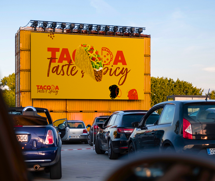
Not only is "Tacoda" a legacy brand of restaurants that offer tacos. a company that shows its clients love and care. warmly welcomes everyone.
Holistic approach
DesignOps took the opportunity to craft a visual identity for Tacoda. The team concentrated on creating an identity that talks to, touches, and expresses love for tacos, something that sticks with the customer and touches their heart 🥰 .
Behind the thought about Color and typography
Enter your text here...
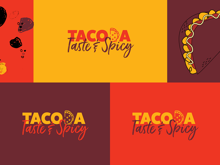
Color
Our colors of choice were this palette as it is not only vibrant but eye-catching just like the tacos of Tacoda.
People often feel hungry when they see the hues yellow and orange. Red is known to evoke strong feelings and passion. As a result, when yellow and orange are paired with red, one becomes intensely hungry. Earthy colors like green and brown are frequently associated with eco-friendly, natural, organic, and nutritious food options.
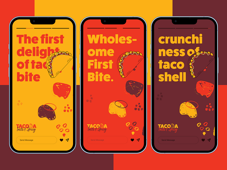
Typography
We went with this typography style as this represents the brand’s culture more than any. The Express vibe it gives allows the brand to go beyond.
Feel free to leave feedback and don't forget to press (L) and don't forget to follow us on Dribbble.
We would love to help you with UX/UI & Brand-Identity Design and help you kickstart your business.
Give us a 👋 hello: designops.co@gmail.com


