


Succor Branding Design


Succor Branding Design
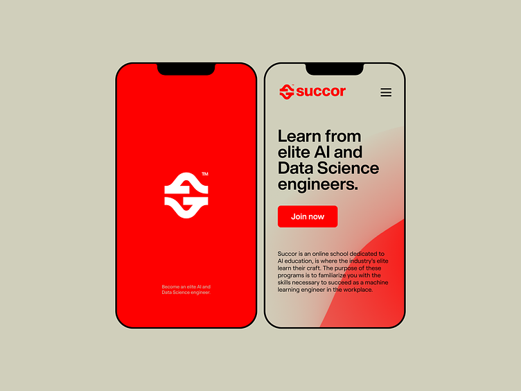
Succor is an online school dedicated to AI education, is where the industry's elite learn their craft. The purpose of these programs is to familiarize you with the skills necessary to succeed as a machine learning engineer in the workplace.
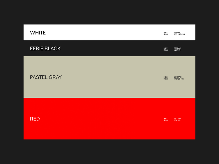
It was challenging to position Succor , as the firm is cutting-edge in its use of technology, the goal was to give the impression that Succor was more conventional and traditional than it actually is. The color scheme had a significant influence, consisting mostly of biege pastels with red serving as the single bold accent.
The emblem is, once again, quite classic, with solid forms and clear lines.
The idea behind the symbol was that the letter S was made by hands, which stand for helping, teamwork, and community.
On the otherhand, the company's graphic language reflected the cutting edge nature of its technology through the use of contemporary design elements like gradients and smooth curves combined with abstract forms representing artificial intelligence and data.
Succor attributes were reflected in the overall tone of the brand, which thry may be summarized as serious, bold, inventive, and distinctive. Because of this, a distinct brand identity was established.
Get in touch with me:
contact@secondeight.net — www.secondeight.net — Instagram — Behance


Get in touch with me:
contact@secondeight.net — www.secondeight.net — Instagram — Behance


