UX DESIGN AND ARCHITECTURE

EXPLAINING ARCHITECTURE TO NON-ARCHITECTS THROUGH UX DESIGN PRINCIPLES
Putting our Clients First.
While I was at Heliotrope Architects, the first thing we would do upon receiving a project, before any ideas were laid out on the table, was analyze the site. Always putting the clients first, I was tasked with creating diagrams that explained the team's thought process from site analysis to ideation, keeping in mind that the majority of clients do not know how to read architectural drawings.
The key task at hand:
Making the drawings as simple and easy to digest as possible, with no knowledge of architectural drawings required to understand them.
Above:
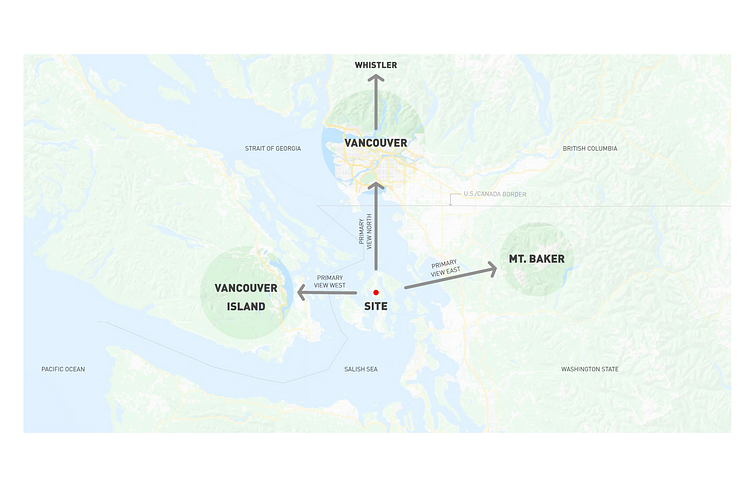
Site Placement drawing highlighting the surrounding views from the property that the team kept in mind going into Site Analysis on a macro level.
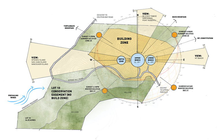
Site Analysis drawing for a project showing how the team studied the site elements within the clients' property lines and allotted "building zone" as set by the local County. Distinct colors were used to group different site elements together for visual clarity. I created a set of visual "rules" for myself to keep a common language throughout the drawing:
Dark green to differentiate hillside versus a lighter green for general, natural green area
Gray to show the paved road area
Dark orange to show the sun at different spots throughout the winter and summer Solstices
Gold to show the allotted "building zone" set by the County (anything built can only be within this zone)
Light gold to show the main views from within the "building zone"
Light blue to show the different zones based on what is currently on the site and the natural site elevations (this shade was chosen to stand out within the gold shaded area)
Darker blue to visualize the prevailing winds coming from the coast, considering the property is on an island
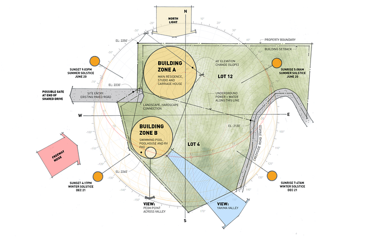
Site Analysis for a different project, different clients and a different site with slightly different visual rules. It was important I kept in line with these rules in order for the client to not get confused and wonder what was what in the drawing:
Light green for general, natural green area
Gold to show the allotted "building zones" that were actually decided by the team as best spots to place desired buildings
Dark orange to show the sun at different spots throughout the winter and summer Solstices
Gray with to show the paved road area
Pink to show external site influences
Light gold to show key site considerations for placing "building zones"
Light blue to show the most important view as noted by clients, drawing extra attention to it, demonstrating that even their specific requests are being heard
Parti Diagram for a project to be published in a magazine. Using the existing Site Plan to note where all the trees are, I simplified the shape of the trees to form a green "cloud" of sorts to clearly indicate that the building is nestled by a huge network of them, while showing the topographic lines helps indicate that it is on quite the steep slope.
One key part of the building that the Principal Architect asked me to highlight was the rock outcropping at the east end, for which I shaded it a darker green, along with the cut out of the deck around the cropping drawn in a bold line to draw the viewer's attention. Through the use of color contrast, I have made distinct what elements of the building are "solid" versus "open." The red arrow cutting through the "open" element of the building points to its connection with the outcropping and the direction of the slope (towards the primary view to the water), as well as the fluidity between indoor and outdoor spaces.
Project Credits:
Heliotrope Architects


