Forge Studio Brand Guidelines


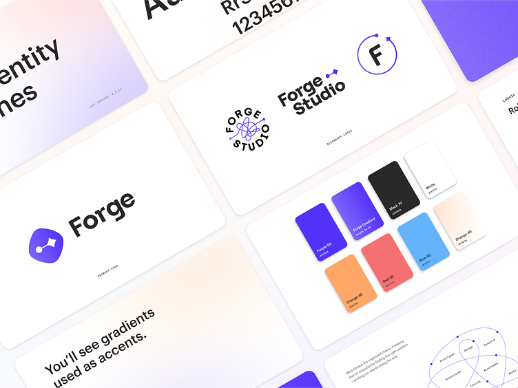
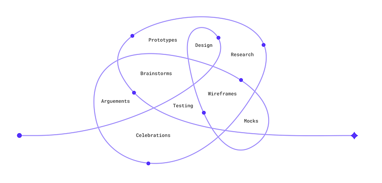
The logo mark communicates the journey from idea to launch. As designers, we see a similar design when creating user flows or mapping prototypes. Simply put it represents how to get from point A to B. The spark at the end represents the celebration of reaching a goal—whether launching a new product or achieving a milestone.
When the mark is expanded out it represents the organized chaos that comes with solving complex problems. We have the ability to take what seems chaotic and simplify it into an actionable plan that can be executed thoughtfully.
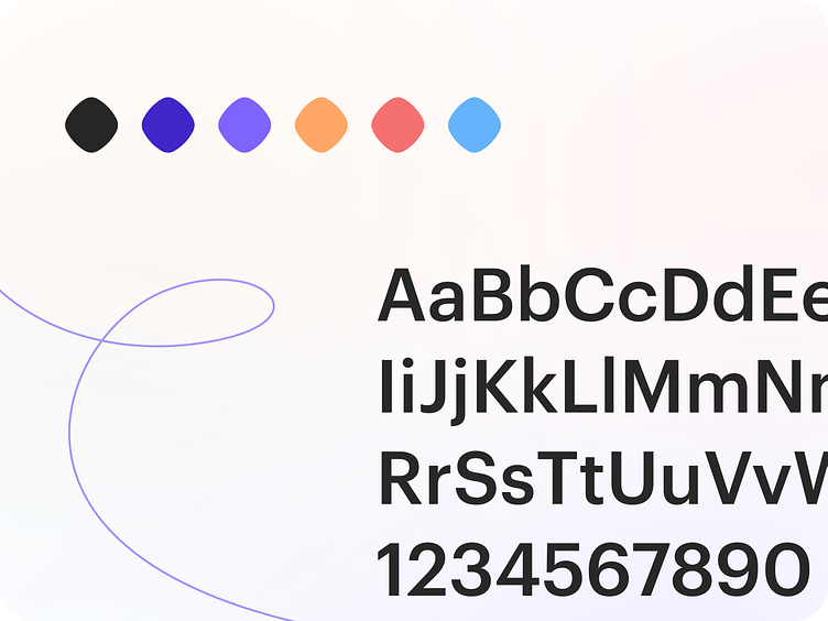
Our color palette is bright and soft. Purple is our primary color that represents strength but is complimented with soft gradients to feel calm and welcoming. Our team is caring and generous but not afraid to collide into healthy discussions around opposing views and ideas.