Dog Walking App - WagSg

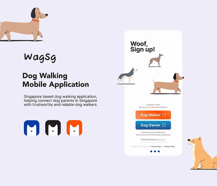
This dog walking app was completed as a part of Dribbble's Product Design Course, designed individually using Figma.


Market research
The applications that supports Dog Walking locally are Pawshake and PetBacker.
Both of the application supports a huge range of pets and services, everything you can imagine, which also exposed many shortcomings.
Findings:
Related application on the market, do not specify the location they support, thus no one is nearby on search for most application downloaded.
There is no "dog only" application in Singapore.
Walkers/sitters tries hard to "sell their service" with explanations of what they could offer.
Not much hierarchy, text heavy, hard to read.
Important notices written to be read are easily skipped.
Insights:
Opportunity to design a structured yet customisable profile.
Easy to pick up information, and not miss important ones.
User interviews
Context: Singapore
After some primary research on my end, I wanted to further understand, identify and define the problem to solve locally.
I went to interview 12 individuals with dogs in my nearby park and a number of family and friends.
Pain points
Below are the Key pain points and quotes compiled from all interviews and research done ideating.
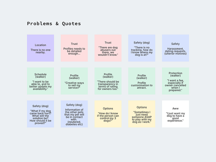
Findings:
After empathising and looking in the perspective of both the Owner and the Walkers, I realised that most of the problems revolves around the key question of:
What is needed to establish Trust?

Persona
Based on user interviews and research I built 2 personas.
Owner: Zane Grant
Walker: Dion Lee


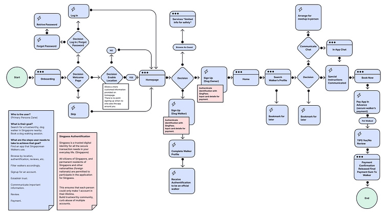
User flow (Owner)
As I was creating the user flow, I realised that there are many key interactions, actions and decisions.
Having learn the rules of using certain shapes for specific indication helped.
Dog Owner's (Persona Zane Grant) user flow
From Onboarding to The End of Dog Walk
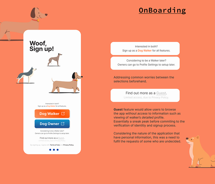
User Testing
Participants: 8 participants that is walking dogs
Participants were introduced to a brief short description, and were given a task to complete.
Participants were also asked to feedback about individual designs.
Task: Try to book a dog walker.
Questions:
What do you like most about the features?
What was one thing you liked most about the design?
Do you feel this design was made for you? Why or why not?
How, if at all, do you expect this feature to help you match with a walker you trust?
Is there anything else about this survey or this app that you would like to share?
Findings:
Some users felt that there was limited choices as I did not prototype every profile shown.
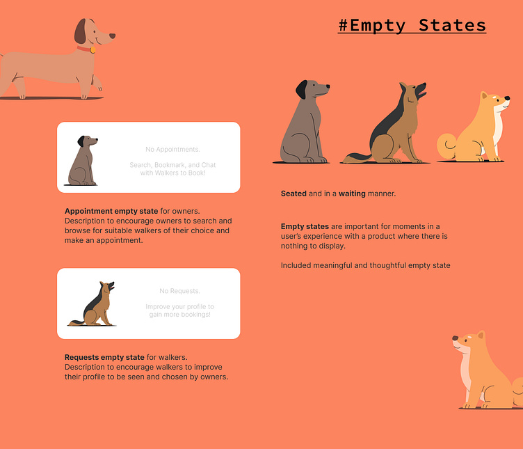
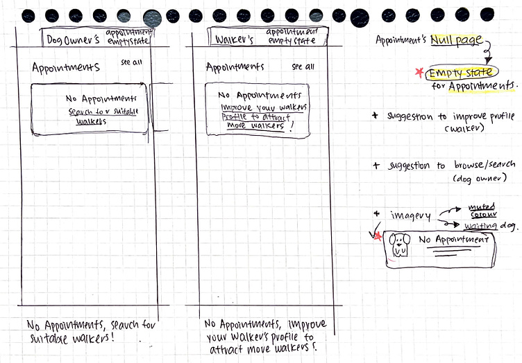
Users were confused on the home page, tried to wait for things to load. (Lacking of empty state)
Insights:
Users spends most of their time on other apps, and thus also prefer that things/designs are done similarly. Simple and intuitive is key.
Empty State designs will be needed to inform and reduce confusions.

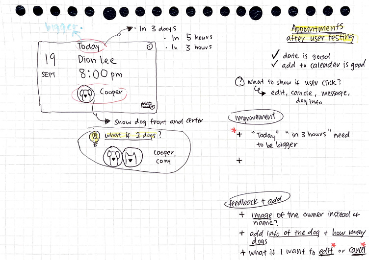
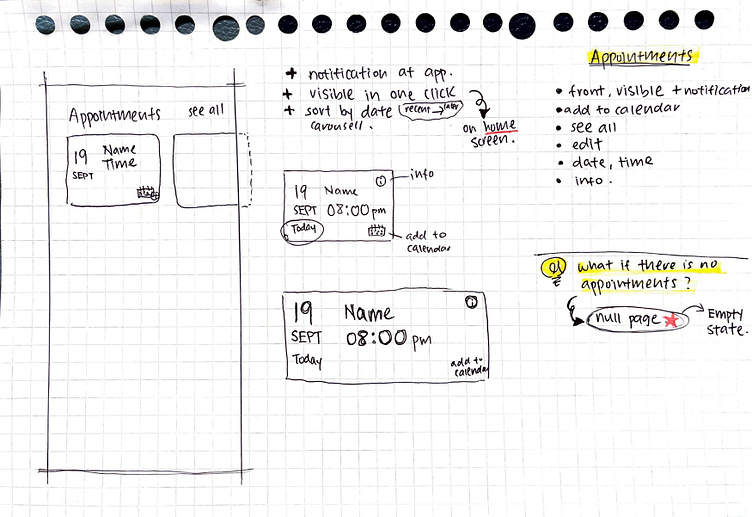
Key changes:
Home page, for sufficient negative space I kept the appointments and restructured.
Empty state, to inform and lessen confusion, I added empty states with a touch of encouragement to either find a walker soon, or to better their profiles to be seen for owners.
Appointment card, I kept information that interviewees mentioned were key and tried to simplify.
Dog profile, having simple short videos and images added.
Insights:
There are many sensitive topics to think about, and more research and experience is needed to resolve on a more professional level.
e.g. "What if my dog was abused during the walk?"
Mistakes made, Insights and Reflection:
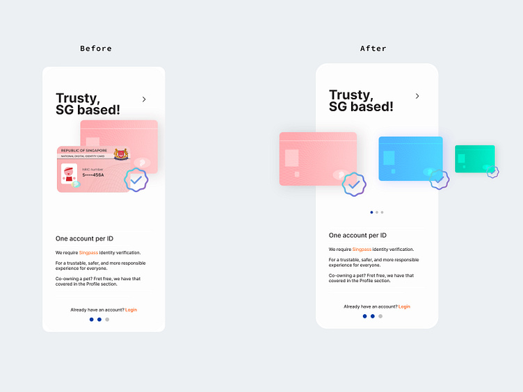
Through user testing, I interviewed a Permanent Resident that was confused about the Pink Card and found out that I missed out two groups of people residing in Singapore.
The Permanent Residents and Long Term Pass Holders.
It is a huge mistake considering that they were this application's potential users as well.

What's next?
Dog's Experience front and center
Business Perspective
Engineers Perspective
Dark Mode
Application monitored, online meet and greet [trust]
Option for Gender preference [safety, preference]
Option for Cancellation Fees
Personal takeaways
Safety I wonder what is behind all the complication
By enabling contact be it chats or calls Only via the application...
Lock the call function, only allow calls to go through during the appointment for emergency situations.
Results in the What Ifs , What if the app stopped working?
What is privacy, in the middle of all the What Ifs?
Learning from several mistakes, I am now more curious about Laws of UX,
UX Psychology, and the topic of Inclusivity.
I was always the Think Tank in group work. Having to 1 man everything on top of learning to use a new platform Figma was challenging.
I am still figuring things out, regarding UX Roles.
Let me know if a certain position seems suitable for me!

This dog walking app was completed as a part of Dribbble's Product Design Course, designed individually using Figma.
Big thanks to Product Design Mentor Jesse Showalter & Valerie Downs.
2022 in a course of 6 weeks
To get in touch
thinking.teng@gmail.com


