Seven tricks to draw a well functioning Roman lowercase letter g

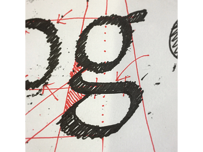
1) To keep it upright make sure the g has its lowest point right underneath the highest point. Well, maybe offset by the with and angle of your pen.
2) The g with a roman construction is often referred to as the bicameral g but let's not forget the negative space between the loops. So, it's really 3 to keep an eye on.
3) Make the bottom wider than the top (pack the whole fella into a trapezoid).
4) Think of the two branchings as siblings. They don't need to be identical but pretty similar would be good: keep the branching at the same angle.
5) Align all three bumps along the left edge of the trapezoid: The left side of the top loop (that I like to call a baby o), the first and second branching.
6) Make sure the notches, those triangular negative spaces are big enough to survive small text size. If the notches are too small the left profile has a tendency to melt into one straight line.
7) Lastly: In a pickle the spine (that s-shaped stroke top of the bottom loop) should be the thickest stroke. The entire letter benefits if the spine has a perfectly straight section between its two curves. That gives the letter crispness and salience.


