derma.up - Brand Identity for Skincare Products

derm.up is Brand Identity for Skincare Products.
It consists of two words, the first is a derivative of the word "epidermis" and the second is a call to action and at the same time a hint of the result.
Phonetically it sounds easy, the second word also affects the memorization of the name due to its size and simplicity of sound.
The name is not emotionally colored and conveys calmness and confidence in the result, which is also reflected in the design.
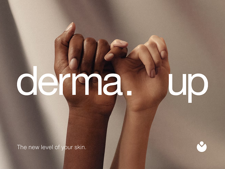
Logotype
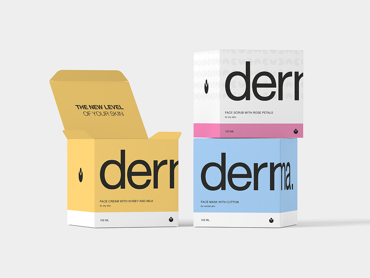
It is performed in a grotesque font, the contrast between the spacing of words in the logo reflects the path to the result. The small distance between letters symbolizes the skin cells, which are closely related to each other and form a single entity.
It should be noted that the use of the logo of contrasting scales also symbolizes the skin as the largest human organ.
The logo is easy to read and works well at different scales.
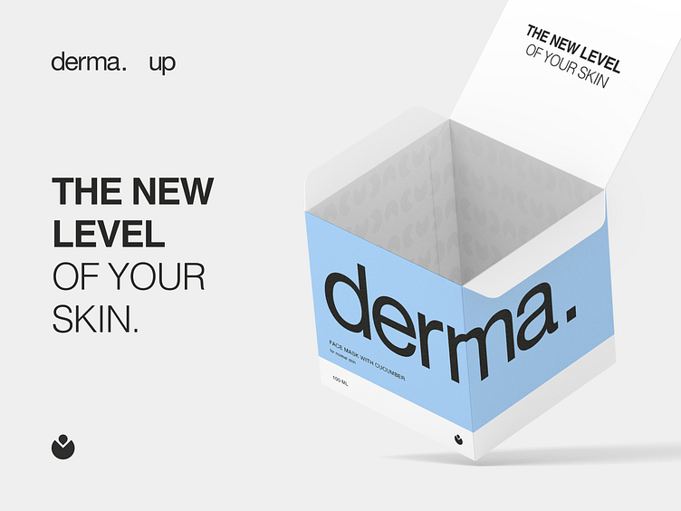
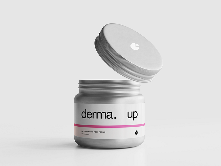
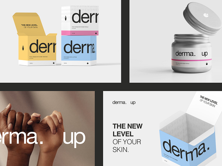
Branding is based on purity, emphasis, and contrast of scales. The colors are clean, bright, and natural.
Our main goal was to keep the balance. The product does not look too cheap or, conversely, premium.