Participate! — Website 002

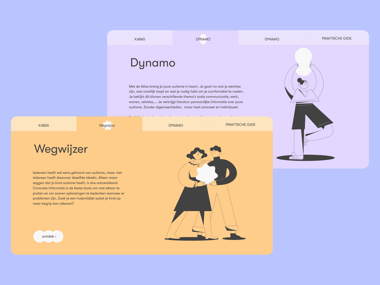
Recently we were working on a website for autistic people. Pastel colours, white space around the text for an easier read, and a calm structure with small images were the keys to improving the accessibility for autistic people.
Watch live: Coming soon
Press “L” to appreciate it and share your feedback with us below!


