Beautiful Landing Pages That Failed

Some designs are just too beautiful to work.
This is a story about how we discovered that beauty can actually distract from the page goal. 😅
What could be better than a beautiful landing page? Users should love UI-rich pages more, right? Unfortunately, not always.
Goal
We have a lot of invite landing pages - a page where people land when someone invites them to join Sweatcoin. And depending on which feature they are invited to, pages differ. The main purpose of this type of page is to convert people into sweatcoin users. So our KPI here is visitor-to-user conversion.
Problem
We have old, simple & quite ugly invite pages. And we wanted to make them beautiful - to convert more visitors into users.
The two pages I was tasked with were:
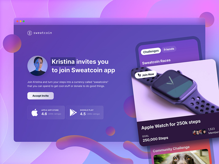
1. A general landing page where you land after being invited.
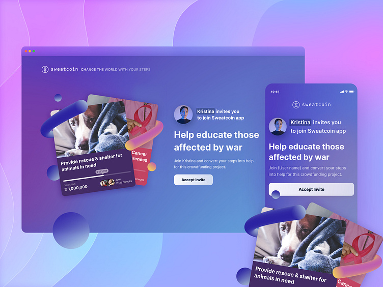
2. A landing page for when someone invites you to join our charity campaigns (Sweatcoin for good).
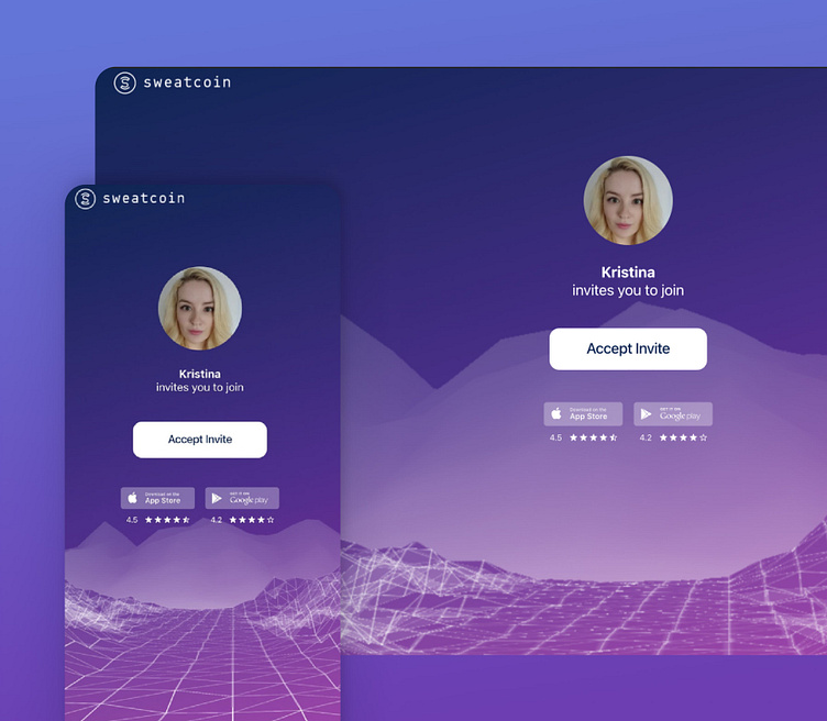
You can see the old general invite page below.
Solution
I decided to start with a bit of research. I checked the most popular prizes in Sweatcoin challenges and noticed that all races with Apple Watch as a prize are way more popular among our users.
As for our charity campaigns - supporting animals & cancer campaigns gathered the most donations.
So for the general invite page, I decided to feature a race with Apple Watch as a prize.
And for the charity invite page, I found an image of a cute dog for the first card and a cancer-themed image for the second card.
We also have a bit of a dynamic element on the pages - the user's first name. So an invited user will see who is inviting them to join Sweatcoin.
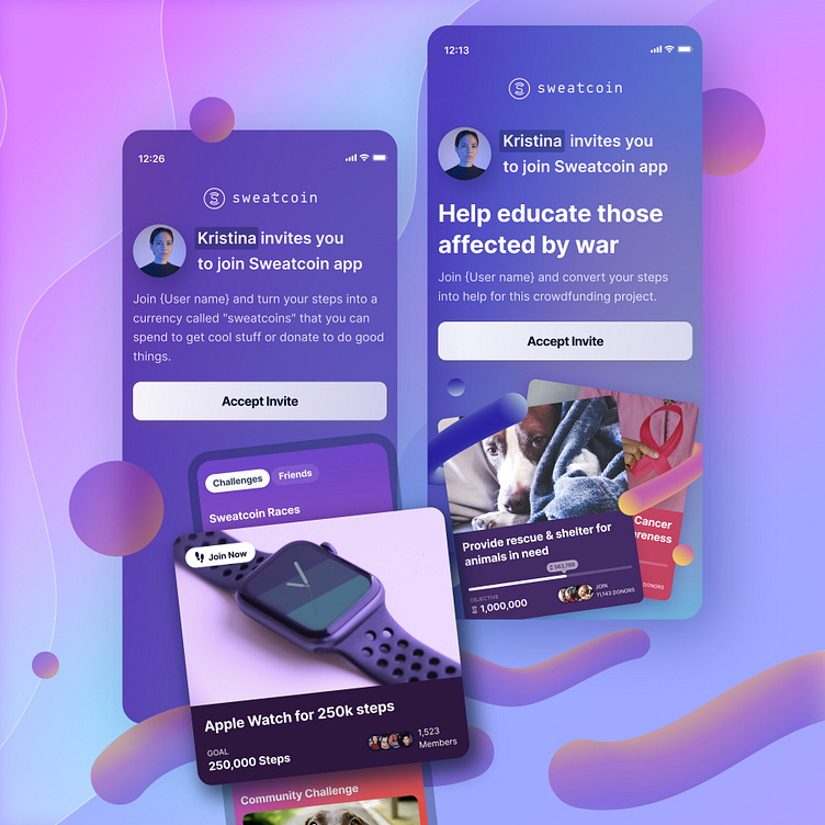
You can see both new mobile pages below.
A/B Testing & Fail
At Sweatcoin we love testing. It's the best way to make sure you're launching only the most valuable features & designs for your users.
So after the pages were built, we ran a series of A/B tests. And in all of them, the new pages were performing way worse than old pages. 🤯
After a bit of investigation, we realised that the reason behind lower conversions is actually the number of choices users faced. People were so overwhelmed by the apple watch, app UI & dog images, that they ignored the main CTA on the page.
Why? As the number of choices increased on our pages, so did the effort required to collect information and make a decision. Simplicity wins over abundance of choice.
Since more effort was required to make a decision - action failed to be taken. And our tests went red. Successful invites dropped by 6% (visitor-to-user conversion) for both iOS & android users.
Summary
I think it was a good learning experience for everyone in our team. We realised that over-beautifying designs & creating more visual distractions is a path to waste users' mental energy. And what's worse, distract them from becoming our users.
Sometimes simplicity is king because it makes decisions effortless, pleasant & fast.
So keep this in mind, test your designs and stay calm.
Love this case study?
Like & subscribe! More are coming.... 😉
________
Follow me on my 📸 personal or 👩💻 professional Instagram.
Or visit my website to learn more about me.
🎓 Learn design with me: Dribbble UI Design Course & Product Design Academy


