Jonkers Navigation

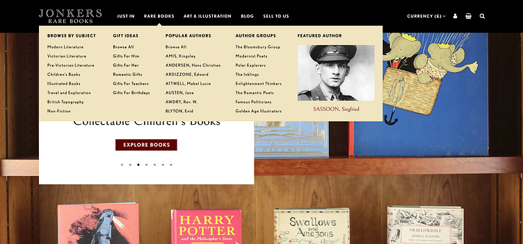
My original plan was to keep the navigation quite simple, with only text links, as the old website had an extensive author drop down with lots of links and author groups! However, the client wanted to add images and make the menu more visually interesting. Therefore, as a compromise, I decided on one mega menu drop down, which combined both images and text into the drop down and still reduced the amount of links shown.
Final mega menu design:
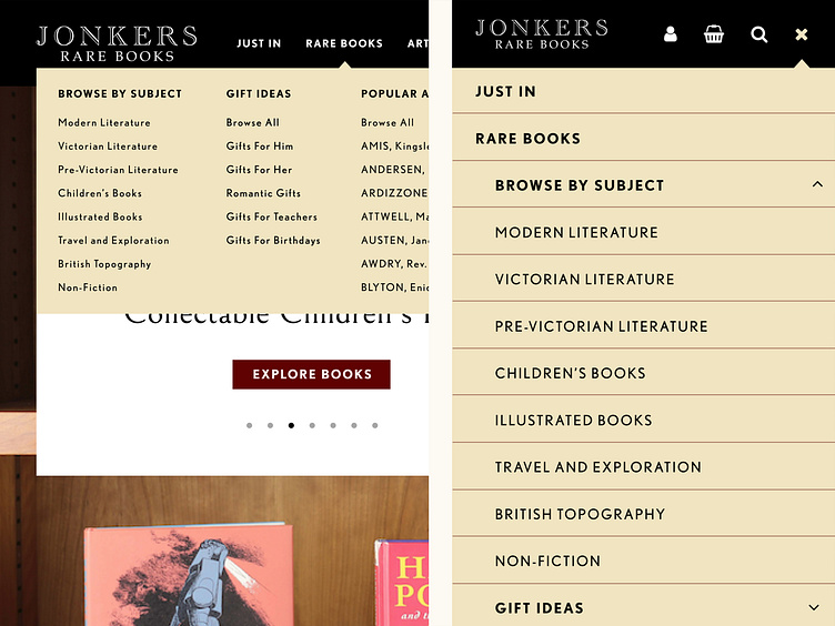
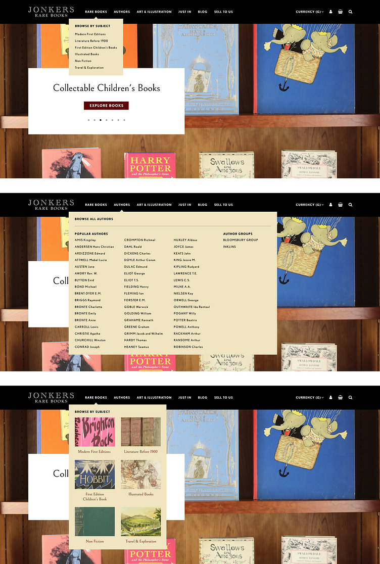
Iterations of the navigation:
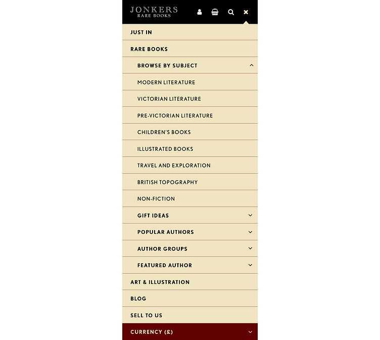
Mobile navigation design, which combined the currency drop down into the mobile nav: