


Rise Branding Design

Rise Branding Design
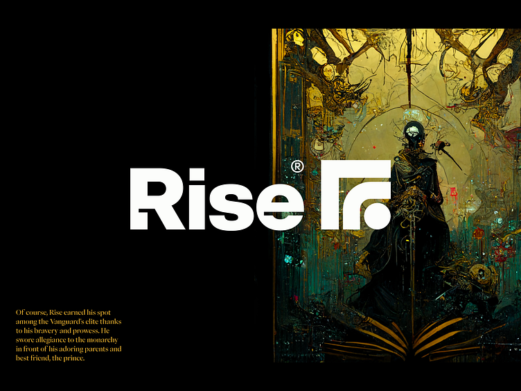
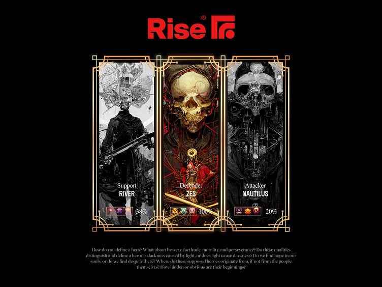
Rise is a multiplayer online battle arena (MOBA) game in which two teams of players face off on a set battlefield. Each player is in charge of a single character with a unique set of skills that get better as the game goes on and help the team's overall strategy.
I was given the opportunity to work on Rise not only on the branding and identity but also on the art direction. Rise is a fusion of mythological with science fiction and cyberpunk aesthetics. including comprehensive images and with visuals that are vivid and eye-catching, such as colors and fonts.
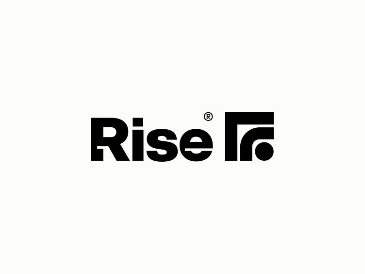
To begin, there is the logo, which is comprised of several components, including a beginning point, the letter R signifying the company's initials in the centre, and forms indicating growth and the word "rise," progressing from the smallest to the largest.
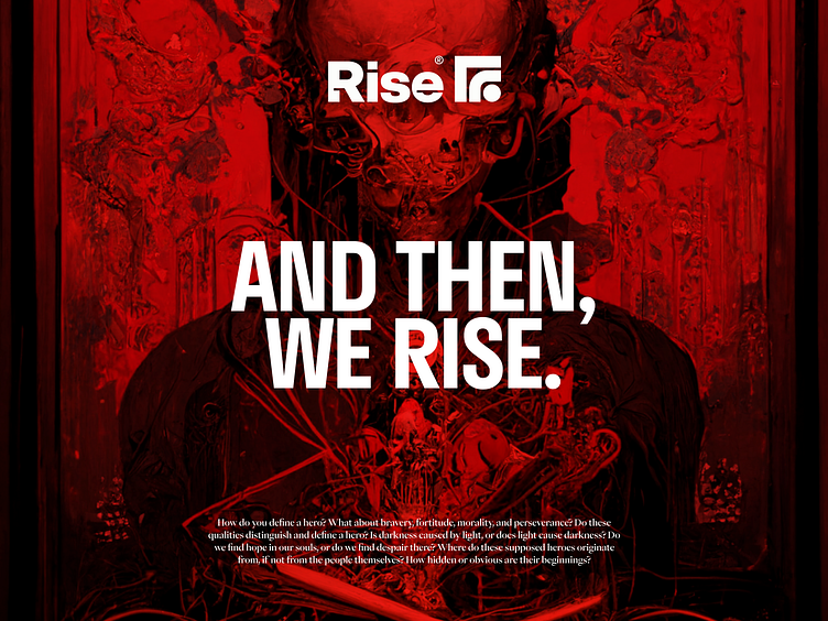
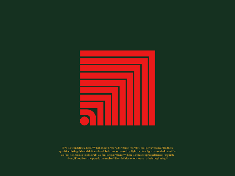
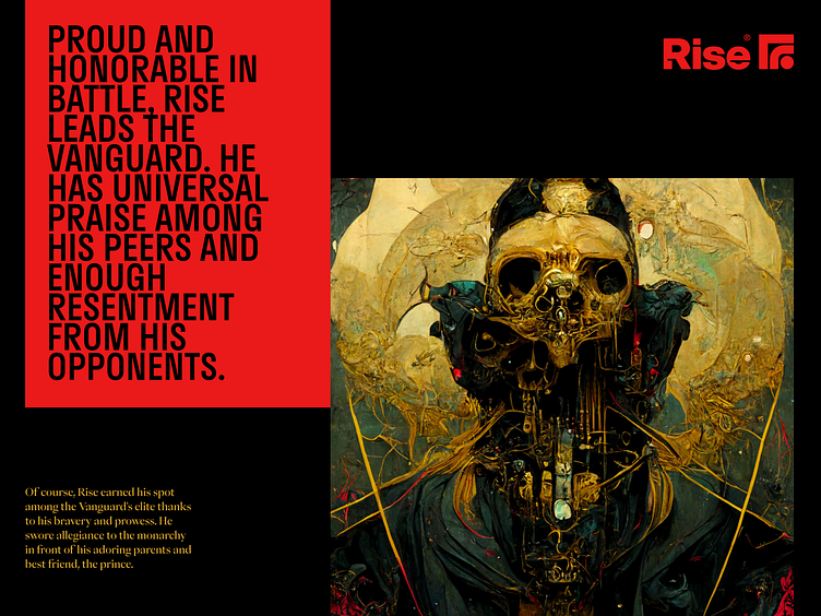
The brand as a whole is intense, dramatic, dark, unsettling, strong, stylish, and luxurious.
Ancient cave art, cuinform, cosmic iconography, served as inspiration for the Rise graphical system. This led to the creation of a distinct identity for the brand.

Get in touch with me:
contact@secondeight.net — www.secondeight.net — Instagram — Behance


