Carolina Panthers Concept

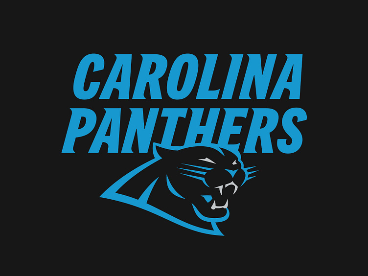
Here’s what I would do with the Carolina Panthers.
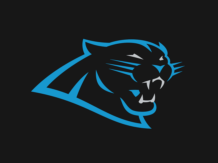
The first task at hand was doing away with the plushy teddy bear-ness of the current mark. In its place is a new, more aggressive panther that still maintains the equity of the previous.
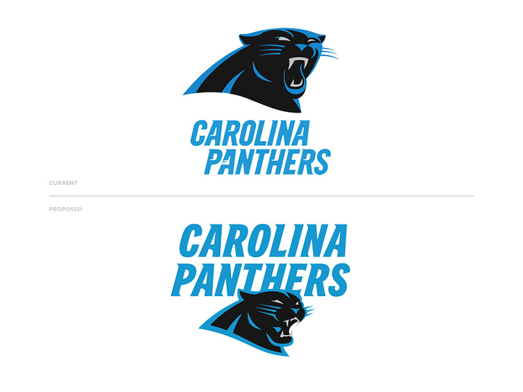
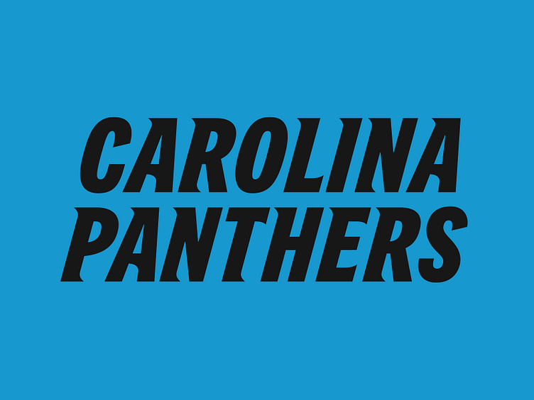
The second subject is the wordmark. While it’s much better than the previous brushed lettering, it still suffers from Corner Widget Hell. Proposed is a solution with a steady visual rhythm and balance to it. With Trade Gothic as a base, the letterforms were redrawn to create motion and take cues from the logo to feel cohesive.
This is only a concept and is no way affiliated with Nike, the Carolina Panthers, or the NFL.


