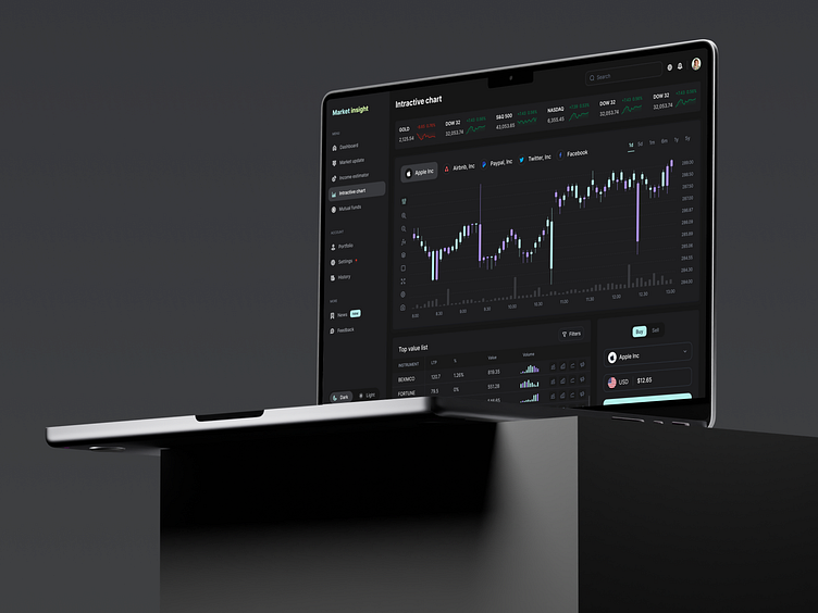
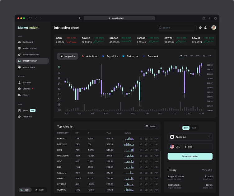
Market Insight: Interactive Chart Dashboard (SaaS)


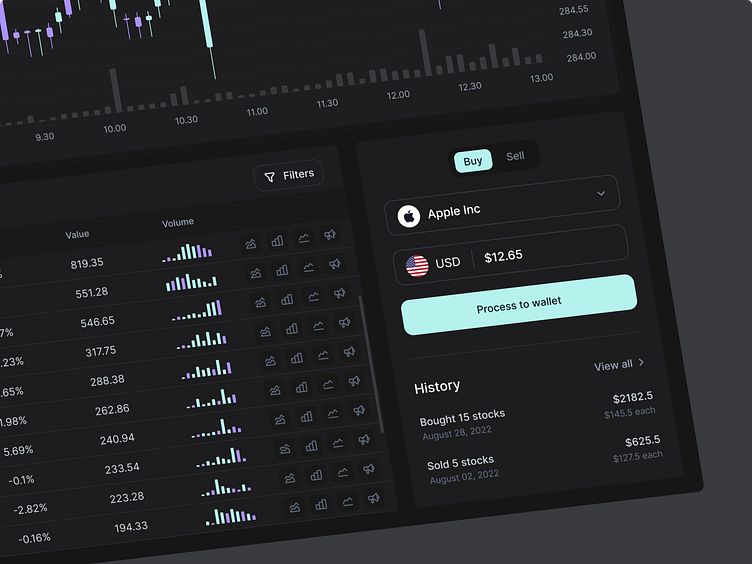
Choosing the right charts and appropriate color contrast is the most important part of visualizing data. The color black for the background makes others' color pop and comfortable for the eye; we also use purple and teal to make aesthetic visuals.
What do you think about the design? We would love to have your feedback!
Boost your business with Single Grain, a premier SaaS design agency that maximizes your revenue through cutting-edge strategies. We develop products designed to convert and captivate users, crafting SaaS landing pages, analytical dashboards, and mobile/web apps for SaaS solutions.
We appreciate your interest, Dribbblers! 😍
Are you in rush? Pick your Schedule: https://calendly.com/musemind/30min
Contact us: hello@musemind.agency
Visit Our Website: musemind.agency
Check Our Design Case Study: Behance
Let's Check Our Others Dribbble Profile:
Musemind Saas • Musemind Mobile • Musemind Branding
Give Musemind a follow below:


