Webinarpalooza Logotype

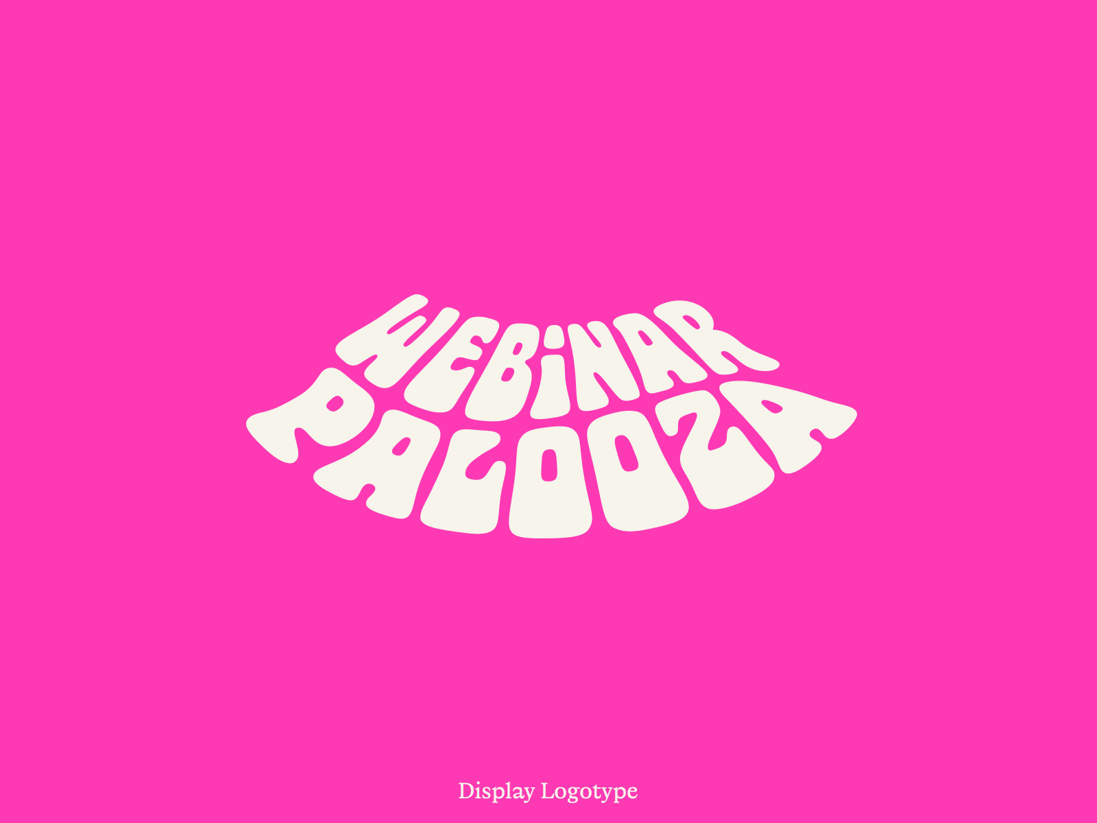
With the wild scale usage of this logotype across the varying collateral, I ended up drawing 2 optical sizes for large and small uses.
The display size is a bit more blobby with tighter spacing while the text size has more squared off forms, open counters, a bit more open spacing and a reduction of the bottom-heaviness you see in the display.
Super subtle stuff but it makes all the difference!


