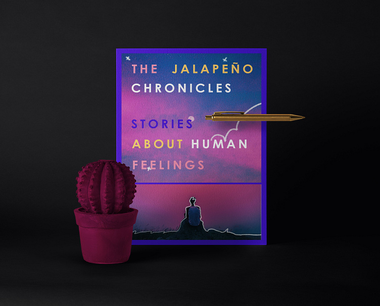
The Jalapeño Chronicles visual identity


Our client was starting a channel where he shared creative pieces of multimedia art. It is called "The Jalapeño Chronicles".
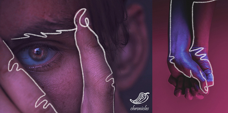
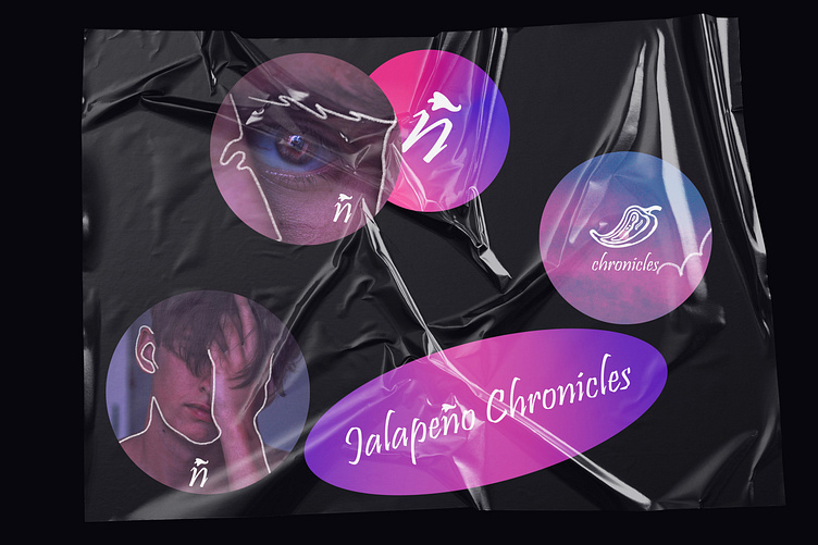
This channel includes stories about various types of human relatable topics through the eyes of one person. The client want the logo to be vibrant, expressive and representative.
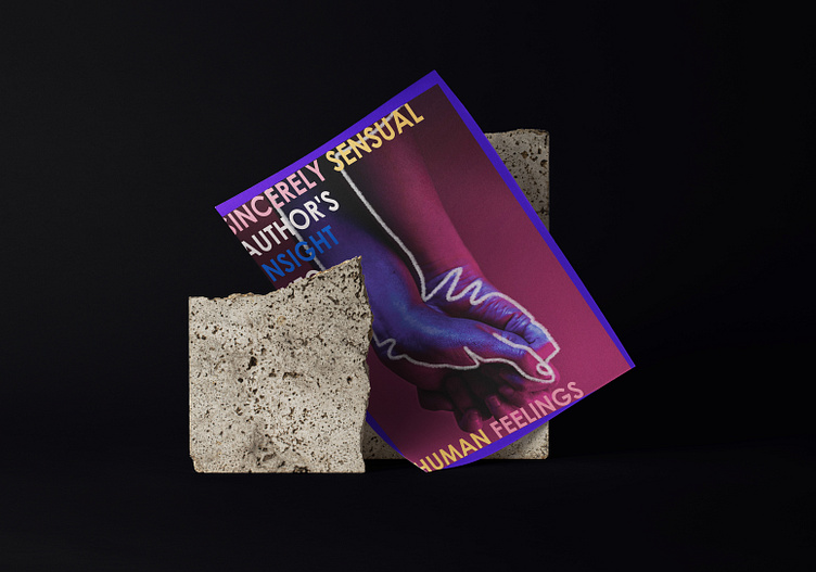
This blog is a wholeheartedly sincere look at the phenomenon of human feelings from the point of view of the author.
You will ask: "But why Jalapeño" ?
It is Client`s nickname, using it gives him an advantage to be more personal with content. It also remind that he is sharing a point of view, a journey and a story through expressive creative ways.
Also "Chronicles" concept is related to factually stating information, in this case author's written content.
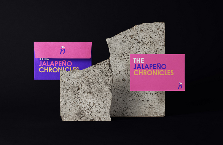
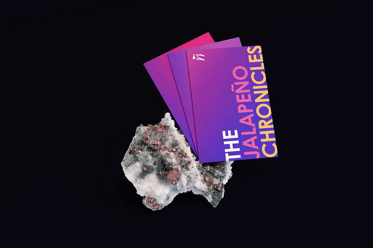
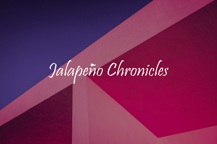
We decided to make bold bright visual identity with large typography for posters and other printed matter. Logotype has a vibrant eccentric tune to match the character of a blogger who talks about human emotions.