Interactive bubble chart / data visualization

I participated in a hackathon at my company last week. We were a team of four backend/data engineers, two frontend devs and a designer (me). We had about 5 days to build our idea.
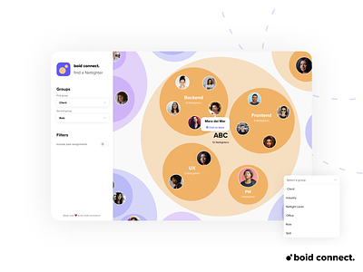
To help colleagues building their network, we used internal data and visualized it interactively. Users can change the inner and outer bubbles however they wish, so they can explore others based on the criteria they are interested in. If they see an unknown face, they can contact them directly.
It was a lot of fun – even though we constantly felt like we were running out of time. (We even got lucky and won it, wohoo 🎉)
-----
(ABC is a dummy company name for confidentiality reasons)
-----
Don’t forget to Press “L” ❤️


