GEO website

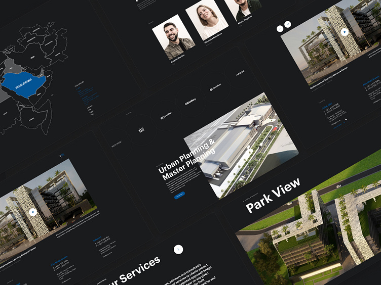
In this mockup, we redesigned the web page of the GEO website.
GEO is a firm of designers, engineers, planners, and consultants providing various professional services to clients around the middle East.
In this work, we used minimalist design, in dark colors, with an emphasis on typography. Minimalism highlight the character of the company engaged in design in the architectural field - nothing superfluous, only the most essential thing, the focus on details. A dark palette is associated with experience, a serious approach to each client, and reliability. Typography is the main element of design. Due to the minimalistic design style, the whole emphasis is shifted to the content. Thus, nothing will distract the user's attention from the central aspect of today - information. Because the one who owns the knowledge - owns the world.
Hope you like it 🙂
—————————————
Thanks for your comments & likes!
Would you like to cooperate with us? Write to us!
Our website: https://www.studiopresto.com
Instagram: https://www.instagram.com/studio.presto/


