Evident - Branding Case Study: Logo, Colors & Typography

Unlocking the value of data for digital companies
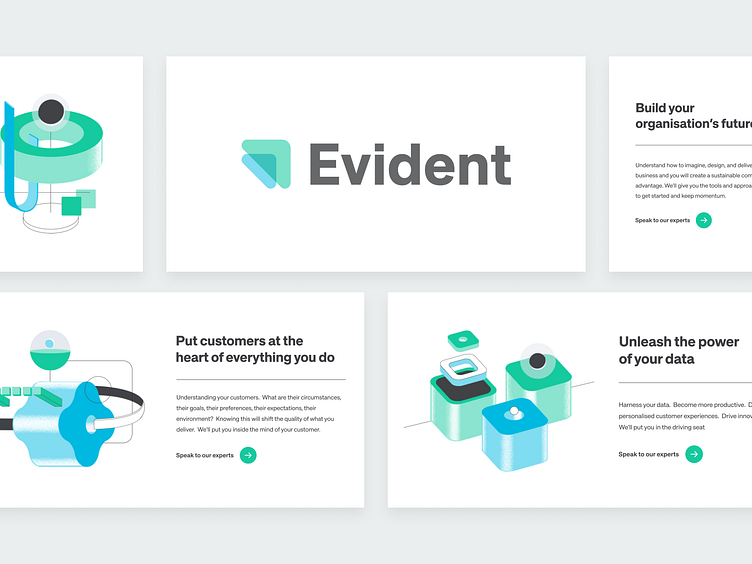
Our team is thrilled to present you with a recent project for a company called Evident Studio. It is a data-driven digital consultancy, making possible groundbreaking transformations for its clients with the help of the new value generated by data analysis.
Naming
The name Evident resonates with the inner sense of the innovations driven by the company.
Their approach is usually based on some evidence (data, factors, etc.) and are evident, and easy to implement by the clients in their day-to-day processes.
The naming itself imperceptibly guides us through the whole branding philosophy of Evident Studio. Professionalism, expertise, and strategy powered by simplicity and elegance form the core of this brand.
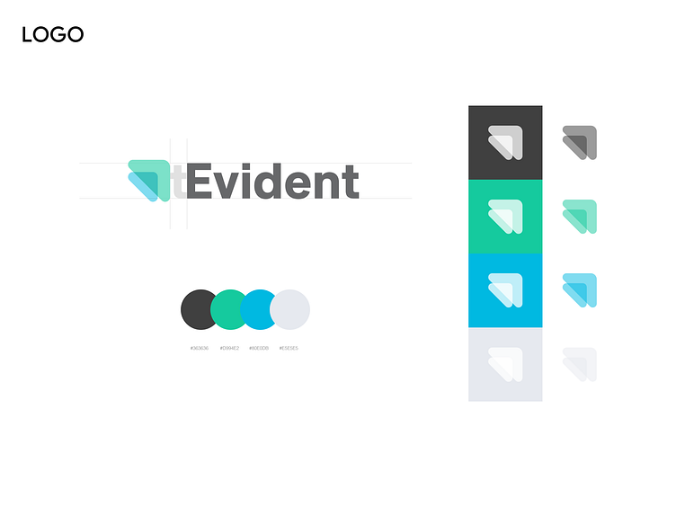
Logo Solution
With the icon playing the main role, its primary message is clarity and a reference to the high-level understanding of the process of finding patterns in data. E.g., merging two data pools to see the hidden insights.
Also, it can be understood as an arrow pointing further and up, thus indicating the strive for progress and growth. Rounded corners give it a soft and friendly look.
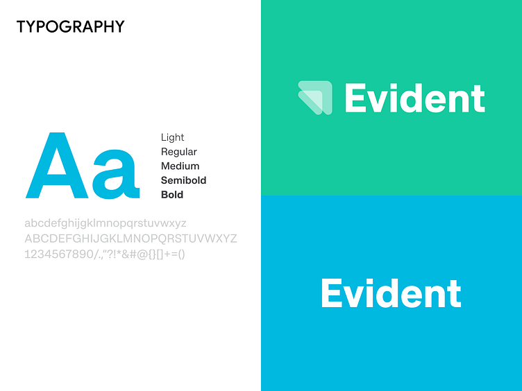
As for the wordmark, we've used the Approach typeface (as well as the primary, secondary, and print font). It is a reimagined early grotesque direction, feeling familiar yet catchy enough. It has a square dot over the "i" letter (which was later referenced by the general direction of the 3D illustrations on the Landing page).

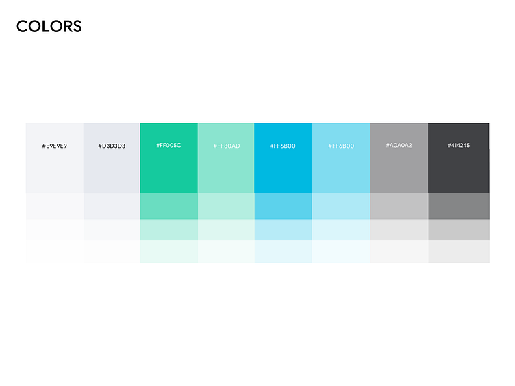
Brand Colors
The color palette consists of two core colors - Evident Green and Evident Blue. The combination of green, the color the human eye is the most sensitive to, and blue, usually associated with trust and professionalism, forms a truly unique and attention-grabbing approach, despite both colors being extensively used in the IT sector.
The character of the brand conveys quality, a high level of expertise in the particular field, yet the ability to evolve, grow and be open to everything new.
Keep in mind that a brand identity reveals its full potential in the combination of its all elements.
A logo alone will not fulfill the function that the brand is counting on.
We are ready to elevate your brand's visual to the next level!
Become a part of Outcrowd communities:


