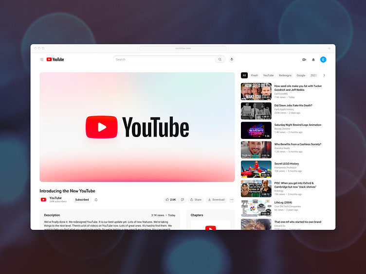
YouTube Redesign Tightened

The latest YouTube redesign really impressed me. Then I spent a little more time and saw the details just were lacking. From strange spacing choices, to massive line-lengths, to odd proportions, to not nearly leveraging YouTube Sans, to misshapen icons, to muddy colors and much more. This is my redesign of the YouTube redesign. See before and after and view the realpixels below:
• YouTube corporate design @1x