Comparison chart

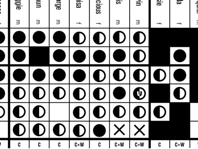
Helping a friend visualise the findings of her PhD thesis and associated research. Here, we cleaned up her attempt at visualising the results of her interviews, and helped install some order. Potential readers can no see correlations between results and the various groups at a glance.


