New Electra App Icon ⚡️

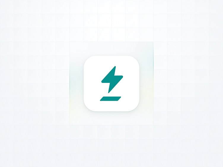
Few months ago, we push online this new Electra App Icon 🎊🥂🎉…
I imagine what you are thinking: it seems rather basic! YUP! But, let me introduce you the work behind it.
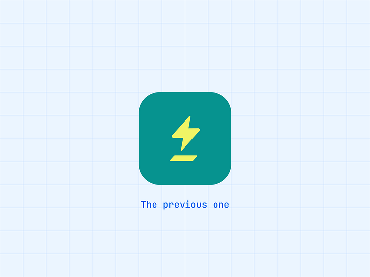
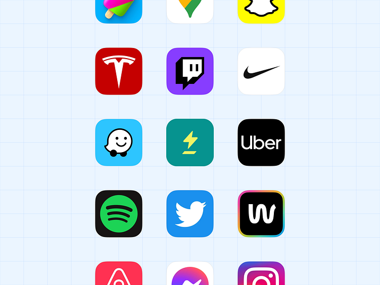
The previous icon had the main lack of being unnoticed besides other icons. So we worked on that 👇
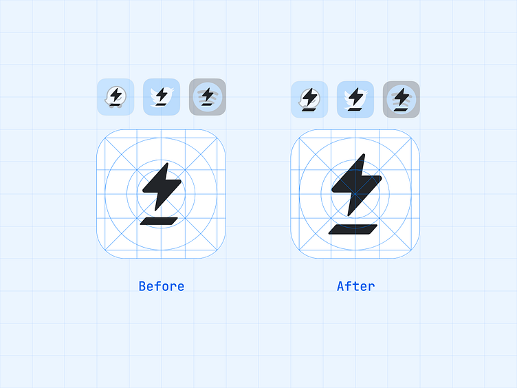
First, get a bigger icon 🤯
The icon is smaller than the others. So we need to expand it.
Yes, you heard me right — don’t tell anyone I said that!
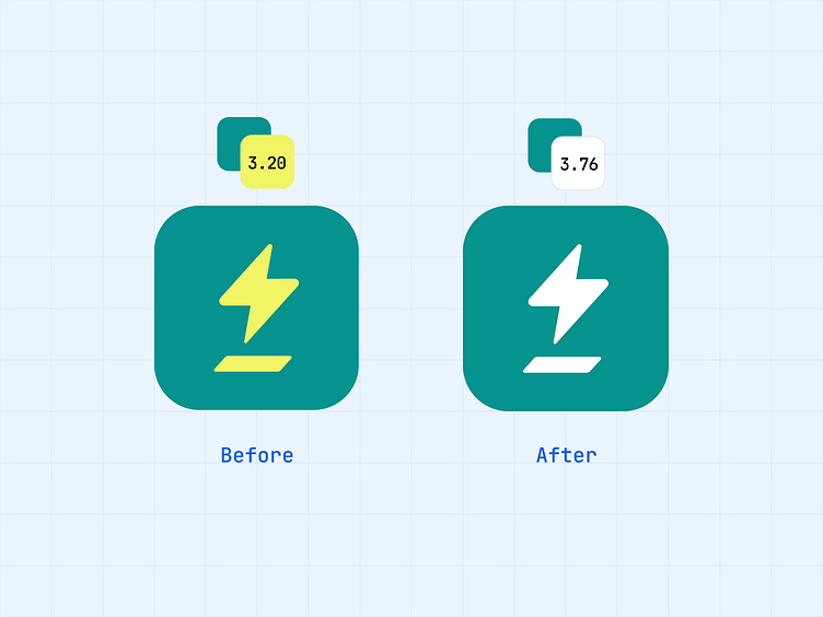
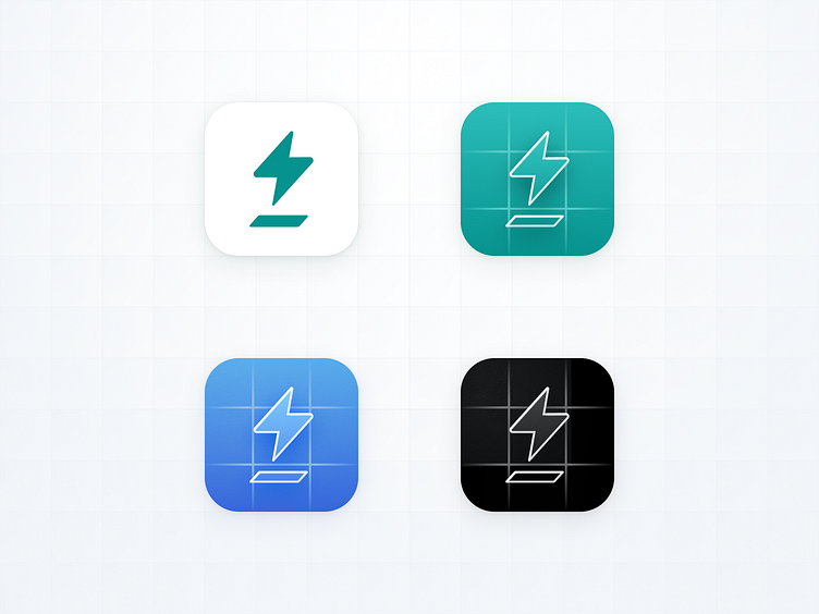
Increase the contrast
The yellow + green have a bad contrast ratio. It’s a little bigger by replacing yellow with white.
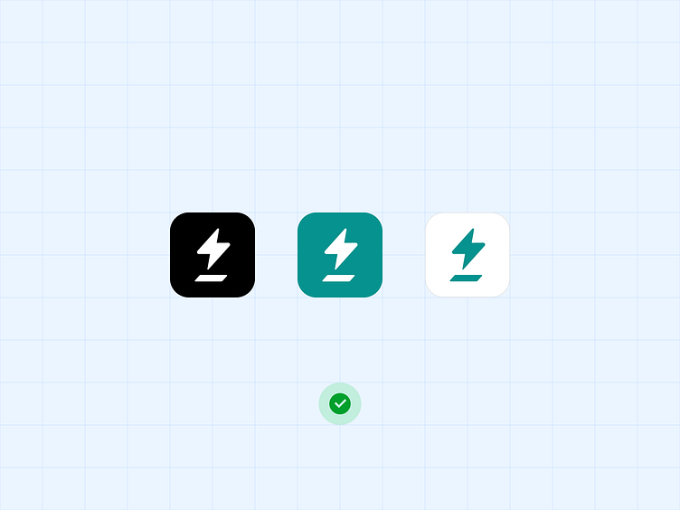
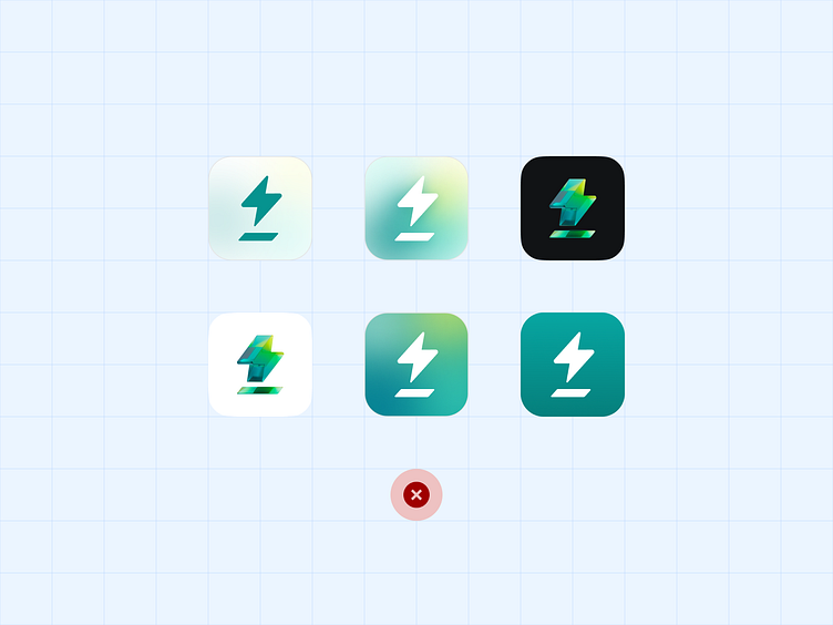
Keep it simple
It's a temptation to use effects, shadows, gradients, 3D, or borders. The Electra UI is simple with a white background. So, we keep it. Simple is strong!
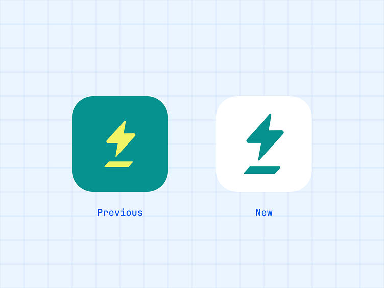
We took the opportunity to create a dedicated version (for stores, releases, develops and local).
❤️
Thank you for watching


