


Bottling Potions - Small batch skincare branding and packaging

For seven years now, Mike has written all of our Smith & Diction case studies. Yes, technically I (I being Chara. It’s me, Hi) am the copywriter around here, but back when we started this company, I was holding down a full-time gig on the side, so I only had time for “real work” not the fun stuff. Plus, Mike is way funnier than I am, which is why our official brand voice basically sounds like a pop punk song.
But now, I’m full time at the studio, and it’s time for me to take over. So I’m just gonna do my best to write like Mike.
Gold Flakes and Donkey Milk
We started working with Sabbatical Beauty wayyyyyy back at the end of 2020. Yes, that’s right this project was a full two years in the making. But we’ll get to that. Just hang tight.
Sabbatical is a small batch skincare business headquartered right here in the BOK Building. They have a cult following for their truly wild products, like the one that has actual flecks of gold in it, and the one made with donkey milk…yes, donkeys make milk, in case you’ve never thought of that before (which I hadn’t), and apparently it makes your skin as soft as a baby’s butt.
Sabbatical came to us because they needed a new brand to help their products feel as luxurious on the outside as they are on the inside. Adeline, the founder/owner, came into our studio and said, “I want you to make me some trippy shit” while telling us how she sees herself as a kind of witch, brewing up magical potions to keep people young forever. We were like, “OH. HELL. YES.” because we love making stuff that walks the line between elegant and WTF is going on here.
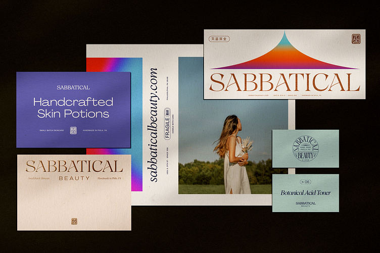
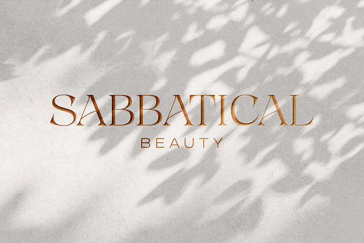
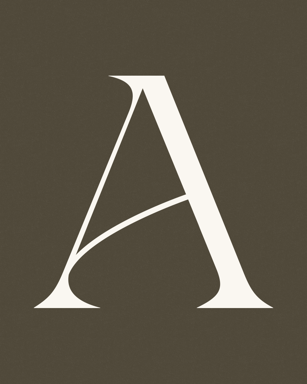
That witchcraft vibe came through strong in the wordmark. Yeah, it’s got a luxurious elegance to it. But it ALSO has these super sharp, deep, angular serifs (especially on the S & C) that give it a totally witchy vibe. Then Mike customized the crossbars in the three As to have a delicate upward swoosh, which gives the whole mark a feeling of motion and flow. (The base typeface is Grand Cru for anyone that’s curious.)

Botanical Academia
Before starting Sabbatical, Adeline worked in academia. Then she took a literal sabbatical, and during her time off she launched this business, and never went back. So in addition to the undertones of magic, we also channeled some academic vibes in the brand, making an official-looking Sabbatical seal that would feel at home on a diploma or something like that.
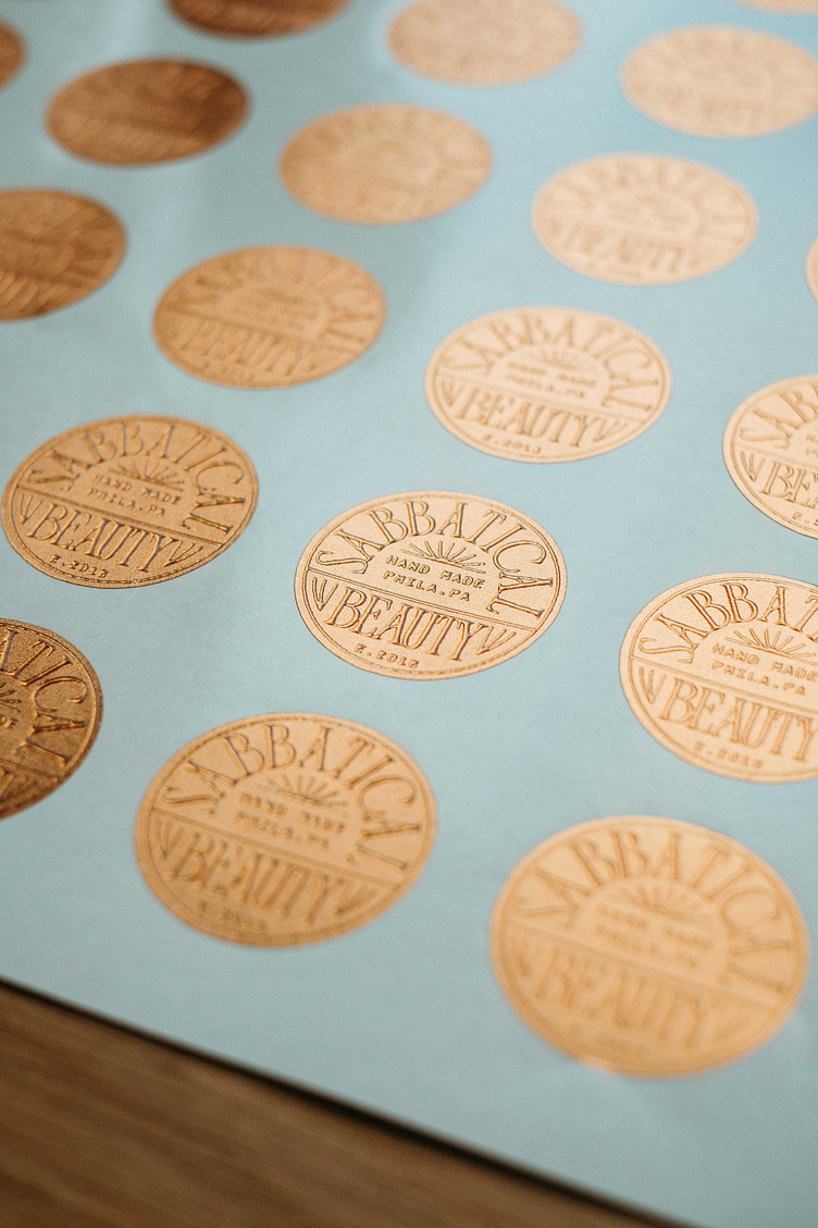
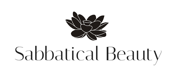
In the middle, Mike put a super abstract, geometric version of a lotus flower, as a tiny homage to Sabbatical’s previous logo (cue White Lotus S2 intro song). This jam was meant as a little extra supporting element, but we ended up using it ALLLLL over the place, from gold foil embossed stickers to the sign outside Sabbatical’s brick-and-mortar space.
Witches and Snakes and How to Make a Logo
That witchiness Adeline wanted to incorporate isn’t just a side vibe — it’s like, her whole deal. She told us about a Chinese phrase — 文武双全 — that essentially means “be a scholar, be a warrior.” And she talked to us about how she reinvented that phrase into something all her own, replacing “warrior” with “witch” — 文巫双全. For Adeline, this perfectly represents her potion-making, a blend of actual chemistry and indescribable magic.

After our first talk with Adeline, Mike was pretty much immediately like, oh yeah, that witch symbol — 巫 — is gonna be the logo. And honestly, that’s kinda typical. We don’t pull magical brand ideas out of thin air, we just listen to our clients. We just get folks talking about why they wanted to start a business in the first place, what they love most about what they do, and all their big blue-sky dreams, and at some point during the conversation Mike doodles a little note in his notebook, and that evolves into their brand. But I digress…
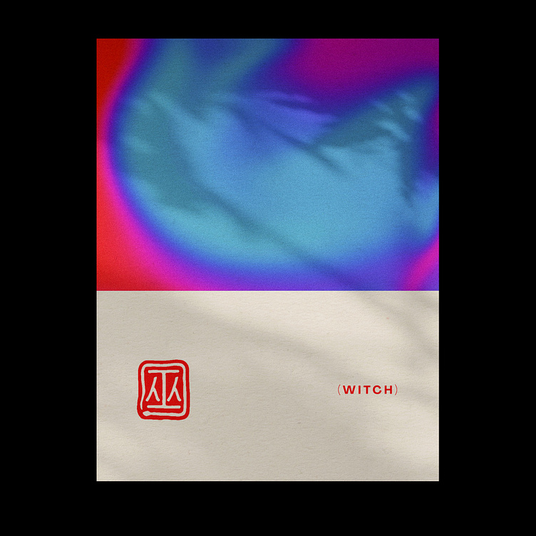
For the logo, Mike gave that 巫 symbol a subtle snake coiling around it, representing healing and rebirth. It functions like a nice grounding outline, but has way more interesting meaning to it. And he gave the whole mark a natural, imperfect vibe, mimicking Sabbatical’s whole approach to natural beauty.
Look close, and you’ll see that we also use the full “be a scholar, be a witch” phrase — 文巫双全 — as a brand element in a few places, but it’s much more low-key than the main witch/snake mark.
Print ALLLLLLL the Gradients
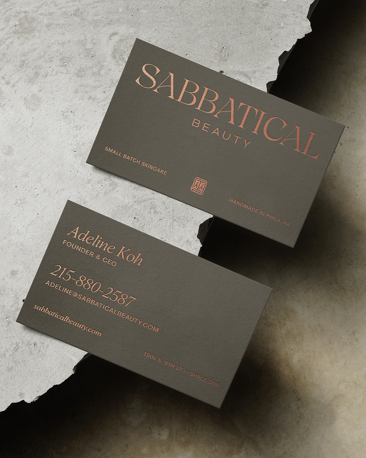
Building out this brand was fun, because the Sabbatical team had about a bajillion tangible pieces of collateral they needed: actual product labels, boxes, tissue paper, stickers, business cards, note cards, ingredient lists, you name it.
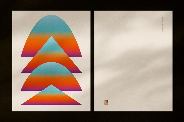
We leaned into some wobbly, potion-y, witchy gradients to give the brand some texture and color — rather than sticking with straight luxury. Not all of these elements made the final cut (hello budgets), but we loved the original vibes. So here they are in all their unrealistic gradient-saturated glory.
Lotus Redux
Remember that pre-Smith & Diction lotus logo from way up like four minutes ago? Well, that botanical element still felt really important to the Sabbatical team. As much as they dug the new witch/snake mark, they also wanted to include something organic/natural/floral in the brand, too. So Mike spent wayyyyy too long making a new lotus icon for them, giving it more structure, symmetry, and originality than the original mark. Then he brought in some principles of sacred geometry, and used that to give the lotus a really gorgeous glow.

We made this thing into a pattern, perfect for tissue paper and notecard backs and such. Someday it’ll probably be wallpaper in Sabbatical stores across the country.
Packaging in Paradise (aka the drama you’ve all been waiting for)
If you were reading closely back in the beginning of this thing, you might currently be wondering, when do we get to the whole this-project-took-two-years-to-roll-out drama. And if you’ve ever read any of our other case studies, you’re probably wondering when we’ll get to the Mike Smith-style YOU ARE NOT GONNA BELIEVE HOW HARD IT WAS TO MAKE THIS SHIT HAPPEN story.
Well, you’ve arrived. Bust out a bowl of popcorn and enjoy the show.
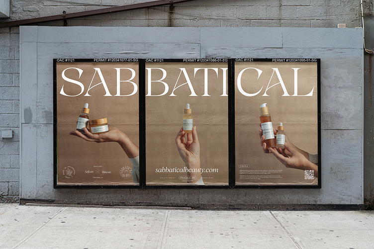
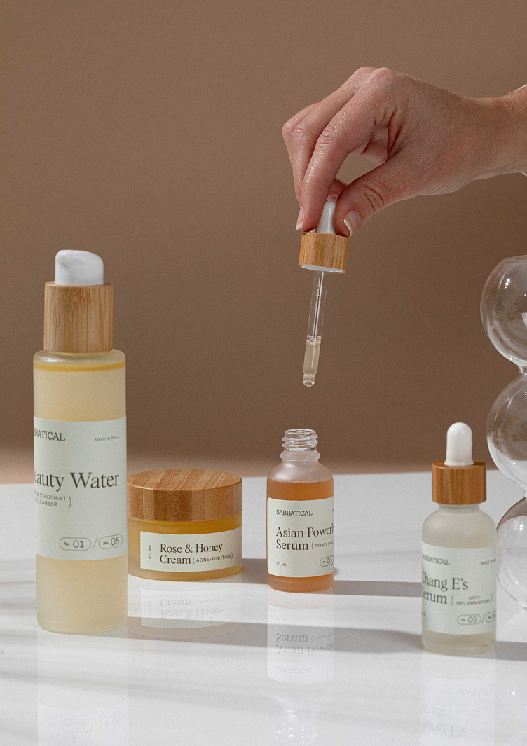
When you’re a skincare company, far and away the most important part of your brand is the packaging — the actual little bottles of cleanser, serum, and lotion that sit on people’s bathroom shelves. So once we had the core brand established, we were like ok let’s get these labels made for real (not just mockups), and I’m pretty sure we hit every possible road bump that exists in this kind of process. Because before we could design the labels, we had to pick new bottles — and it was ~M~E~S~S~Y~.
First, we had this idea to do some super gorgeous copper-colored bottle tops. But it turns out that copper has more tones and sheens than a frickin’ sunset, and it was impossible to guarantee consistency without placing custom orders of like 100,000 bottles at a time. Which, no. This is a small business in the actual small business sense. We’re talking batches of like 100.
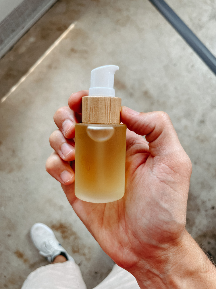
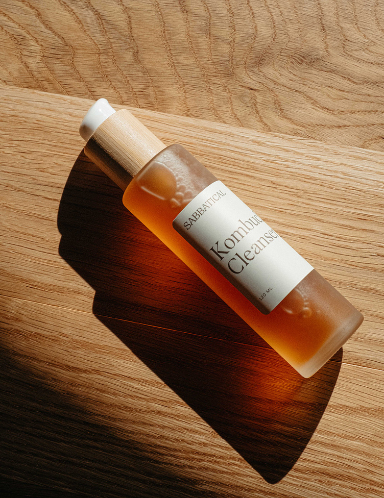
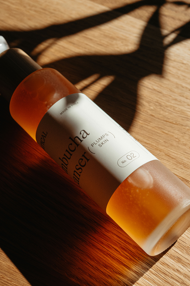
Round two. We settled on these beautiful frosted glass bottles with bamboo tops. More sustainable, and bamboo is pretty tough to mess up, it just always looks like bamboo. Cool! You would think that was the end of that story, but you would be wrong.
Remember in 2020 when the whole world was talking about “supply chain issues” but most people didn’t really know what it meant? Well, let me tell you. It was like you size out all the bottles you need and painstakingly calculate sizes and pick tops and finishes and call a guy in China and get him to price out a whole line of bottles, and then he ships them to you on a very slow barge and you wait a month for them to arrive and then when they do, they’re just like, totally different bottles and you call him back and ask WHAT HAPPENED???? and he says, oh sorry yeah one of them is plastic, not bamboo, and that other pump top you wanted was out of stock so we swapped in a different one IDK SUPPLY CHAIN ISSUES. And you’re like MY GUY didn’t you think maybe you shoulda mentioned that before shipping them to us via the slowest shipping on Earth, but of course he didn’t because why would he. Then you start the process over with him again, saying no we don’t want that ONE SIZE to be plastic, we want them all to be bamboo like we said originally, and he says ok but this time (after another month waiting for the next actual barge to sail from China) one bottle is 2 oz smaller than you wanted and you’re like yeah well, the whole product is only 10 oz so that’s kinda a big deal and so on and so forth for A SOLID YEAR. Nightmarish, not just for us, but for the very hardworking folks at Sabbatical, too.
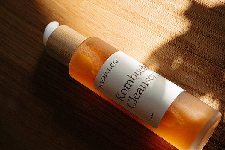
BUT the final bottles are, thankfully, adorable. Bamboo tops, cute little hints of white, frosted glass. ~chef’s kiss*~*
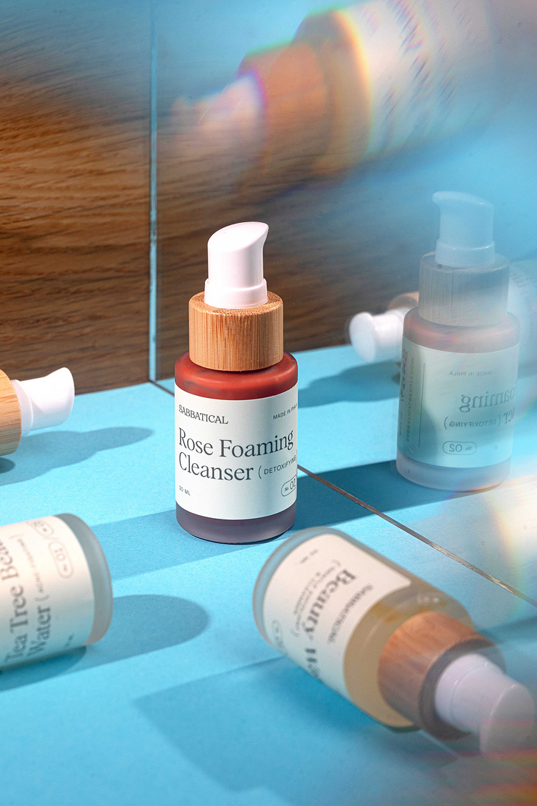
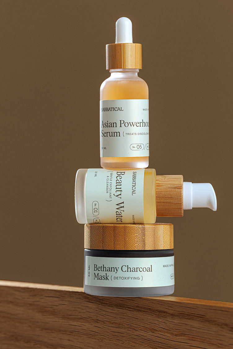
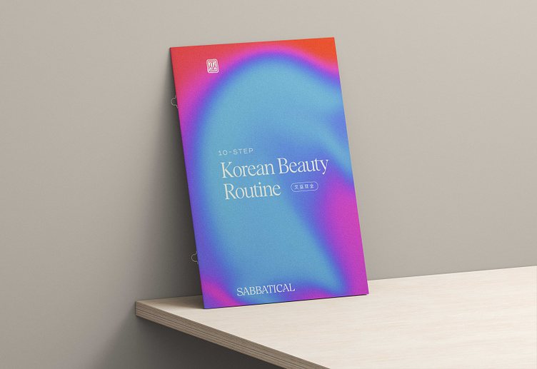
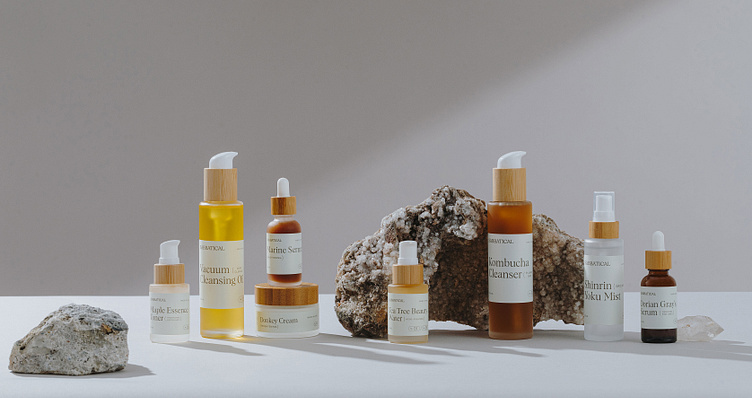
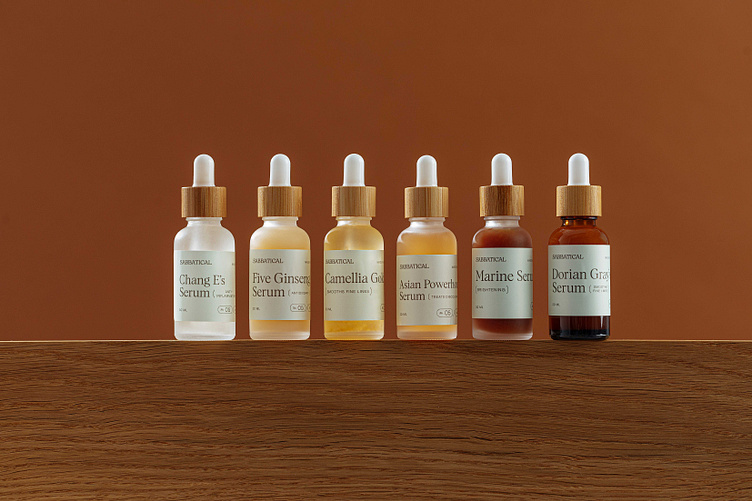
We also had QUITE a time designing out the label system. Sabbatical leans into a 10-step Korean beauty process, which means they have a million different products, in all different kinds of bottles, shapes, and sizes. Mike designed out the initial label layouts to be absolutely gorgeous, spacious, and stunning…then after all the above-mentioned bottle hullabaloo, I gave him the final sizes and we were like WELL SHIT THIS AIN’T GONNA FIT AT ALLLLLLLL.

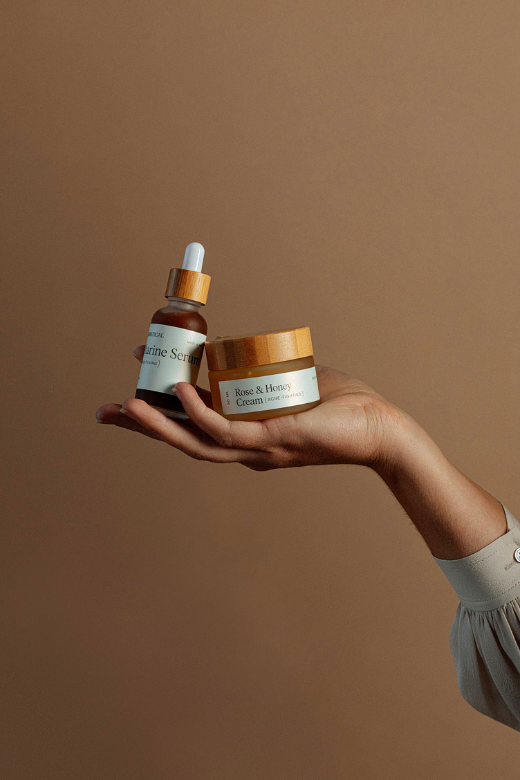
But honestly the remix is even better than the original. We put the labels on a super soft green color that we don’t use anywhere else in the brand — but it really balances out the colors of the actual products, and gives a nice clean palette to let the super fun product names shine. And it gives them an evergreen quality — since a label with a ton of color could get old pretty quick.
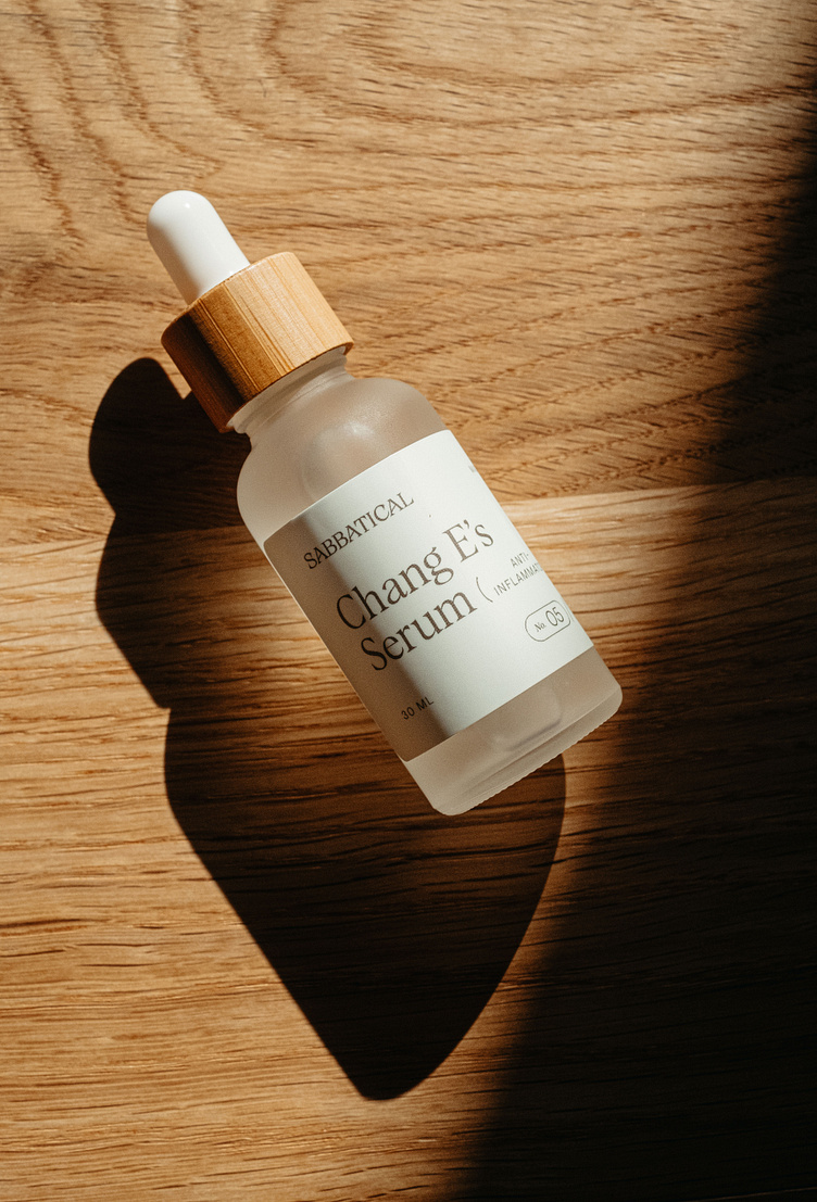
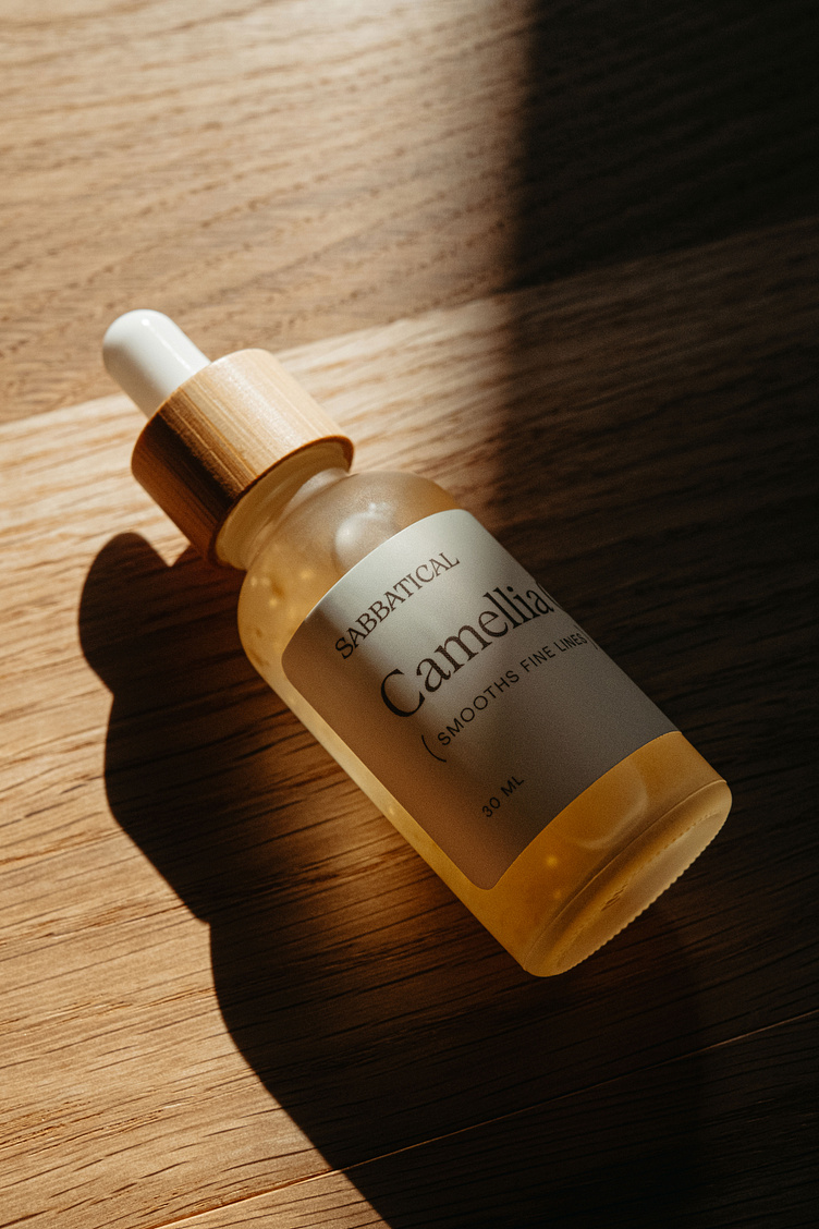
We also built a system of cute little parenthetical descriptions, so people know at a glance what each product does (hydrates, cleanses, smooths fine lines, etc.). This really ties back to Adeline’s witchy/potion-y vibes. It makes me think of a literal witch’s cabinet that has like unicorn horn for longevity and spider hair for loyalty and whatnot. Obviously witches are writing their ingredient labels on masking tape, but it’s got the same energy.
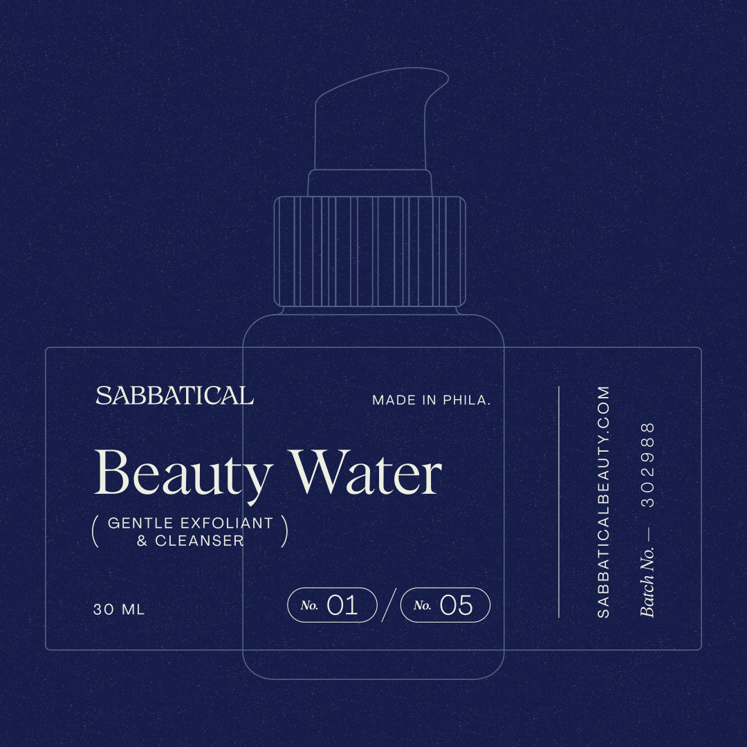
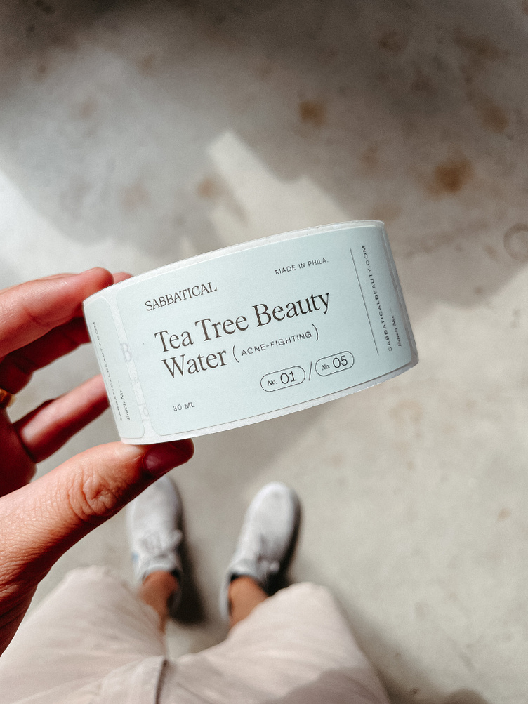
The labels also have a little number system to show which step in the 10-step skincare routine each product is used for. That way folks who are like, ALL IN on their routine can line ’em up in number order and not have to think too hard about which step comes next.
Quick shoutout here to Summer, who joined our Smith & Diction team earlier this year and spent a VERY LOT OF ENERGY wrangling every single product name, size, benefit, and stage to make all these actual labels. It was an absolute puzzle to get all the different names / descriptions to fit and look nice and consistent on all the different label sizes (especially the one that’s only ¾ inch tall no exaggeration). But she did it, and we love them.
Wrapping It All Up
We also thought through the shipping/unboxing experience, since Sabbatical’s business is mostly DTC. We went handcrafted meets high-end, with a pop of unexpected celebration.
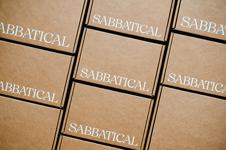
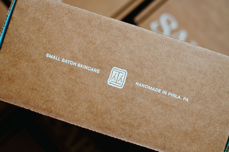
The boxes themselves are kraft with white ink, which is hard to find as it turns out. We talked to at least three different printers who were like, yeah no problem we can print a faux kraft on white boxes no problem and I had to be like ABSOLUTELY NOT and start all over again. But the final boxes are so so good. Nothing more classic than screen printed white on kraft.
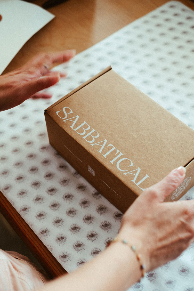
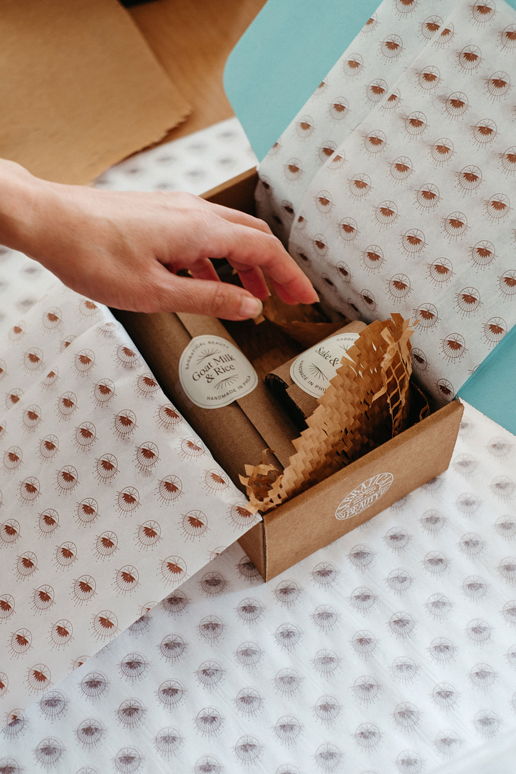
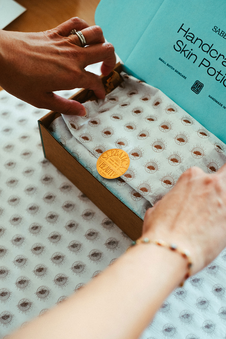
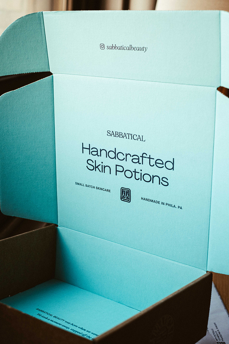
We went minimalist with the outside design, just that gorgeous wordmark spanning the entire top of the box, then we flooded the inside with color to get people hyped on OMG MY NEW FANCY LOTIONS/POTIONS ARE HERE.
Then we wrapped it all up with some shining lotus tissue paper and sealed it with an embossed copper seal.
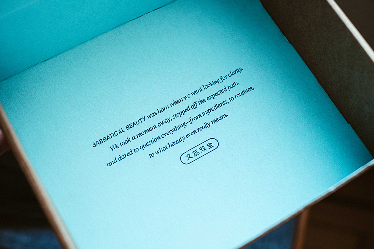
Naturally, we also included our little witch/snake logo on there, too, and we used the interior box bottom for a nice little brand copy moment, obviously my favorite kinda vibe.
Sabbatical Beauty was born when we went looking for clarity. We took a moment away, stepped off the expected path, and dared to question everything — from ingredients, to routines, to what beauty even really means.
(be a scholar, be a witch)

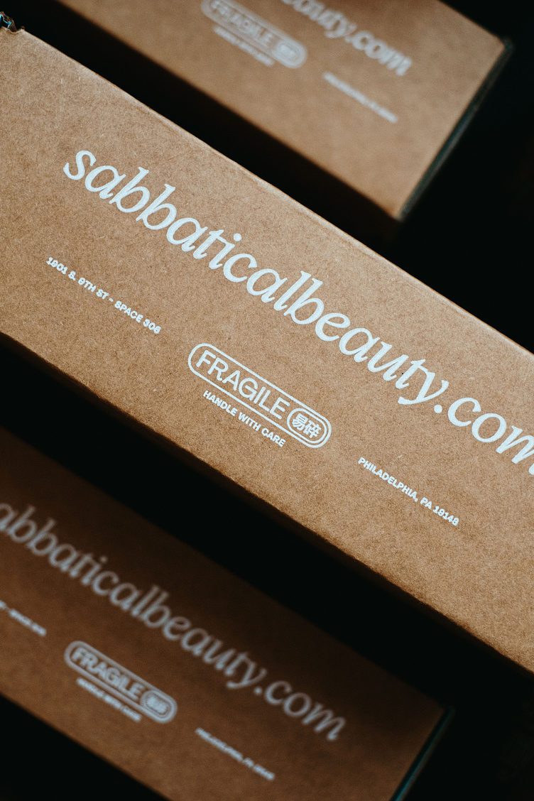
The back of the box also got some absolutely gorgeous details. We added a nice big URL for any nosy neighbors looking at this on someone else’s porch who might want to give it a Goog, a return address (practical, ya know), and a custom FRAGILE lockup because these glass bottles are definitely very fragile.
Dialing it Up to the Absolute Maximalist
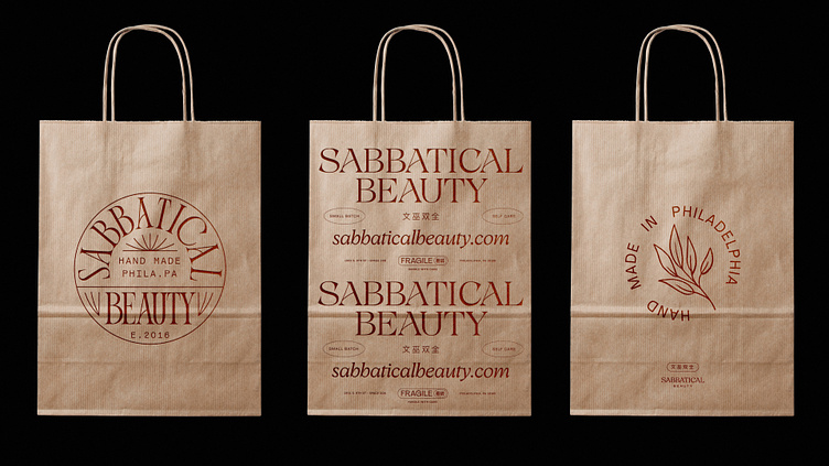
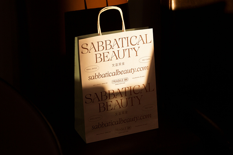
We also designed out some simple kraft takeout-style bags for the Sabbatical team to use when they sell things in their actual store. Some of them felt real clean and minimalist, but Mike also did a real unexpected maximalist one that defs channels the “I buy serum with gold flakes in it” kinda vibe.
In the end, the Sabbatical crew just bought some plain kraft bags and stamped them with the little academic seal rather than doing a custom print run (budgets, baby!), but we’re still crossing our fingers for these to be real a few years from now.
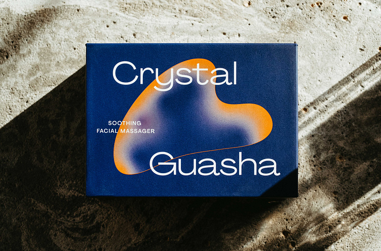
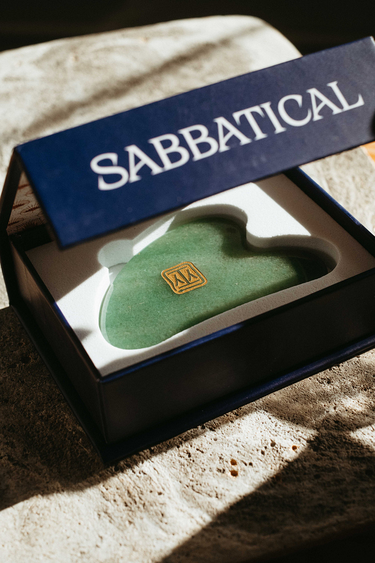
Guasha Box
Finally, we also designed out some custom boxes for Sabbatical’s crystal guashas. We took these down a totally different route than the bottles and shipping boxes, with all sans serif type and moody colors. We wanted them to really balance out the light and airy product packaging, and boy do they. Plus, come on, who doesn’t want to see a logo they made engraved into a crystal then plated with gold? Almost too fancy to use.
Pop in. Pop up.
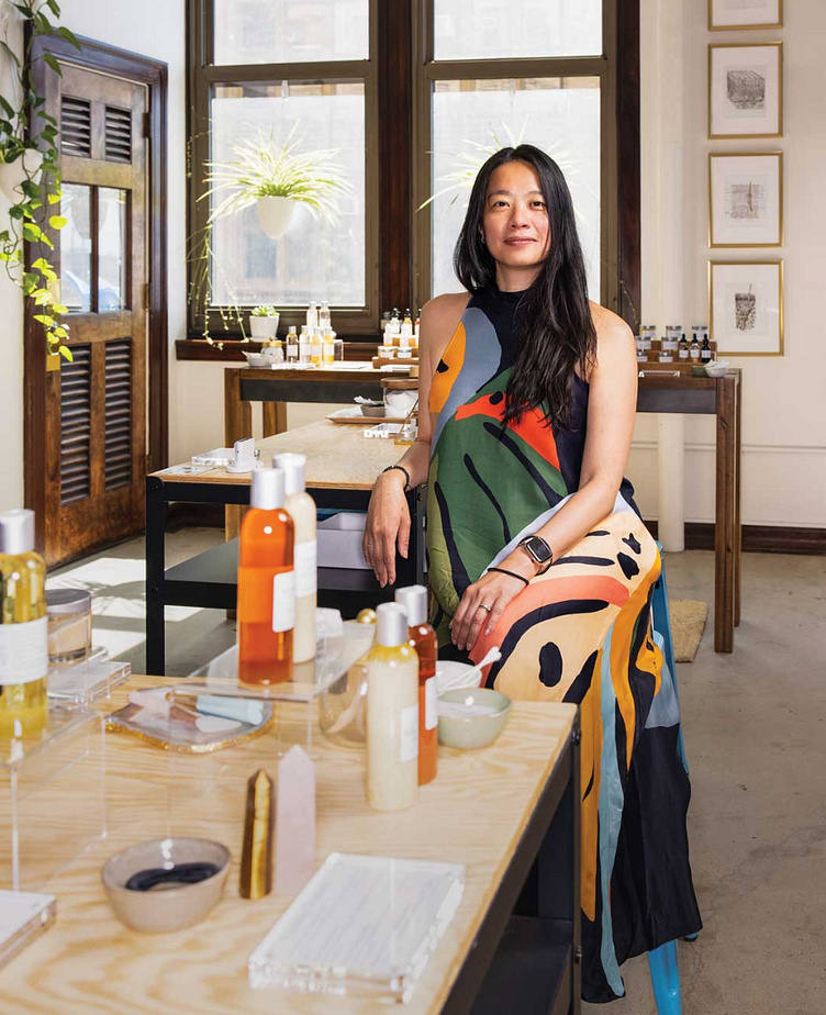
Next time you’re in the BOK Building, pop up to space 308 to get a feel for these products yourself, in Adeline’s beautiful showroom. She and her staff are some of the kindest people and genuinely love helping people look and feel their best. Stop in and support a small, Asian-owned business for Christmas, for Valentine’s Day, for Winter Solstice, for anniversaries, birthdays, or for random Wednesdays. Then take the stairs up to the 5th floor and say Hi to us in space 510! We love visitors.
We’re so lucky to work in a building that supports and champions small businesses and encourages collaboration within its walls. We’ve met so many inspiring business owners and feel incredibly grateful to be part of this colorful community. Also shout out to Thu at Càphê Roasters for making this intro!
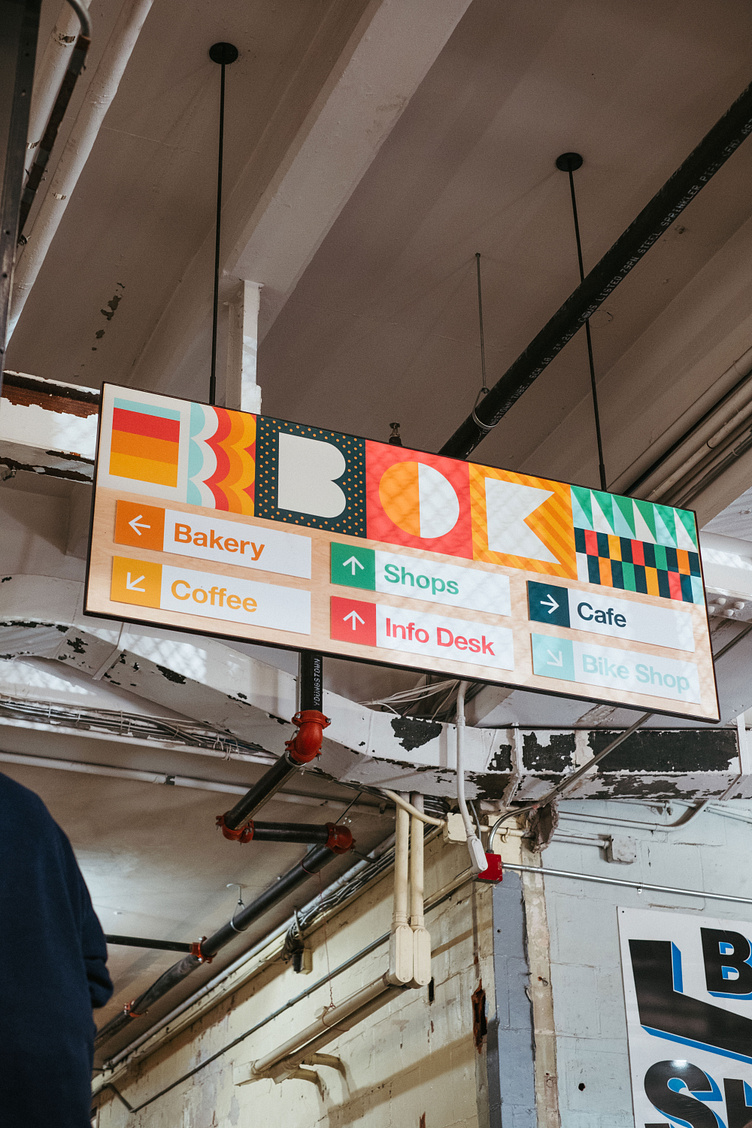
Bonus thing, we made this cool sign for BOK a few months ago. I think it’s very fun. Shout out to DNL DSN for the fabrication on this piece.
Did you like this project? Want to work with us and make some weird and/or fancy stuff together? Let's goooooooo.
Shoot us an email at → hello@smith-diction.com. We love talking to all kinds of folks. Even if we can’t work with you for some reason, we’ll try to intro you to someone who can! Networking!
Download all of the photos from this post here.


