Brand identity POLYSTEEL

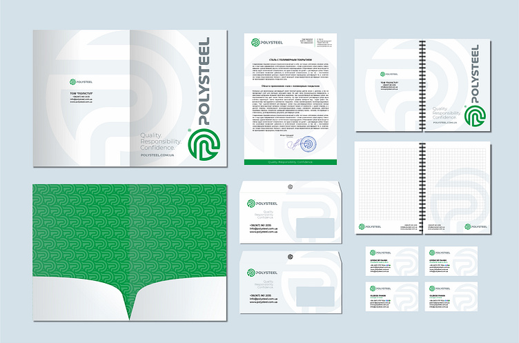
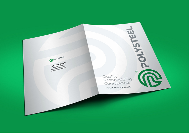
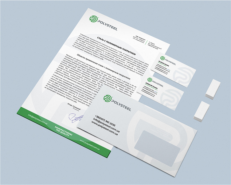
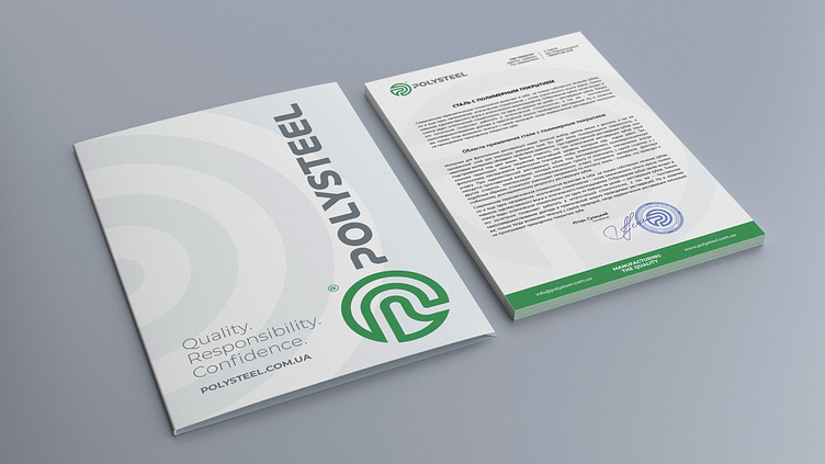
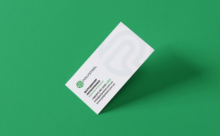
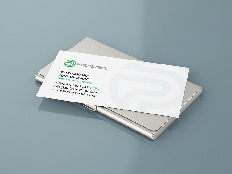
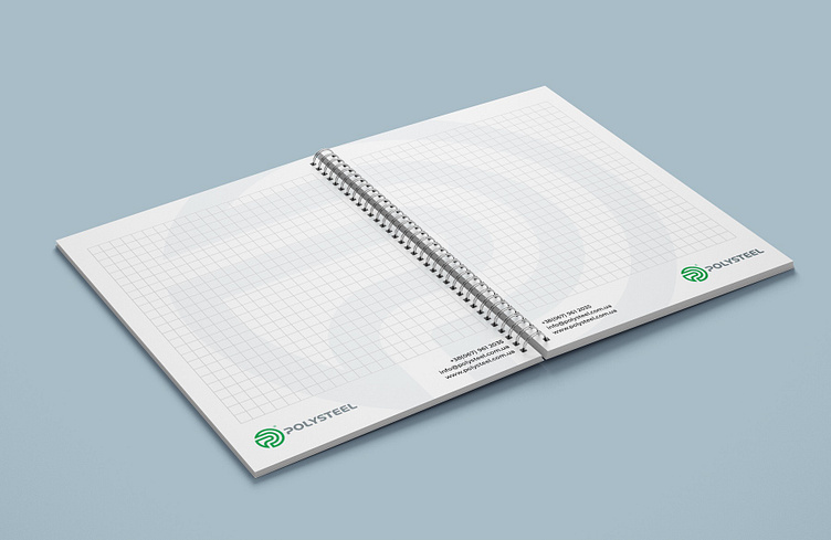
At the request of the client, two versions of the corporate identity were developed. One of them is in light style as shown below. The round graphic element has become an interesting and harmonious basis for design.
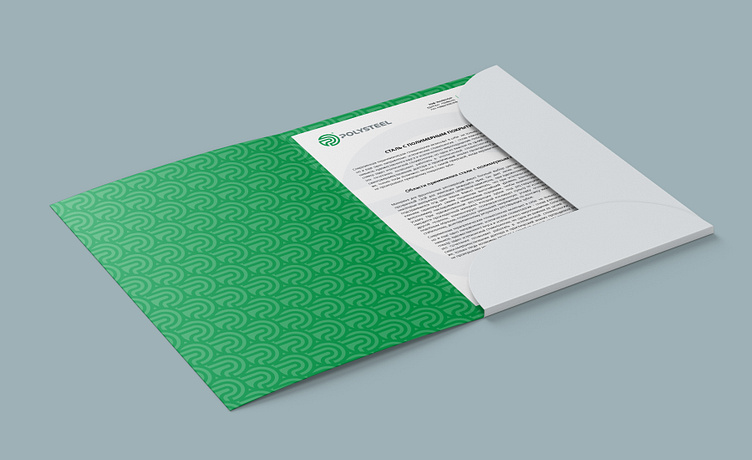
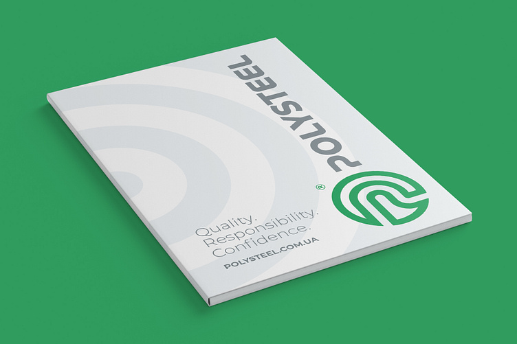
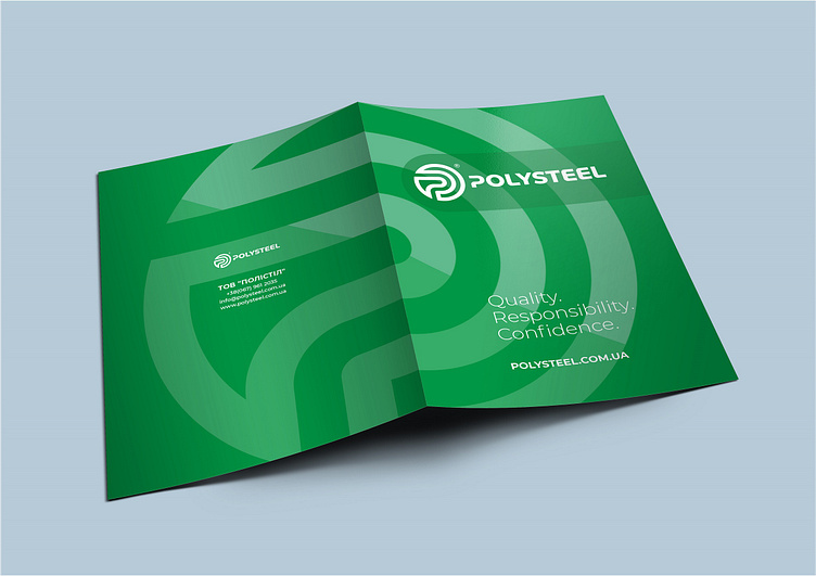
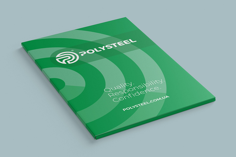
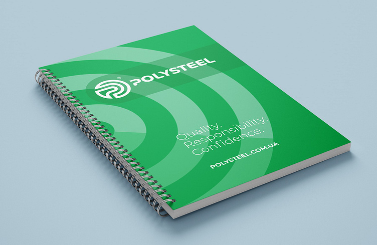
Below is the second design option in green tones. It looks brighter and thus attracts more attention, which is quite appropriate for marketing purposes.
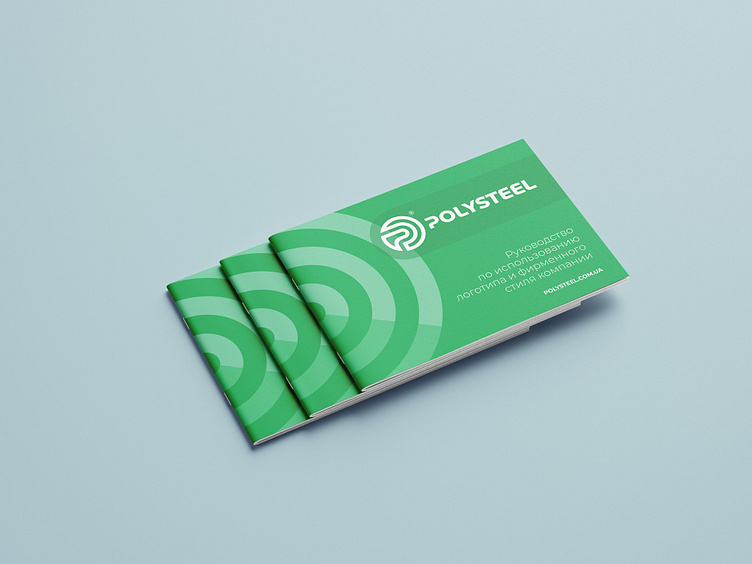
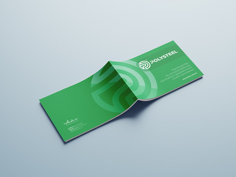
The prepared guidelines for the use of the logo, corporate graphics, colors and fonts will serve as a consistent and harmonious design of offline and online advertising media in the future.