WunderPass – Logo


Hello everyone!
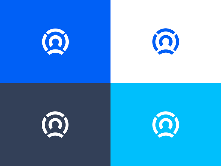
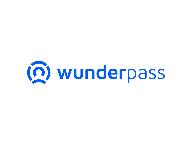
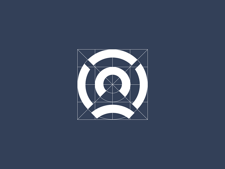
The original logo was good, but needed a bit of tightening and refinement. For a start, we took care of the symbol. We focused on precision and cleanliness. When we fixed the symbol, we adjusted the wordmark. We gave the symbol a little more space than before and established guidelines for using the full logo and the symbol itself. We also made the logo in one color instead of two, which gave it even more clarity.
Check our website at www.bazen.agency.
You may follow us on Instagram/Facebook/Youtube/LinkedIn/Behance.