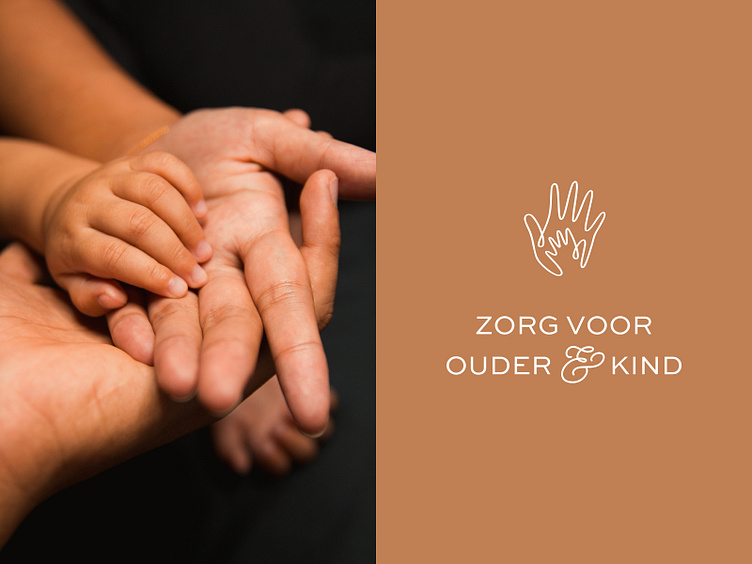
Vivendi branding: logo icon


The Vivendi logo consists of a logo icon and a wordmark. The logo icon is made from a single hand drawn line, symbolizing the connection between parents and their child. The hand of the child is enclosed by the adult hand, symbolizing protection. By keeping the hands slightly abstract they can represent both a child’s parents and a teacher or counselor.
For the wordmark we choose a bold and friendly letter. The connection between the ‘e’ and the ‘n’ creates a unique ligature, again symbolizing the connection between parent and child. Fun fact: the word ‘en’ in Dutch means ‘and’, another reference to that important bond.