


Paradigm Gallery + Studio

The year is 2010, I’m a senior in college. I’m awful at design but I think I’m untouchable. Every Friday and Saturday night I drive myself into Philly listening to Taking Back Sunday getting amped up to go to some art shows. See some art, drink free beer, rinse and repeat.
One of the many places I’d usually end up was Paradigm Gallery back when it was on South St. One time I saw Jukebox the Ghost there and the space was so small that the band played inside while everyone else stood out on the street to watch. What??? Extremely 2010 Philly thing to happen.

Over the years I’d been invited to participate in many group art shows there and met some really inspiring people along the way. Fast forward literally TWELVE YEARS and I get an email from Sara & Jason—the co-founders of Paradigm—asking us to help refresh their brand for a super special secret announcement. I was more than excited to pay it forward.
Paradigm has evolved since the years I was hanging up 11x17 posters in their space. They’ve grown up. They are real people in the art world. And now it is time for their brand to grow up too.
Up, Up, Down, Down, Left, Right, Left, Right, B, A.
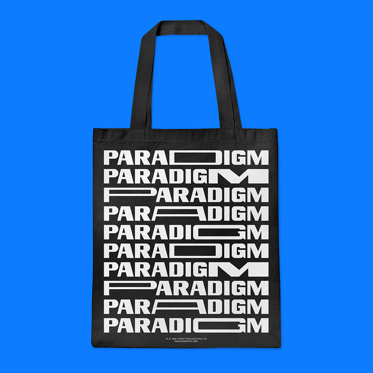
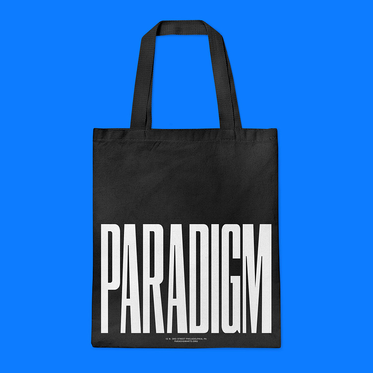
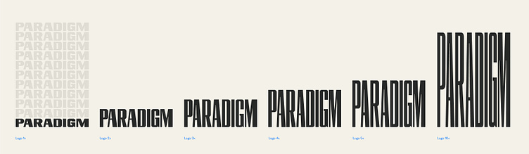
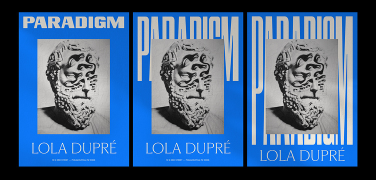
Right from the jump, we knew we wanted to make something that was flexible. Something variable. Something that could grow and evolve just like Paradigm has. Dayan, the type man here at Smith & Diction, custom made this wordmark that was built to expand horizontally as well as vertically.

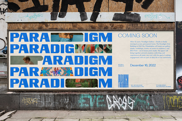
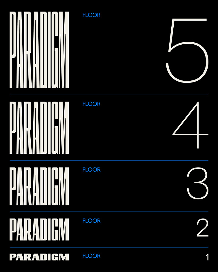
This was particularly great because part of the super secret special announcement is that the Paradigm folks just bought a brand new (actually kinda old) five-story building to move their gallery and studio into. Right now, they’re raising money to help make this move happen, check it out.
We wanted to tie the new visual identity into the physical space, but without being obvious about it. So Dayan made the wordmark vertically expandable up to 5x (representing the five floors). Then we also made a 10x version, just to be purely ridiculous. We call it the skyscraper version. That was our concept. Then we pushed it to the limit.
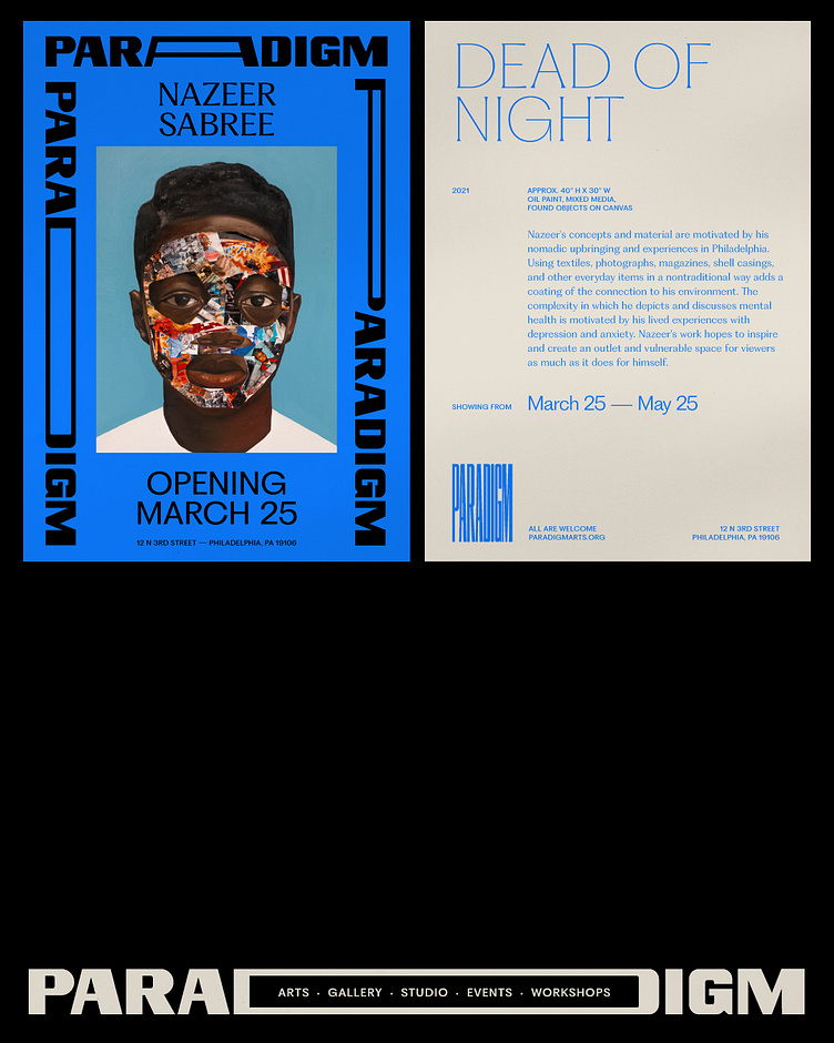
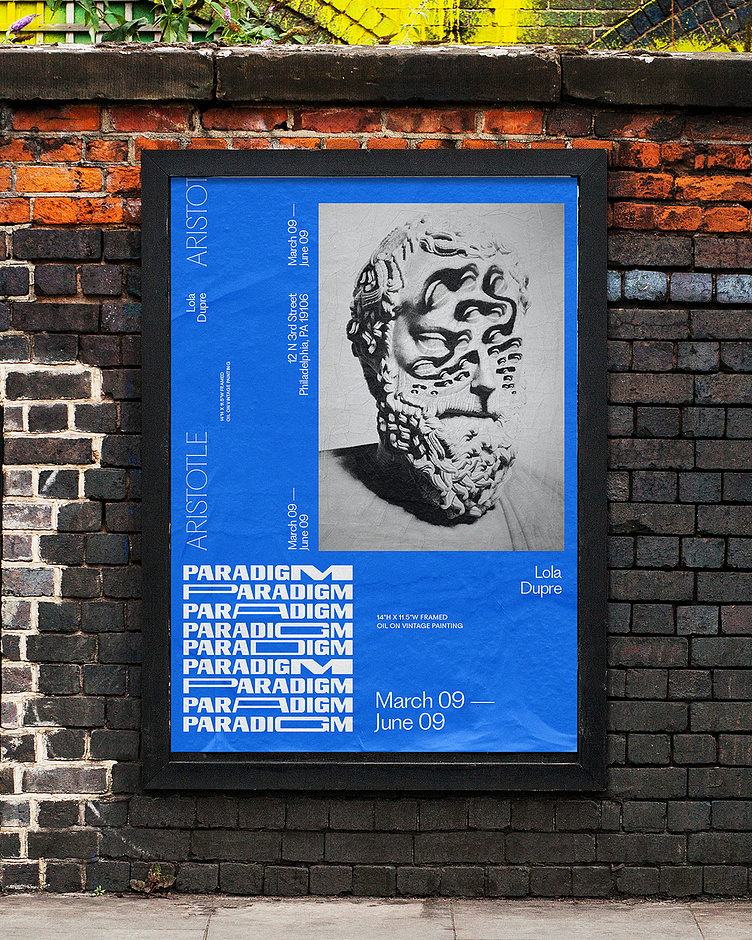
We also used the wordmark as a frame by stretching out the letterforms, which works really well to stand out from the typical show flyer scene. It gives a momentum and energy to the piece. It’s like, “We’re going somewhere, hop on for a ride.” It just sets a tone of “We’re not some stagnant gallery. The stuff in this show is going to be cool.”
This type has got range.
At the same time, one of the main pieces of feedback from the Paradigm folks was that this brand needed to do it all. It needed to feel at home in Philly. It needed to work in Europe. It needed to work for the collectors spending $100 on a piece and for the collectors spending $50K on a piece. Tall order for sure. But we always love a challenge. Weird but considered is the S&D credo.
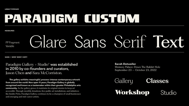
We built out the brand typography using Fragment from Pangram. This was the key that unlocked the doors for us. It comes in a super unique glare, a hardworking sans, an elegant serif, and a legible text weight. This gave us the tools to speak in all of those different visual languages while remaining consistent. One hang up is that it didn’t have an italic, which bummed us out a bit, so Pangram, if you’re reading this — we’d love an italic. Please and thank you.
Short and Sweet Sprints
This identity was a really wild one to build out. All of the pieces just clicked incredibly quickly. It was like building the plane while it was in the air but like in a good way.
As a studio, we’ve been testing out a new work flow. When the pandemic hit we were taking all kinds of jobs we normally wouldn’t have. We had friends starting businesses of all sizes and shapes that just needed simple logos/brands. They couldn’t afford the whole brand concept but they just wanted to seem a bit more considered than a typeface. In all honesty, since we were a bit desperate to just keep working, we started taking on these projects as a sprint. This was unheard of for me and I’m sure is a bit taboo in the whole “design thinking” world but I was just like screw it. I want to make cool shit for cool people. We’ve now been offering sprints to homies for the past two years and some of my all time favorite work has come out of it. Universal Patterns, Voyageur, Exposure, Remade Animation, Kevin Twohy (secret), Reclaimed Motel, all of those were 1–2 week sprints. Fast, dirty, and incredibly fun. You just make whatever comes into your head and you don’t overthink anything. It’s absolutely freeing. AND you get to help homies!

We’ve been trying to wrangle the process a bit and put it into our typical job offerings but it’s still just a bit unwieldy. We can’t promise a successful outcome every time, so it feels dangerous to offer it to someone who’s not a friend at this point.
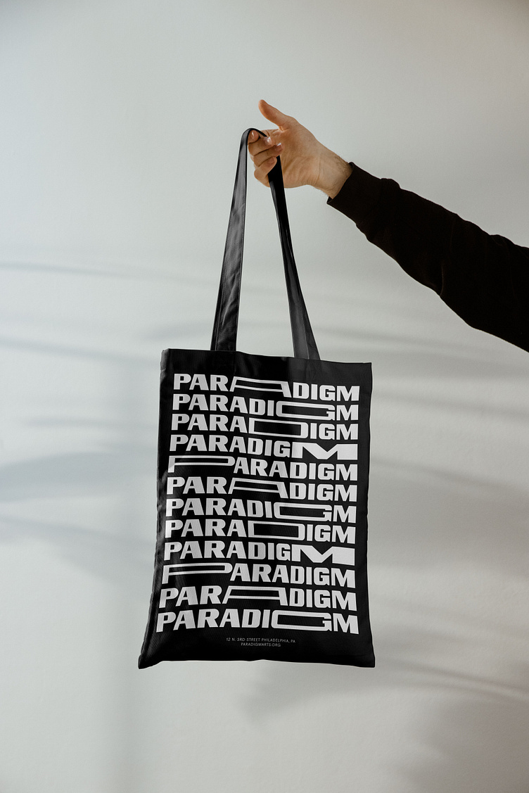
Anyway, Paradigm was a sprint as well. And it freakin WORKED. Dayan, set the foundation for three separate directions and then we just ran as fast as we could making all kinds of fun stuff. Posters, wheatpastes, postcards, letterhead, business cards, poster tubes, pins, whatever we wanted. And it all just fell into place. Unlike a typical S&D project we stuck to one brand color and didn’t overthink it.

It also helped that Paradigm allowed us to tap into their amazing roaster of artists to use their work in our brand mockups. Turns out, when you’re using dope art as the focus it’s really easy to make stuff look cool. As we were putting together this brand Dayan and I would just send links to pieces being like, “Yooooooo, am I about to buy this?!?!?” It was so fun to see how diverse their collection is and to try and make it all feel cohesive.

That’s that. We’re so proud of this work and even more proud to help out people in Philly doing awesome things. Paradigm was, and will continue to be, such a special piece of my design life journey and I’m so grateful to be a tiny piece of their story.
They are currently raising money for their new building, so if you’ve got a few extra bucks please check out their fundraiser on ifundwomen.com. They’ve got a ton of awesome details about their hopes and dreams for the space. And they are offering some really cool rewards for people who donate. One of which is a screen printing workshop were you get to make these totes! So go help out the Philly art scene, here’s the link again.
Here’s another link, just in case you missed the previous three.
Anddddd one more link for good measure.
Did you like this project? Want to work with us and make some fun yet flexible stuff together? Let’s goooooooo.
Shoot us an email at → hello@smith-diction.com. We love talking to all kinds of folks. Even if we can’t work with you for some reason, we’ll try to intro you to someone who can! Networking!


