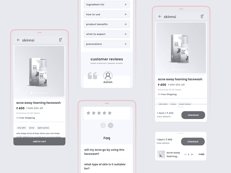
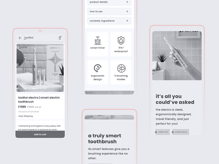
product detail page

Hello everyone 👋🏼
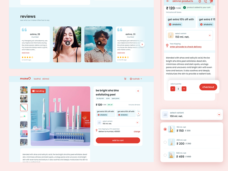
The main goal of this requirement is to provide our users with an integrated experience so that they can make faster decisions about products. Apart from this, we also attempted to make a unified details screen for skinnsi and toothsi.
the challenge
previously, we had an outdated product details screen, and i would not be wrong if i said we had two different types of experiences for toothsi and skinnsi. from the perspective of business and users, it did not even meet the basic requirements.
* cart icon was not there
* there was no option for select variants
* cart experience was completely different from standard behaviour
* information hierarchy was not correct
there was no option to check area serviceability
old designs
competitor analysis & research
at the beginning of each requirement, putting key facts on paper is essential to gaining a broad view of the requirement and identifying possible risks. Also, it opens up subjects to discuss with other stakeholders and triggers any potential new directions. As the brief made the objectives and requirements quite clear, the intent of this exercise is also to summarise all the important information so that we can examine potential first concept directions.
data points: link
competitor research: link
metrics and early impact trends
With the launch of this feature we are tracking L2 metric % (add to cart - product detail view). For toothsi products this number has improved by 4% and for skinnsi products the average is about 6% in a week's time.