Education App Design

Are you looking for a quality and modern design?
Please email us at info@computools.com.
Greetings, everyone. We want to share our new design for Education App.
This app helps users get enough information about educational institutions.
Users can find colleges and universities through the app and learn about campuses and places to live and work near selected educational institutions.
We created the design to be simple and user-friendly. Instead of text pages, we used icons.
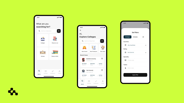
You can see the app's home page in the first shot. Users can navigate through four blocks in one click: colleges, schools, places to live, and work. It is essential information for applicants who are planning their studies.
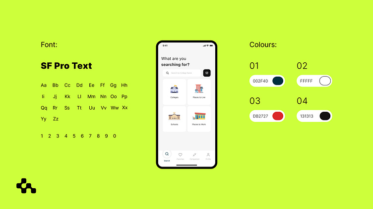
We used an industry-typical SF Pro Text font without excessive frills or details. The design used the four primary colors listed in the shot. We chose a shade of white as the background color and added three contrasting ones for the other elements. Most users trust the white background, while the dark gray and black connote high quality, reliability, and technology, and the red details are eye-catching.
From the home page, users can navigate in four directions. In the pictures below, we see the Colleges tab:
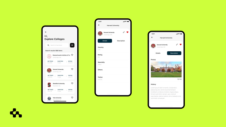
The results drop-down according to rankings, but we've added the ability to sort them by filter. So users can see the colleges they want, their rankings, the duration of study there, and even the tuition fees.
If they click on the college tab, there is information about the country, ranking, specialty, tuition, and others. College descriptions include images and detailed text information.
In general, the design concept of this interface implied a fast and easy search, user-friendly interface. Therefore, users have to quickly navigate and find the information they need and be able to rate it.
If you liked our design, please share your impression in the comments.
UI by Anna Voropaieva
Motion by Oleksandr Korshunovyc


