WunderPass – Styleguide


Hello everyone!
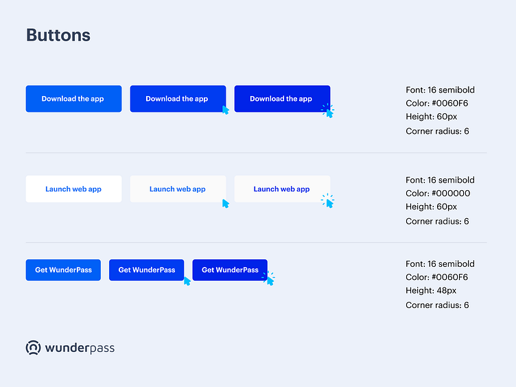
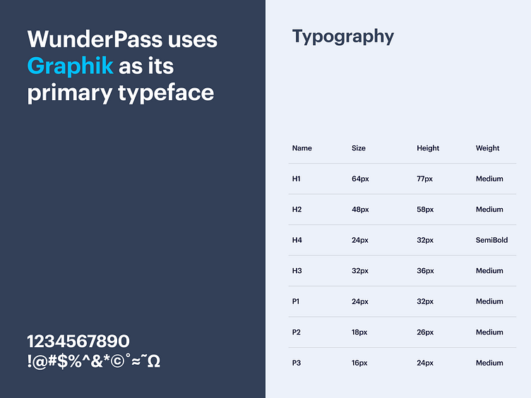
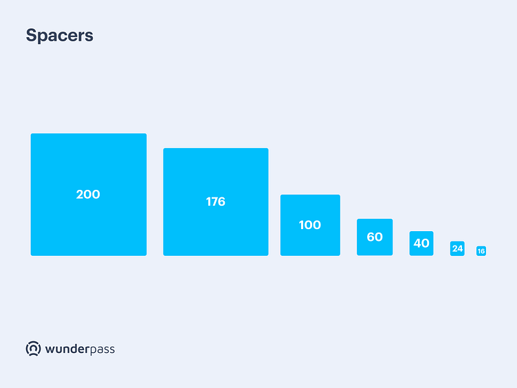
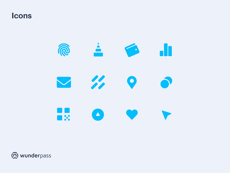
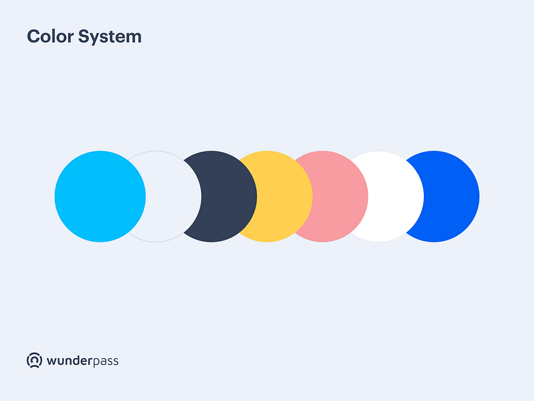
In today's post we are talking about the WunderPass brand.We wanted to refresh the existing brand. What does it mean? The existing brand lacked a bit of freshness and serenity. WunderPass is fun, user-friendly, but at the same time serious and safe. That is the impression we wanted to leave on the landing page.We used bright colors, but we opted for Royal Blue as an accent color that is characteristic of the crypto world. We chose Graphik typeface, which is serious, bold and rational, which we balanced with fun illustrations and vivid colors. We achieved a strong structure of the website by using consistent vertical spacings and solid icons.
Check our website at www.bazen.agency.
You may follow us on Instagram/Facebook/Youtube/LinkedIn/Behance.